The background color seems good and I like the Terry header. The buttons seem pesky and why do we need to know what kind of camera you use. The images are amazing , but I think there are too many for one page. Maybe if there was three pages?
As you know I am not an art director... so these are only thoughts.
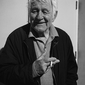
Railman, I tried the old guy in B&W and liked the color better because, it's almost like 2 photos in 1 the red tomatoes against a B&W old man.
Craig not sure what sort of grief you had with the buttons that's the 1st time I've heard that, I'll have a go at them. From having the site as a music site for a few years already and looking at the stats on the page(s) hits, people do not surf much from page to page. They mainly come in take a look at all but come back to the one they came in on and spend their time by and large.
The buttons seemed out of place and a little distracting. Again, I am no a.d. Now that you mention it the going to more than one page theory seems valid. What about dazzling them with your brilliance and getting them to come inside?


![[No title]](/data/xfmg/thumbnail/31/31708-69f4ec98ec000d4fc9a9a1cc282e8e16.jpg?1619734965)