What's new

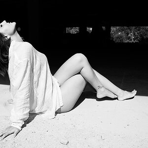
New Gorgeous Boudoir Photo

ps. I much prefer the second image with the eye contact, its a cheeky look, could just be a male perspective.
 
hey my 5c worth on the web site, its simple and easy to navigate and the photos load real fast so all good but I felt your opening home page was a little dull with all that great work in behind. I don't have a web site so imagine its tough setting one up but its just didn't grab me on the home page.
What would you recommend doing instead?
 
Consider removing or changing the label on the two colour images so the image is allowed to feature, you have your own style with the taped on label next to the KB but this does not carry through in a consistent style and the boudoir label is quite fancy next to the plain Family and Wedding headings. Once in your sites its great. Look this is just an opinion and I'm far from an expert. Only you know what you want so perhaps change nothing and get a little more feedback as is?
 
I think the first posted image is much too harshly lit.
She has a really bright mask-shape blanched area on her face that has no texture or color.
Her right hand is way too bright also.
Instead of an overall feeling of voluptuous, smooth curves and a sweet face, the entire impact of this picture is bright stuff and a cleavage.
 
Last edited:

Create an account or login to comment

You must be a member in order to leave a comment

Create account

Create an account on our community. It's easy!

Log in

Already have an account? Log in here.

New Topics

Back
Top Bottom