What's new

new here....here are some of my pictures!

Ciggy_Num_Num

TPF Noob!
Joined
Nov 5, 2011
Messages
18
Reaction score
2
Location
New Orleans
Can others edit my Photos
Photos OK to edit
here is some of my work...hopefully these images arent huge....lol....

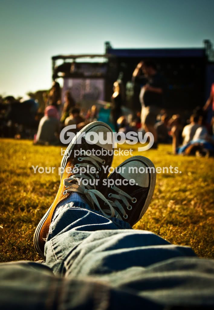
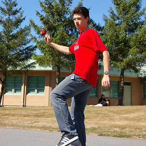
chillinvoodoo.jpg


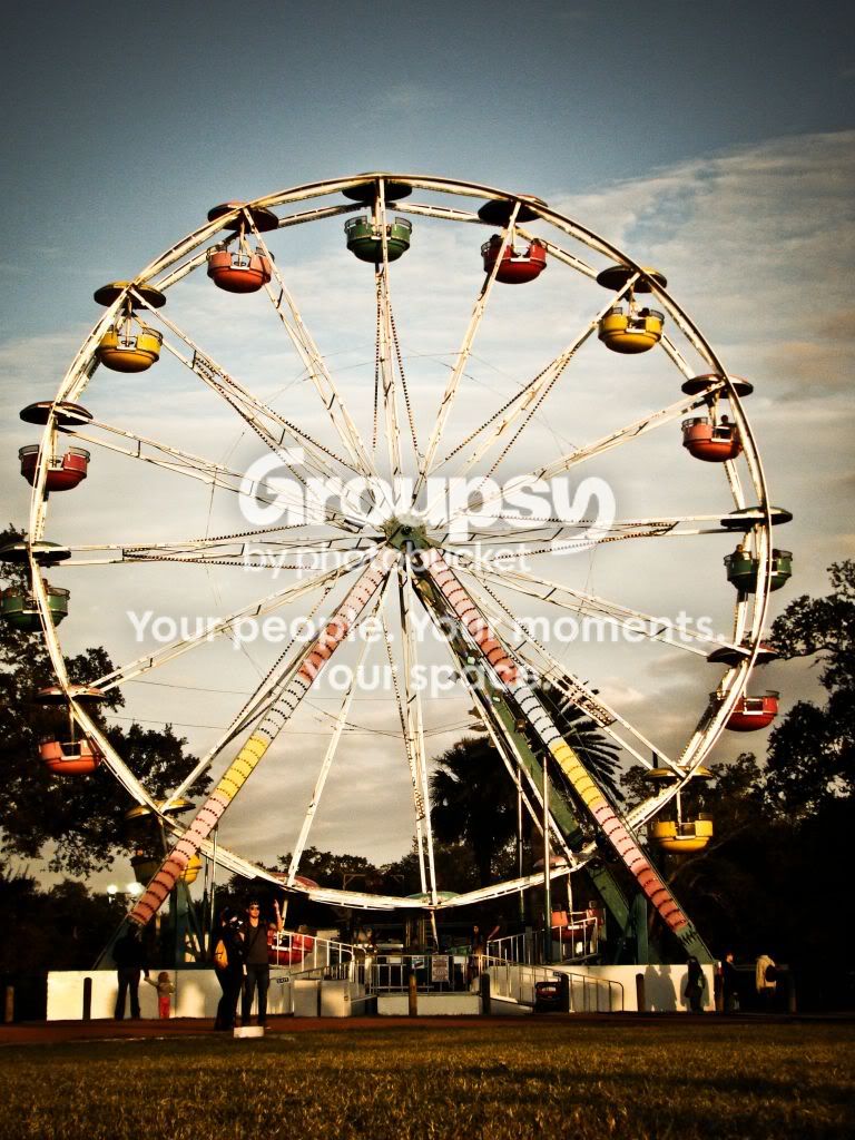
feriswheel.jpg


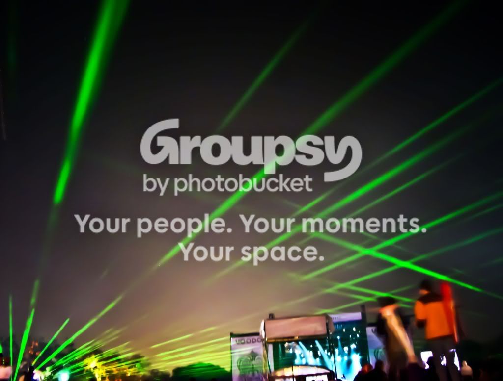
lazershow.jpg


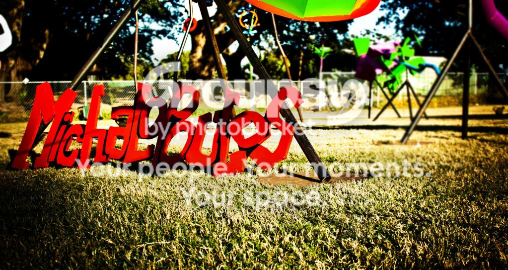
MikeOpolous.jpg


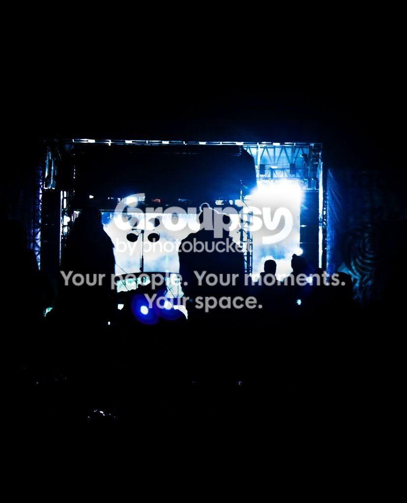
silouettepeople.jpg


Drewnegmakiofisheyefilter.jpg


SWANreedit.jpg


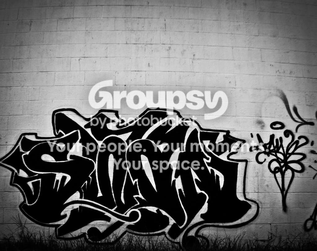
TEEHcornerBWsig.jpg


jonfsroyal3-2.jpg


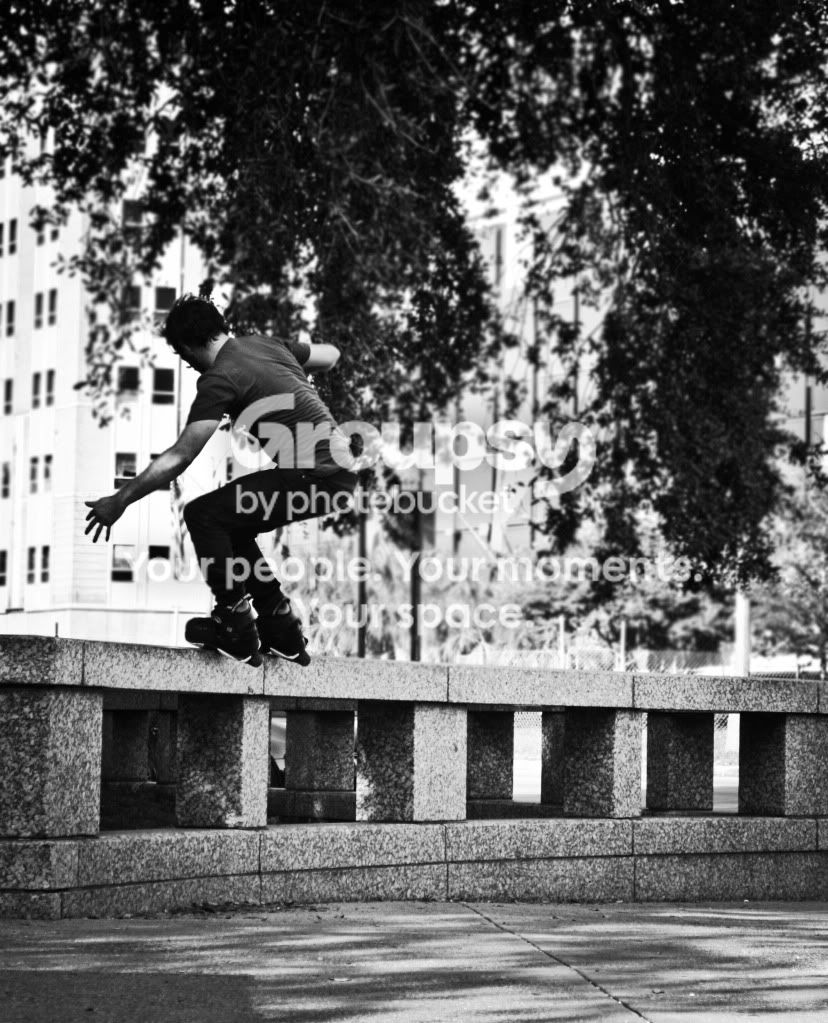
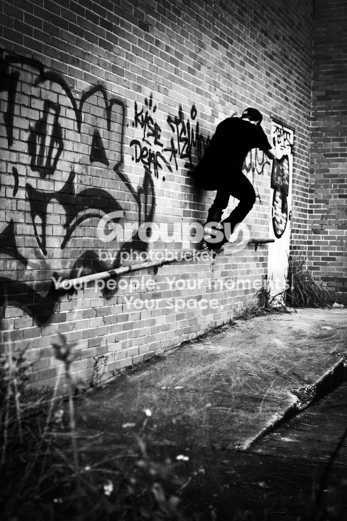
fishbrainupwallrail.jpg
 
There are a lot of photos here to C&C, if that's what you wanted, but I must say that the overall impression is very good! I especially like 3, 4, and the second to last one.
 
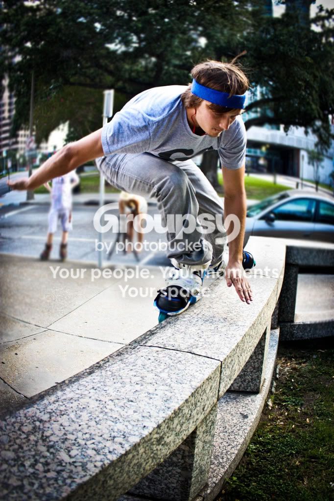
The first photo is fun but I think it would have worked better if just the hem of your jeans and your shoes were visible. The other photos look a bit overprocessed (might be my screen though). The skating boy would have been good if you had got in closer and we could see his face more. I like the last two B/W shots - that guy skating on the hand rail! I really like how you are experimenting with different styles :thumbup:
 
glad yall like the shots!

Tish, when you say over processed, what do you mean? like the color is off or not right?

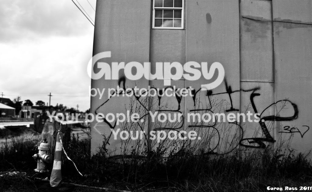
yeah, i mainly shoot graffiti and rollerblading, but id like to expand out a bit, haha!

thanks for the comments so far. any more CC is welcome, its the only way to get better. :)
 
If you are looking for CC:

1. Next post, make sure to add about half as many photos, and only add what you think is best.
2. Number your photos for easy reference. Ex: I like #1 because...not "I like the one with the writing on the wall in the upper right under the one....blah blah"

But, I'll do it anyway.
1: It's good. I like it. Nice DOF, nice editing. My favorite. 8/10
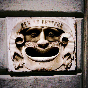
2: I like the editing. It's cropped entirely too close. The left is just about clipped off, and the subject really isn't all that entertaining alone. 4/10
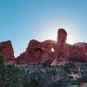
3: Very confusing, very busy, lacks a subject. 0/10
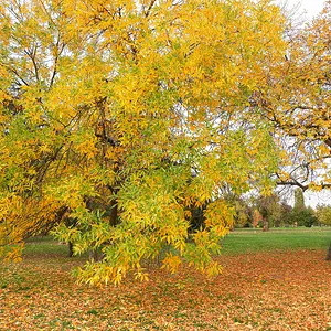
4: Overprocessed. Colors are entirely too oversaturated, contrast is pushed way too high, The background is very busy and takes away from the not-so-interesting subject. 2/10
5: Not very level, and is really missing a clearly defined subject as well. 1/10
6: The skater is sharp and all, but the composition is severely lacking, the tones are a little flat, and there's some pretty bad falloff on the edges. 3/10
7: Major distortion, vignette=tacky, subject is cut off, poor perspective, subject lacks significance. 1/10
8: Not level. Subject lacks interest. Poorish composition. 1/10
9: Much better! Nice contrast. Subject is in focus, fairly good composition, Just slightly off level as well. 7/10
10: Same as #9, but the vignette is still a bit tacky. 6/10.

Overall, try to stay away from vignettes. They're considered tacky in 95% of situations. Sorry if my critique was a little nit-picky, but no one will ever get better unless you know what you should fix, right? :wink:

Keep shooting! :thumbsup:
Mark
 
damn. haha! you are the first person to ever rip into my pictures. thank you!! lol. ive never had anyone get that nit picky. i really appreciate everything you said and will definitely take everything you said into consideration.

im really glad that you liked a few too. at least lets me know i am doing somethings right. ive been shooting for a few years, all self taught and i have never really had an critique/advice.

again man, thanks for that, youre right, its the only way to get better.


keep em coming. :)
 
Hey, you have the same avatar as that one other guy, or at least, quite similar....What ever will I do!!!
 
Lol! This one makes me happy, because it's also happy! Like, "Hey guys, I'm so happy that photography is my hobby, and you are all my friends!"
 
haha! pretty much.


that smiley makes me laugh every time i see it. lol
 
Most of your photos are wide open, you should really stop down a bit.

Picture number 1, 4 and 8 have the ISO too high.
 
I'm new to! Man those look cool! Keep it up!
 
Agree with much of what MarkW said, including #s 1 and 10 being among the best. I would add only that both of these shots could benefit from a little cropping on the bottom, where there is a lot of out-of-focus stuff. Yeah, the vignette has to go or at least be dialed back quite a bit. #1 also looks too yellow to me, but my work monitor is not that accurate, so take that with a grain of salt.
 
Most of your photos are wide open, you should really stop down a bit.
What for? I can't see where any of these would benefit from the extra depth of field..

Picture number 1, 4 and 8 have the ISO too high.
Why? I don't see recognizable noise in them. That's probably because the ISO was only at 400. Not too high at all.

Message in ​red.
I honestly don't see the base for your statements..

Mark
 

Create an account or login to comment

You must be a member in order to leave a comment

Create account

Create an account on our community. It's easy!

Log in

Already have an account? Log in here.

Back
Top Bottom