New Member Looking for Feedback

scorpion_tyr

No longer a newbie, moving up!
Joined
Nov 15, 2009
Messages
579
Reaction score
60
Location
Longview, Texas
Website
lawrenceburnsphotography.yolasite.com
Can others edit my Photos
Photos NOT OK to edit
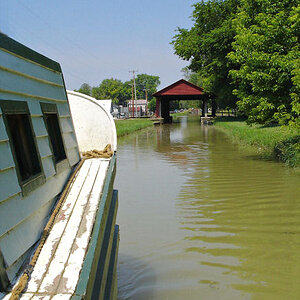
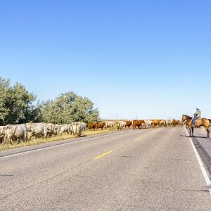
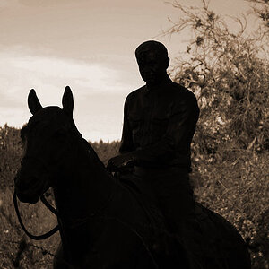
I've been shooting just as a hobby mostly for a couple of years now. Never really had my work critiqued by other photographers. Here's some of my favorite shots, please let me know what you think. Hoping I can take my hobby to the next leve. Any and all C&C will be appreciated!

Thanks!

1
IMG_0061r.jpg


2
IMG_4306er.jpg


3
IMG_6552er.jpg


4
IMG_8788BlueFlagEr.jpg
 
Last edited:
Welcome to the forum!

I think the first one is a great idea. I think you captured everything just right. My only nit pick would be that you can't read the entire Crown Royal logo. Had you spun the glass just a tad it would have helped tremendously. Now my eye is just drawn to what is written and what it could possibly be.

A lot of members on here don't like selective color like in the second and fourth shot. I remember when I got PS it was the first thing I did though lol. When doing selective coloring you want to make sure you're not drawing the viewers eye away from the subject or emotion you are trying to convey. I'm still on the fence about SC so I won't comment on that. The second picture only pops because of the red dress. Had the dress not been colored I think it would have been boring in greyscale. I'm curious to see what that original image was.

The third one is kind of meh to me. I don't like the pose or the cluttered background. My eye is drawn to the blown highlight in the lower third of the image. After my eye goes there it just wanders around and looks at the trash and graffiti on the wall. Finally I look at your model but the pose throws me off so I look around some more.

I love the fourth image. I like the emotion that is seen and felt. There were many times that I stood at attention as that flag glided passed me in that manner. This brings back lots of memories. Again I want to see the original though.

Overall I think you're off to a great start! Keep posting and giving comments to others!!
 
Oh, and yes the 1st image has bothered me ever since I took it that you can't read the entire label. This shot was pretty much an accident. I wasn't even looking through the viewfinder when I shot it, and it was a few weeks later before I could get the pics onto a computer to look at them.
 
Yeah, the selective colour isn't doing much for me either. Personally i think the #4 is a lot better in it's original state and makes for a pretty cool pic. I feel there's a story on the guys face that gets lost when you draw focus only on the flag with the color.

I like #3, but i'm the kind of guy that likes the grittier/dirtier type backgrounds so maybe thats just personal taste.
 
I agree about the selective color, while I am not against it, I think the original images are much stronger untouched. Is it just me, am I the only one drawn to her cleavage on 3, if that is what you were going for...well then you nailed it. All in all, I like the flag picture the best!
 
Is it just me, am I the only one drawn to her cleavage on 3, if that is what you were going for...well then you nailed it. All in all, I like the flag picture the best!

I was. I'm going to assume that was the intent, because you don't generally do a shot like that and not think the cleavage is going to the center of attention :p
 
i like #4, really good theme/story to it.
All others are snapshots.
 

Most reactions

New Topics

Back
Top