sinaali
TPF Noob!
- Joined
- Dec 8, 2009
- Messages
- 12
- Reaction score
- 0
- Location
- Tehran, Iran
- Can others edit my Photos
- Photos OK to edit
Hello everybody!
During past weeks and hopefully this weekend we spent some time taking some new photos from whatever we found interesting. I'd like to share some of them with you and of course looking forward to receiving your kind feedback on them.
Thanks in advance!
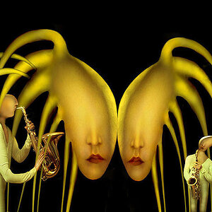
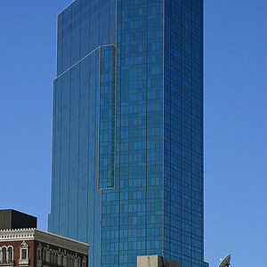
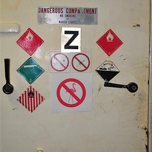
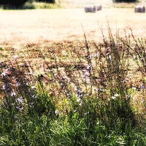
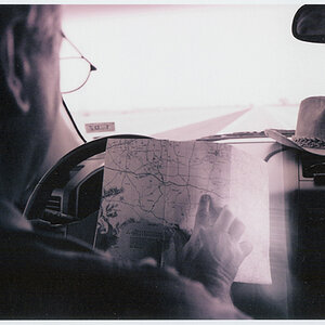
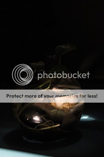
1:
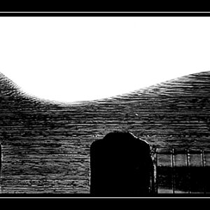
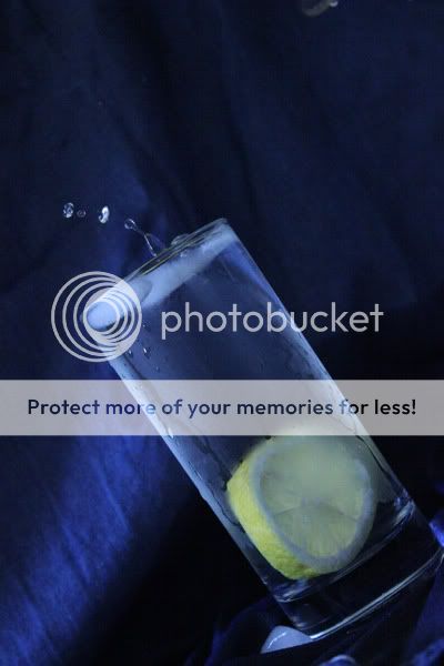
2:

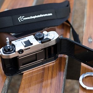
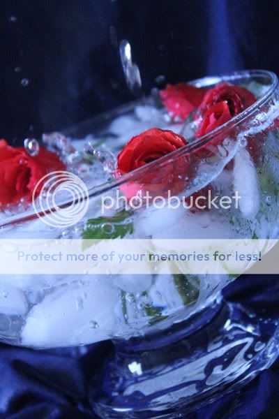
3:
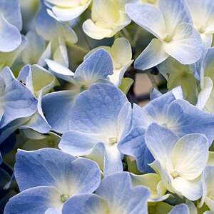
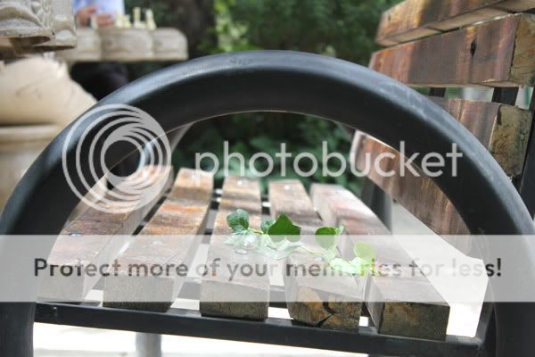
4:
5:
6:
During past weeks and hopefully this weekend we spent some time taking some new photos from whatever we found interesting. I'd like to share some of them with you and of course looking forward to receiving your kind feedback on them.
Thanks in advance!
1:
2:
3:
4:
5:
6:
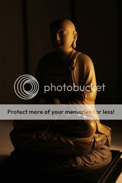
 . We've taken these photos according to our lessons and of course based on our own ideas. Certainly they're full of mistakes, but we hope that we'll make improvement and reduce our mistakes by your nice and useful comments and reviews.
 ![[No title]](/data/xfmg/thumbnail/34/34127-a0d1223fcaca46821c9dace22d8f88c2.jpg?1619736298)