kellylindseyphotography
TPF Noob!
- Joined
- Mar 26, 2008
- Messages
- 1,270
- Reaction score
- 0
- Location
- Haverhill, Ma
- Can others edit my Photos
- Photos NOT OK to edit
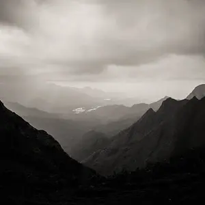
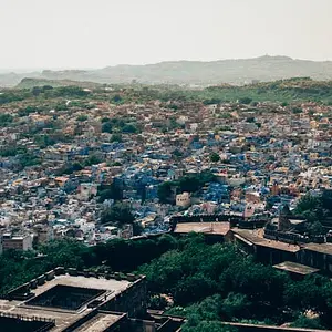
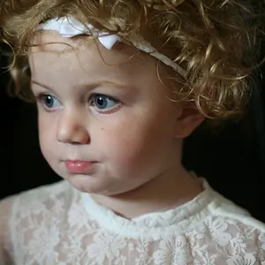
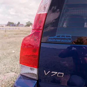
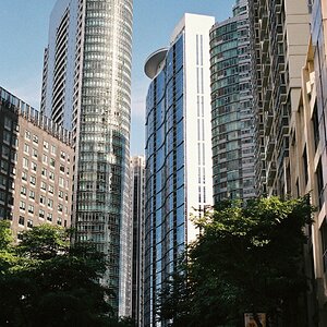
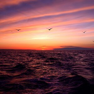
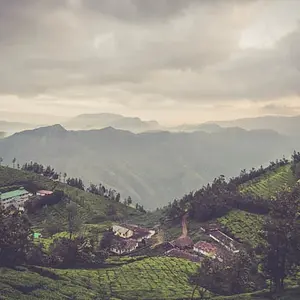
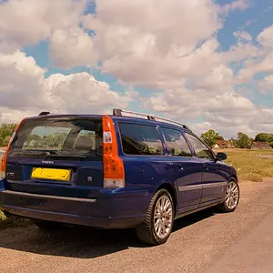
Can I get some c/c on the new pics I've put up? Thanks!!
(which do you hate, which do you love, which don't belong, composition and placement of photos on page etc)
http://www.freewebs.com/kellylindseyphotography/index.htm
(which do you hate, which do you love, which don't belong, composition and placement of photos on page etc)
http://www.freewebs.com/kellylindseyphotography/index.htm


 I also fixed the contrast in the first 2 shots (Hopefully, enough now?)


![[No title]](/data/xfmg/thumbnail/37/37604-7ad625e983f92f880eb65a264eeef5e4.jpg?1734170732)
![[No title]](/data/xfmg/thumbnail/32/32937-a884897f1671b4bfa4a955c9e4b7e574.jpg?1734162741)