The white balance seem to be really off otherwise something will certainly grab attention Make a curves layer then click with the gray eyedropper somewhere in the background and pull back the opacity by around 60%. I think that's how the colors should roughly look like.
I dont know how much PP you did already. It looks a bit like you worked too much with a healing brush around her hair. It might be jpeg compression though. Not sure.
Lighting: I think short lighting would have been more flattering for her.
Thanks for the feedback. I went a bit overboard with pp on this one. This was just one of many images and a look the subject was going for, but appreciate the C&C. I shot everything in RAW so anything can be fixed.
generally with portraits I like the nose and chin to be the closest items to the lens ... here the arm, the cigarette and her breast all get attention WAY before her face does ... and, as been said already, the eyes are soft ...


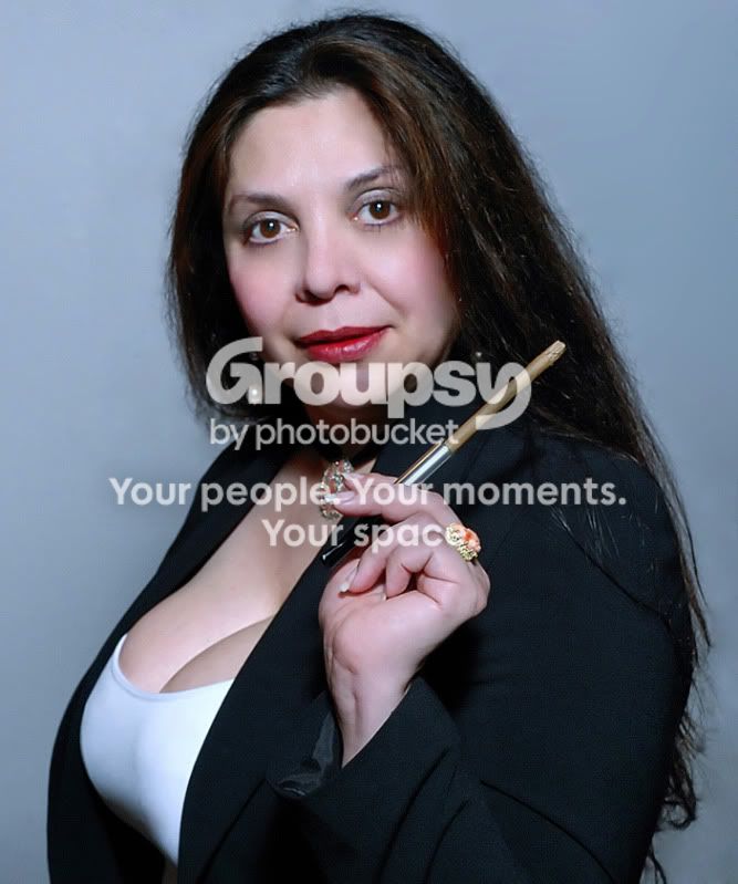

 Make a curves layer then click with the gray eyedropper somewhere in the background and pull back the opacity by around 60%. I think that's how the colors should roughly look like.





![[No title]](/data/xfmg/thumbnail/37/37280-a7e70a01ccd331918e71645cd4c1f16e.jpg?1734170137)