- Joined
- Feb 14, 2013
- Messages
- 281
- Reaction score
- 61
- Location
- Stratford Upon Avon
- Can others edit my Photos
- Photos OK to edit
Hi,
I am very new to photography (only 2-3 months!) but was just wondering what people thought of some of my first attempts at anything other than quick un-thought about snaps. Both taken onboard an RAF Vulcan in very low light.
1)
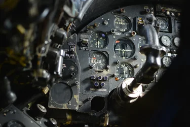
2)
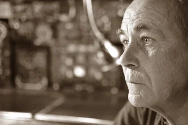
Thanks!
I am very new to photography (only 2-3 months!) but was just wondering what people thought of some of my first attempts at anything other than quick un-thought about snaps. Both taken onboard an RAF Vulcan in very low light.
1)
2)
Thanks!

 )) and tried a bit of a crop on the left. However, I thought it looked based as it is above due to wanting to show a bit of perspective of distance to the gaze so that it didn't look like he was staring at the end of the photo.


![[No title]](/data/xfmg/thumbnail/32/32158-8de1a90710a58144b47a0cee83a6c820.jpg?1734161046)
![[No title]](/data/xfmg/thumbnail/33/33906-2f9b24e4b1e1be07f68257916df0f2b3.jpg?1734164328)
![[No title]](/data/xfmg/thumbnail/32/32183-06800ba86381f42976d75297ee6b5942.jpg?1734161047)
![[No title]](/data/xfmg/thumbnail/32/32161-a5da499a329f1fae945778aac75d4442.jpg?1734161046)