New to photography.

ivomitcats

TPF Noob!
Joined
May 6, 2010
Messages
101
Reaction score
0
Location
Independence, Mo
Website
www.flickr.com
Can others edit my Photos
Photos OK to edit
Woops, didn't even see there was a forum for beginners, this place is better suited for me I think..

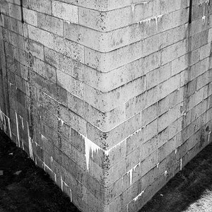
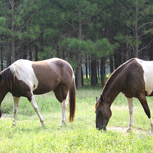
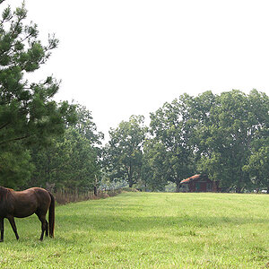
I've only had a camera for four days, or so, so any constructive criticism is more than welcomed.
I'm using a Nikon D40 and a 50mm F/1.8D

Through_the_glass_by_ivomitcats.jpg


Gone_fishin___by_ivomitcats.jpg


Baitshop_by_ivomitcats.jpg


Nikon_by_ivomitcats.jpg


Babyface_by_ivomitcats.jpg


Contrast_by_ivomitcats.jpg


15x2sud.jpg


My flickr (You're welcome to friend! :) ) Clickr for Flickr
 
I like number 2, i just wish the fish was in focus more, no movement down at the bottom of the fish, I like how you can still make out that it is a girl holding the fish up. I dont know what it is, but I like the last one as well. I just it just reminds me a lot where i grew up and spending my days fishing and being outside.

Thank you for sharing!
+1

I also like the the Photo in the bait shot.
 
I like the composition in 1 and 7. I am not sure if you edited the color temp in pp or not. If not your white balance is off. Either way, I still kind of like it. Number 7 would also be a little better if the top of the hat and elbow wasn't cut off. (this happened in 2 also)

I also like 2, I wish it was a little sharper though.

You have a good eye for composition.
 
I don't think the "retro" look with the colour-curve-fiddling does that much for your shots.

1: needs some more contrast. The cat seems rather black. Using the "retro" look will do this to your shots.

2: Great shot, but a tad underexposed.

4 and 5 are blurry, 4 is a VERY boring pic

7 is nice but the purple channel is way overdone. Tone it down a bit.
 
some really nice shots!
 

Most reactions

Back
Top