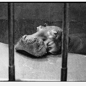
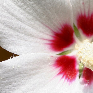
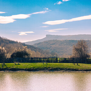
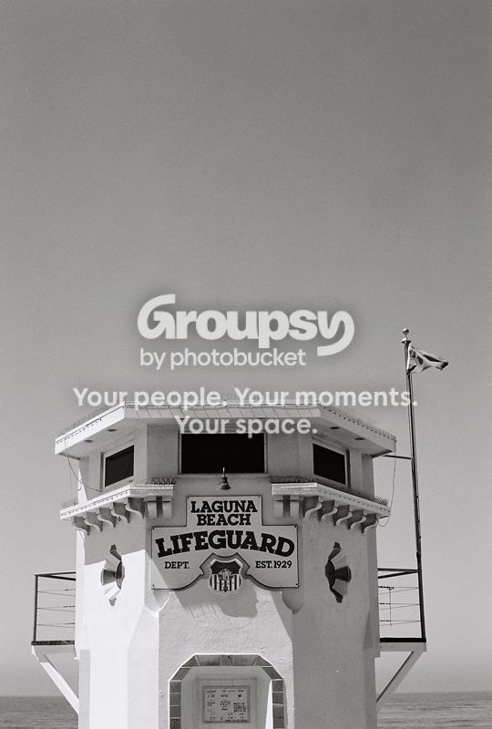
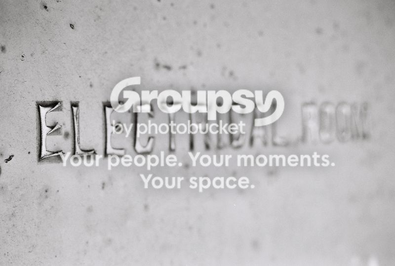
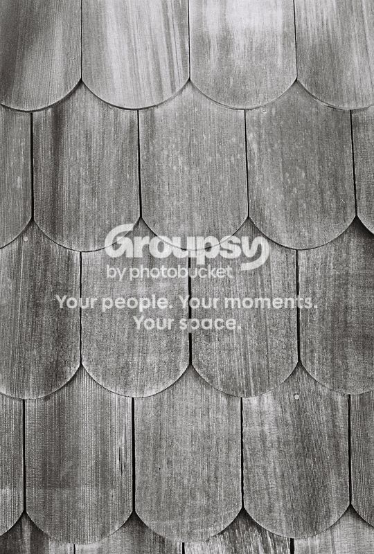
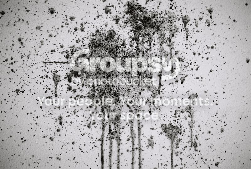
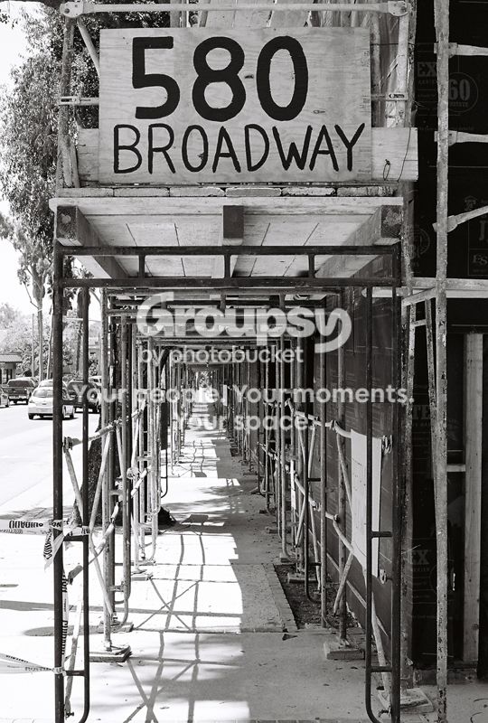
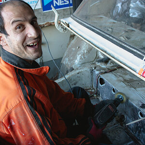
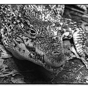
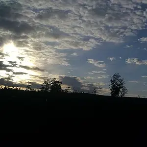
They could all use more contrast, and in general the subjects are not very interesting nor are they presented in an interesting way. The last image is good, but perhaps would be better with less depth of field.
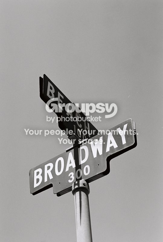
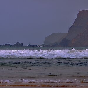
#3 is decent but make sure you get the lines straight or it really stands out, and not in a good way.




![[No title]](/data/xfmg/thumbnail/32/32715-2fc6326453c7dda13dae0bbb0cc16864.jpg?1734162341)