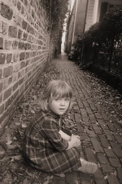
It's a cute shot, but there are a couple of areas where It could be improved. The image leans down to the right; leveling would immediately make it a stronger image, and you've created a bit of a compositional faux-pas in that you have very strong leading lines in the form of the wals and the brick path which take your eye right through the foreground to the bright area in the centre background. Remember that the eye is naturally attracted to bright over dark, and naturally follows linear elements, therefore what will happen is the viewer skips right over your daughter and looks at the bright, empty area in background.
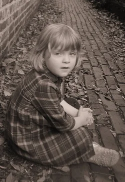
I would level the image and crop more tightly around your daughter; just above her head.
Just my $00.02 - YMMV
~John








![[No title]](/data/xfmg/thumbnail/34/34116-b81991a4a8a532509a981cadbacd573c.jpg?1734164576)