Newbie - be gentle please

pmckenna

TPF Noob!
Joined
Mar 11, 2009
Messages
7
Reaction score
0
Location
Vancouver, BC
Can others edit my Photos
Photos OK to edit
Hi there.....I am totally new to this forum and reasonably new to photography. Admittedly, I don't venture too far away from the "automatic" setting but when I have I've managed to "fluke" a couple of good shots.

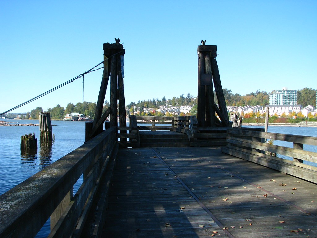
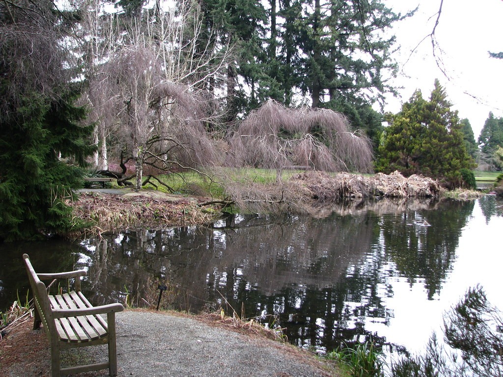
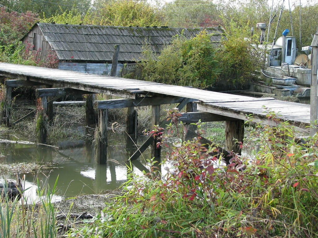
I would appreciate any advice you all can give and am looking forward to all your hints and pointers.

Here are a few of my personal favs:

3347106469_1450715058_b.jpg


3347112229_f6b2e3073e_b.jpg


3347106263_e36a98a2fa_b.jpg
 
#1 could use a fill flash.. the sky looks great, but you kind of loose the warf in the shade... if you had a fill flash you could brighten it up some

#2 and 3 dont really do much for me, so i'll leave them to someone who digs them
 
Here is a question for you: what do you see in these three images ?

We can comment on the technical/artistic aspects ... but you should question them yourself also, as you might be surprised by your own answer.
 
On all these pictures, IMO, it's very hard to find the subject you are trying to focus on? Idk. but #2 and 3 seems to distracting for me.
 
Hi..

The first one is interesting, but the subject is elusive. As presented I want to use the dock as a "window" to see what is beyond, and I don't find anything interesting beyond...then I realize that the dock is probably the subject... For this, you should have been in center weighted metering(or something), and metered on the dock, then used as large an f-stop (small number) as possible to get the background blurred. That way, the dock would have been properly exposed rather than dark (tough to do as most of it is shadow and you don't want to blow out the highlights).......as it is, the shoreline is better exposed (just out of focus..which is OK)... I might also have got down on my knees to give a bugs eye view of the structure...

#2 is fine..

#3 needs to have that corner of the structure on the right side removed (cropped), and lose some of the muddy foreground...
 
Thank you all for your input.....I'm going to try all your suggestions and am taking them all to heart
 
#2 has something going for it. Perhaps if it was taken in early morning or late evening.

1 & 3 are interesting in that they both are of older, man made structures.

Since the composition is good in all three, I can't see you being that much of a noob... or maybe you've been studying.
 
For #1, I agree that if the dock is the focus, you need to use a wider aperture to blur the background.

For #2, maybe go back when the light is better, or boost the saturation. It looks a little washed out.

#3, crop tighter; it's not clear what the subject is.

Of course, this is all just my opinion!

-Dan
 
1. Big white balance issues. Very center balanced image nothing to really keep us wanting to look at the shot.

2. In my opinion is the best of the bunch. The only thing I can say is that I dont like that the benches leg is cut off on the bottom.

3. Doesnt really do anything for me. Again as with number one there is no real subject. If the subject is the barn then the dock is very distracting. If the subject is the dock then show me why because its going nowhere.
 

Most reactions

Back
Top