inkybutton
TPF Noob!
- Joined
- Oct 20, 2009
- Messages
- 18
- Reaction score
- 0
- Can others edit my Photos
- Photos OK to edit
Hi all,
So I've been going with this photography thing for a month or two and I think I need some feedback. Please tell me what you think of my photos. (All taken with my Fujifilm Finepix F700)
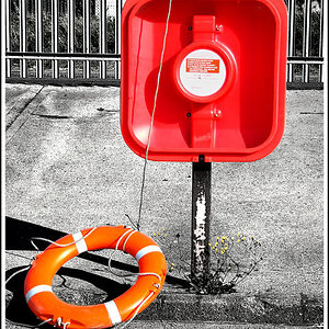
1
Exposure: 0.02 sec (1/50)
Aperture: f/4.0
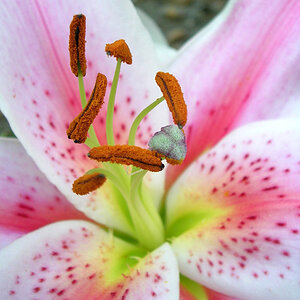
2
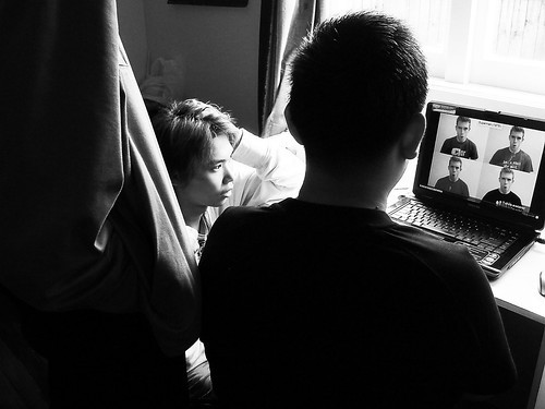
Exposure: 0.04 sec (1/25)
Aperture: f/5.6
Edited in GIMP to desaturate and increase contrast.
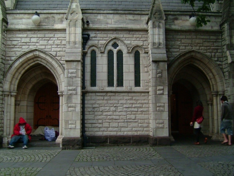
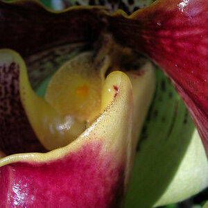
3

Exposure: 0.017 sec (1/60)
Aperture: f/2.8
Edited in GIMP to desaturate and increase contrast.
All taken in Manual mode.
Thanks!
So I've been going with this photography thing for a month or two and I think I need some feedback. Please tell me what you think of my photos. (All taken with my Fujifilm Finepix F700)
1
Exposure: 0.02 sec (1/50)
Aperture: f/4.0
2
Exposure: 0.04 sec (1/25)
Aperture: f/5.6
Edited in GIMP to desaturate and increase contrast.
3
Exposure: 0.017 sec (1/60)
Aperture: f/2.8
Edited in GIMP to desaturate and increase contrast.
All taken in Manual mode.
Thanks!
 ) since I wanted to show a contrast between who's let in the church and who's not.
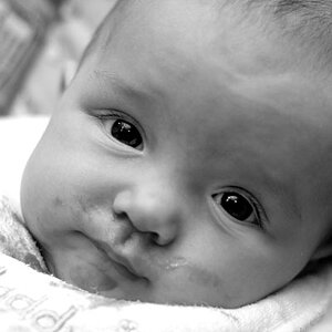


![[No title]](/data/xfmg/thumbnail/33/33440-0778f3522902634844facab43c5a29fa.jpg?1619735969)
![[No title]](/data/xfmg/thumbnail/42/42466-109a1021e2f0f132abfd74e1a6e39444.jpg?1619740192)