What's new

Newbie looking for C+C (Thanks)

madimom_04

TPF Noob!
Joined
Jun 29, 2011
Messages
7
Reaction score
0
Location
Kankakee IL
Can others edit my Photos
Photos NOT OK to edit
These are from a session I did for a local tutu and hair accessory maker.

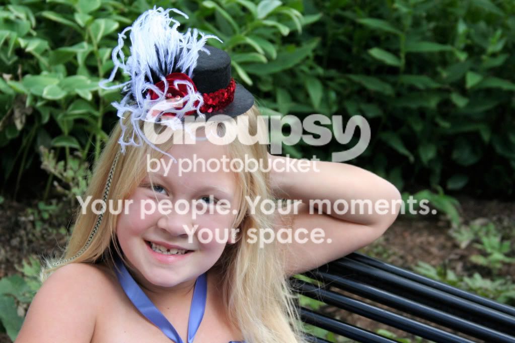
1.
KBANN106.jpg


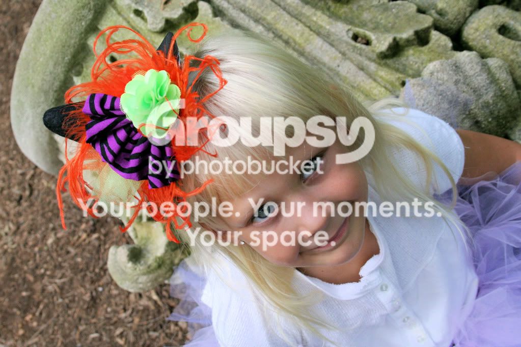
2.
KBANN082.jpg


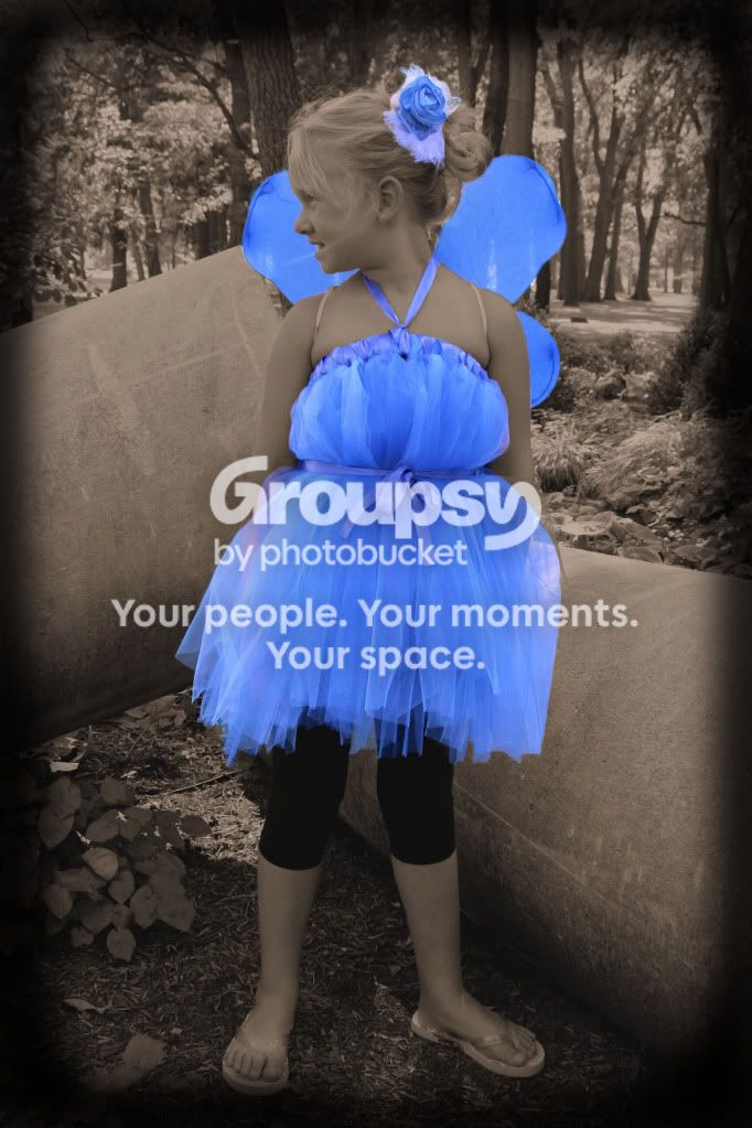
3.
KBANN005a.jpg


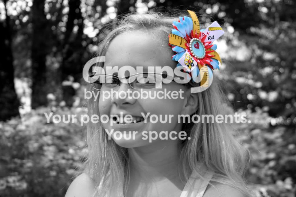
4.
KBANN320a.jpg
 
I think you need to zoom in closer and concentrate on the product and not the models.

The first one I'm not sure if it's my eyes or not but the product seems like it's a little out of focus.

I like the last one, but I think it needs to be cropped so that you mostly have just the model and cut out as much of the background as possible.
 
C& C per req:

1. Two issues here. One is that you've over exposed the highlights on the hair piece and blown the white fringe, and two, your setting and background are totally inappropriate. You want to use large apertures and long glass to isolate the subject in the frame with minimal DoF and have a plain, non-distracting background.

2, 3. While you have (I suppose) chosen the right aspects to highlight, seek five colour has NO place in commercial work IMO.

Just my $00.02 worth - your mileage may vary

~John
 
1: A shallower DOF would be nice. The main thing I see that bothers me is the pose. In my opinion if her head was angled slightly more to the right, looking at the camera still, but head toward the empty space it would be better.

2: That little hat on her head is WAY too distracting. These little props are becoming popular, but not with professionals and here's the reason why: when you put something like that in the picture, especially when it's close to the model like that it becomes the main subject because it attracts all the attention. If the average viewer were to look at this picture, and the think about it 15 minutes later all they would remember is the crazy hat. It's too colorful and distracting. The model, specifically her eyes should be the main subject, not the hat. Imagine this shot without the silly hat. It would be much better. The only other things I can see is the eyes. They look like they've been enhanced a little too much in PP. That may not be the case, but it looks like it to me. Also in try to use a scratch or line remover to take out that hair going across her eye.

3: If you're going to use selective coloring, be selective about it. Don't find something to SC in every picture. To be honest with you there's a lot wrong with this picture, but instead of fixing it with PP, you just added to the problem. Ignoring all of that the main thing here is the background. Next time try this: shoot in aperture priority, and zoom all the way in with your lens. And then back up until you've framed the shot right, adjust your aperture to the maximum and take the shot. This will blur that background more unless you're using a small focal length range kit lens.

4: Another reason not to use selective coloring. This is insanely distracting. Once again, be selective when using selective coloring. Do it to only one color, not one object. The hair piece is now the main subject because it grabs all the attention because of the SC and because it's the object that falls into the rule of thirds. The model's eyes should be in the intersections of the rule of thirds, but in this shot they're in the center of the image. You do have much nicer bokeh in this shot.

Overall:

The Ugly: The selective color. I don't even do it unless a client specifically asks for it and then I charge extra.

The Bad: The bokeh. If you're still shooting with a kit lens this is hard to fix. Get yourself a 50mm f/1.8 for around $100 or less and that'll fix that.

The Good: Your focus is very nice and sharp! You're poses and angles are also pretty good overall. Keep shooting, just spend more time with your camera and less time with your editing software.

 
#1 Girl is OOF but the "hat" is in focus.. looks bad, very distracting.. highlights are blown on the "hat"... plus background is distracting. Pose is awkward.. get that arm out of there.

#2 lighting is harsh and too close / high (the shadows under her eyes are ghoulish), the "hat" is OOF... highlights blown on "hat" again... background distracting again. Tilt??? Don't like it.

#3 If the client likes it, fine.. but (I agree with tirediron) selective color is usually a no no. It does make the outfit stand out.. but in kind of a cheesy way.

#4 composition is bad.. don't center like that.. crop the dead space. The selective color fights with girl.. your eye doesn't know where to look... they naturally goes to the girl, and then are drawn to that horrid flower thingy, and then back again. Shadows on the girl are harsh.. needs better light, that diagonal shadow under her chin is bad. The highlights in the background are also distracting.

If your main subject is the tutu / hairpiece.. then that needs the emphasis.. not the model.
 
Last edited:
I sincerly apologize for my previous posting. I missed the line in the OP where you said
These are from a session I did for a local tutu and hair accessory maker.

In that case ignore the comments about the primary subject stuff. You did a great job of showing the hair accessories as the primary subject. I'm still not a fan of the selective coloring, but the other negative things I said about the models not being the main subject can be ignored since you obviously don't want that for this shoot.
 
Pretty girls.I like the combination of black and white and colored photo.
 
Looks like a bunch of snapshots with some heavy vignetting and selective coloring applied. I sure hope you didn't accept payment for this.
 
I like the way you were able to make prominent the accessories you working with in your PP with selective colorization. They are some fun things! #3 and #4 came out well in that regard. I would take it a step further and crop photos to make the shot almost entirely about the hair accessories. I think you can do that and still keep a good portion of the girls faces in the result so that one can see how the items are to be worn. The way you have them now, the accessories get lost in the shot since the shots look more like a portrait session rather than a series of a portfolio of hair accessories.
 
Thank you for all your comments! I appreciate each of them. It will only make me a better photographer.
 
Watch your backgrounds, and take it easy on the selective color.
Chris, you need a spanking. :-) This IS the beginners forum, and for some reason, beginners LOVE selective color.
Love ya man!
 

Create an account or login to comment

You must be a member in order to leave a comment

Create account

Create an account on our community. It's easy!

Log in

Already have an account? Log in here.

New Topics

Back
Top Bottom