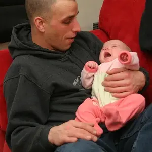
The original you posted is so bright that there is lost detail in the faces....
it looks to me that the photographer was really pushing the high-key look. i know a couple of pro photographers that very much tend to lean this way. it's not quite cup of tea, but that ethereal, dreamy type of look seems to be selling quite well. yes you do lose A LOT of highlight detail, but that's all part of the look. I see this a lot in bridal/engagement/wedding shots. again not my taste, but i do understand the draw, and in the end all that really matters is what appeals to the clients.
although i'm not a huge fan of the high-key look, i
really don't care for the edit, at all. the colors are almost posterized. look at color aberrations in the background, on her belly and shoulder, on his hand and by his butt (yes i looked there), or in the highlights on both faces (they look multicolored!). this color unevenness makes for an unrealistic and overcooked look. imo this flaw is by far worse than the loss of highlight detail in the original image.
I know ALL of this has to do with trying to pull color detail from a jpg that's already highly overexposed. and although not necessarily the fault of the editor, for the sake of presenting an example, this edit to me is not the greatest counter-argument for the deficits of a high-key look.
edit: maybe i'm just looking at this at a funny angle on my monitor. from some angles the posterization isn't quite as apparent, although it's still there albeit a lot less jarring.