To be honest, these have a rather snap-shotish appearance, however assuming that you are looking to improve your skills, I'll comment to that end. In the future, it would be appeciated if you could number your images for easier reference.
Comments per req:
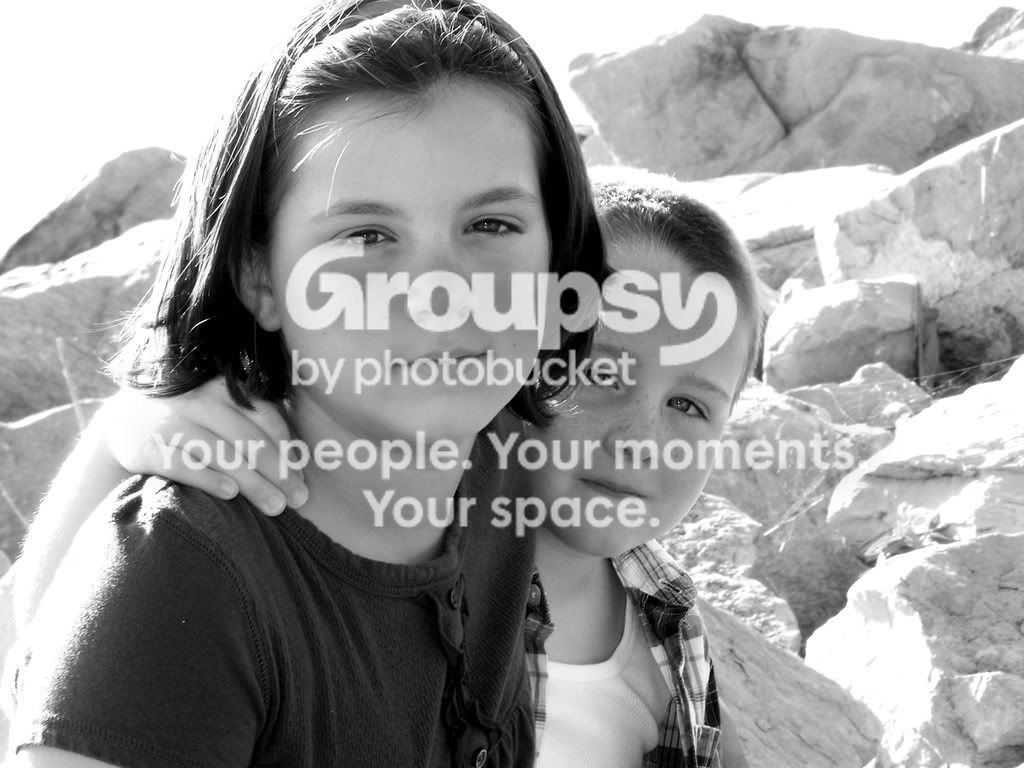
1, 2. This is actually a nice casual portrait. The focus is very good, and the eyes in both subjects look nice, and are sharp. The main compisitional issue is the way the boy's face is partially hidden by his sister(?). Ideally you should have moved a little bit to your right to have them both fully framed. The excessinve highlights and blown areas on the hair and rock behind are an unfortunate by-product of the time of day the shot was taken. If possible, look for more evenly illuminated areas and shoot earlier or later in the day. Mid-morning 'til mid-afternoon is usually the worst light.
3. Would not load for me.
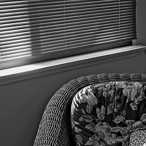
4, 5. The main issue with both of these images is the fact that the subjects are facing away from the camera. The backs of people, as a rule are somewhat less interesting than the front. The other detractor is the background. Always try and frame images so that the background doesn't overpower or compete with the subject. In both of these case, with the fence, and furniture, the eye has far too many things to look at.
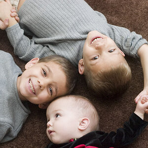
6. Much better; the background is still an issue, but not nearly so much. Avoid cropping small bits of people (esp. fingers of her left hand). Major crops through limbs are generally fine as long as they don't bisect a joint, but small things like fingertips tend to make people think that you were not paying attention.
Just my $00.02 worth - your milage may vary.
~John








![[No title]](/data/xfmg/thumbnail/37/37536-3578b4f283f738d862be62d896fa52d5.jpg?1734170692)
![[No title]](/data/xfmg/thumbnail/34/34079-552f58c1ec0f8485f9c24a5b1db49654.jpg?1734164515)
![[No title]](/data/xfmg/thumbnail/32/32929-22e23acc63d6ecb25e5ee941be87121f.jpg?1734162700)
![[No title]](/data/xfmg/thumbnail/36/36672-6e6efd07ece42d211057279229ffe34c.jpg?1734169173)
![[No title]](/data/xfmg/thumbnail/32/32711-b57dd72845f94aa34b3bd7207b07f98c.jpg?1734162320)