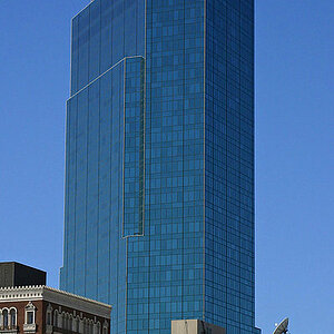
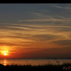
Overall, I think #1 and #2 are too dark and overly contrasty/saturated. Perhaps bring up the shadows and exposure in #1 a bit, though I do like the colors of the buildings in #1. The way the light falls on the Statue of Liberty in #2 draws my eye right to the relatively boring middle. I would rather the brightness be on the whole statue, or at least emphasizing the torch. I understand it was likely just the way the clouds fell and perhaps you didn't have another chance to capture it.
I like #3 the way it is. Simple and to the point. That would make a nice post card or advertisement flyer for the bar. I wonder how it would look in B&W?
I think I see where you were headed with #4, and I like the direction, but I feel like it fell just a little short. I don't feel like there is context to say "New York City!" Perhaps a higher perspective to capture the sidewalk and lit up signs? I dunno, I'm just spitballing.