RebeccaAPhotography
TPF Noob!
- Joined
- Aug 7, 2011
- Messages
- 740
- Reaction score
- 84
- Location
- South Range, WI
- Can others edit my Photos
- Photos OK to edit
These are some photos from my cousin Jeni's maternity photoshoot! This was my first time doing maternity pics! When I say I'm a newbie I am a NEWWWWWWWBIE! lol!!
So my overall goal with these was to try to capture the happiness she had for being pregnant. I did find through my roll of pictures that she had a lot of fake smiles so it really narrowed down what I could chose from to edit.
Is vignette awful!?! Do a lot of people like it? I for some reason really like it! I know opnions will differ but I just wanted to state the reason why a few of these photos have it. Im a little on the addicted side and trying to not do it as much lol!
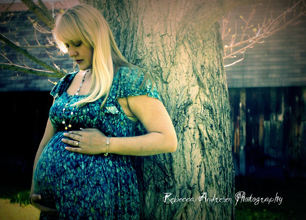
Photo 1)
Jeni18 | Flickr - Photo Sharing!
What I like: I edited this picture in Picknic (yes I know I'm forcing myself to learn lightroom and doing much better with it) I like how I got the colors. I like how my barn room has this pinkish glow to it. I love the texture of the tree (hate the mess it has each fall! lol)
What I don't like: Her looking up in the sky. She wanted something that she was looking up as if she was pondering what life will be like in a few months. Maybe should have done a few more looking at camera?
What I want to learn: Diff exp? Diff color? I dont know this is where I want C/C...
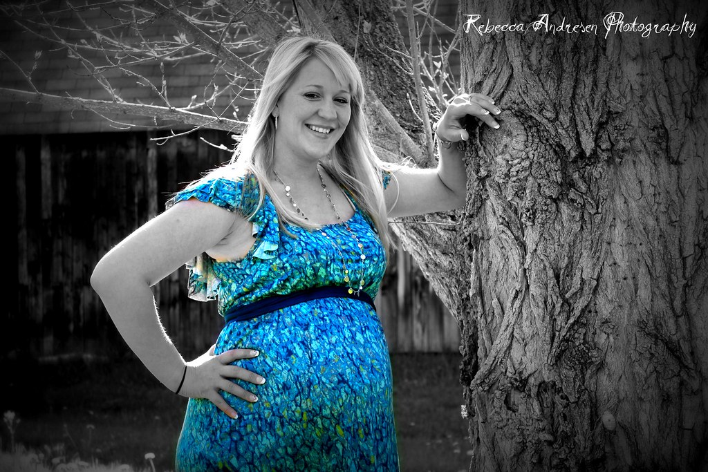
Photo 2)
jeni17-1 | Flickr - Photo Sharing!
what i like: I like the experssion in her face better then Photo 1. I really like the tree vs the barn. The textures.
what I dont like: The dress is too flowly.... Grandma bought it for her so it was a big deal to use in her photos.
What I want to learn: ANYTHING from you folks!
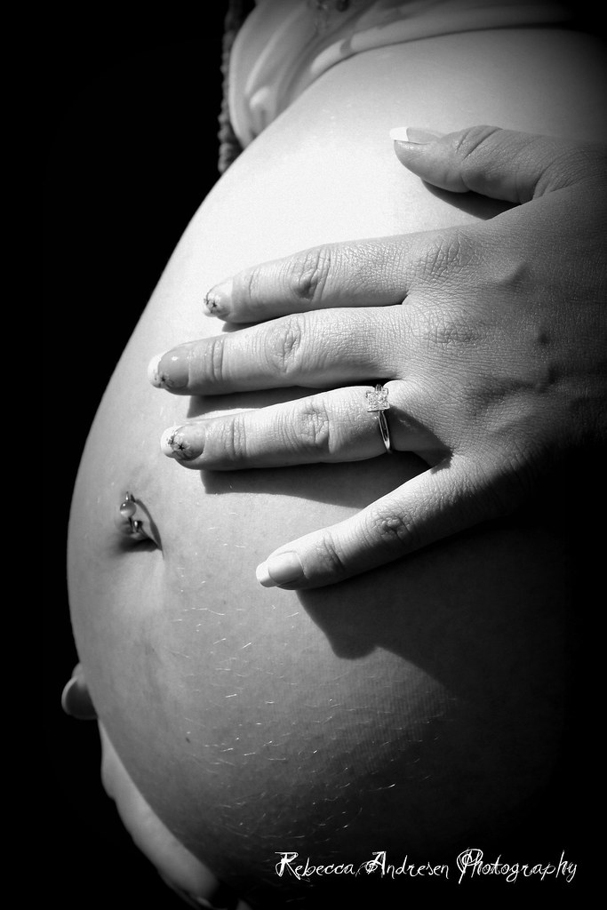
Photo 3)
jeni20 | Flickr - Photo Sharing!
what I like: I love how I actually natural got my background blurred out. I did not do anything as far as editing goes to get that.
what I dont like: I'm not too good at cloning. I wouldh ave like to have taken all the hairs off her bellie and smoothed out her skin more. (just don't know how, need to practice)
what I want to learn: to smooth skin and erase (clone out) hair
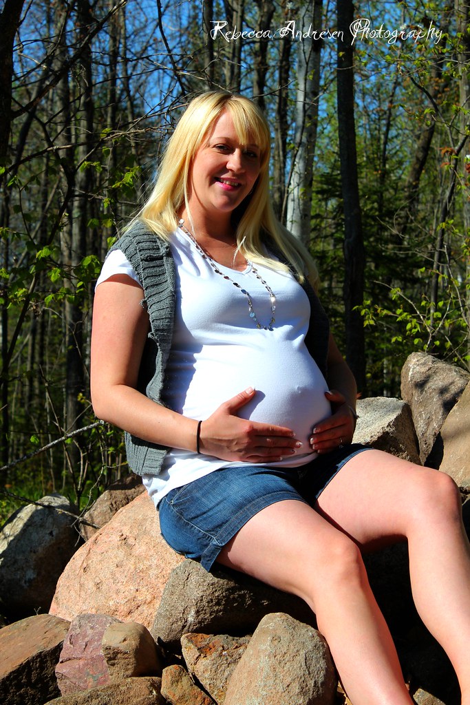
Photo 4)
Jeni11 | Flickr - Photo Sharing!
what I like: I love the rock pile itself! I like how the colors pop.
what I dont like: MY FIGHTING WITH LIGHTING!!! I placed her into the light and had it wash her face out. I also dont like the little bit of cellulite on her leg. But I already know thats a spot I need to work in, cloning.
what I need to learn: To position my subjects in better lighting. I probably should have gone BEHIND her and had her face me that way. She would not have had the sun on her face.
Photo 5
jeni19-1 | Flickr - Photo Sharing!
what I like: I was going for that "older" feel of a photo. I dont really know how to explain what I wanted but I did achieve it slightly.
what I dont like: How her face is pixilated. Also would have liked her left hand to hold the bottom of the dress that way there was a better outline of her belly.
what I want to learn: To use brush strokes effectively to not have her face so granulated. Also maybe not over process? is that what caused it?
Well I guess on that note! I'm ready for some C/C. Hopefully I dont cry like a 4 yr old with a skinned knee ROFL!!! I wanna learn so let me have it! and if I ask you questions b/c I dont understand what your saying just be prepared for the questions rofl!!
Thanks!
becky
So my overall goal with these was to try to capture the happiness she had for being pregnant. I did find through my roll of pictures that she had a lot of fake smiles so it really narrowed down what I could chose from to edit.
Is vignette awful!?! Do a lot of people like it? I for some reason really like it! I know opnions will differ but I just wanted to state the reason why a few of these photos have it. Im a little on the addicted side and trying to not do it as much lol!
Photo 1)
Jeni18 | Flickr - Photo Sharing!
What I like: I edited this picture in Picknic (yes I know I'm forcing myself to learn lightroom and doing much better with it) I like how I got the colors. I like how my barn room has this pinkish glow to it. I love the texture of the tree (hate the mess it has each fall! lol)
What I don't like: Her looking up in the sky. She wanted something that she was looking up as if she was pondering what life will be like in a few months. Maybe should have done a few more looking at camera?
What I want to learn: Diff exp? Diff color? I dont know this is where I want C/C...
Photo 2)
jeni17-1 | Flickr - Photo Sharing!
what i like: I like the experssion in her face better then Photo 1. I really like the tree vs the barn. The textures.
what I dont like: The dress is too flowly.... Grandma bought it for her so it was a big deal to use in her photos.
What I want to learn: ANYTHING from you folks!
Photo 3)
jeni20 | Flickr - Photo Sharing!
what I like: I love how I actually natural got my background blurred out. I did not do anything as far as editing goes to get that.
what I dont like: I'm not too good at cloning. I wouldh ave like to have taken all the hairs off her bellie and smoothed out her skin more. (just don't know how, need to practice)
what I want to learn: to smooth skin and erase (clone out) hair
Photo 4)
Jeni11 | Flickr - Photo Sharing!
what I like: I love the rock pile itself! I like how the colors pop.
what I dont like: MY FIGHTING WITH LIGHTING!!! I placed her into the light and had it wash her face out. I also dont like the little bit of cellulite on her leg. But I already know thats a spot I need to work in, cloning.
what I need to learn: To position my subjects in better lighting. I probably should have gone BEHIND her and had her face me that way. She would not have had the sun on her face.
Photo 5
jeni19-1 | Flickr - Photo Sharing!
what I like: I was going for that "older" feel of a photo. I dont really know how to explain what I wanted but I did achieve it slightly.
what I dont like: How her face is pixilated. Also would have liked her left hand to hold the bottom of the dress that way there was a better outline of her belly.
what I want to learn: To use brush strokes effectively to not have her face so granulated. Also maybe not over process? is that what caused it?
Well I guess on that note! I'm ready for some C/C. Hopefully I dont cry like a 4 yr old with a skinned knee ROFL!!! I wanna learn so let me have it! and if I ask you questions b/c I dont understand what your saying just be prepared for the questions rofl!!
Thanks!
becky
 sorry guys! Now in rush to head out of house to work
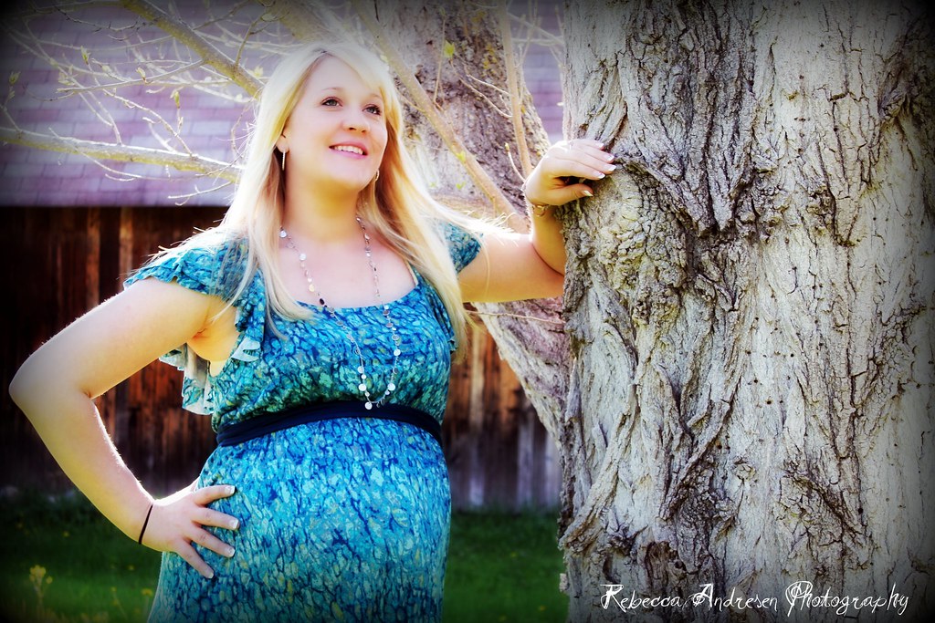
") Luckily Jeni was happy so I can't complain rofl!!!
Luckily Jeni was happy so I can't complain rofl!!!


![[No title]](/data/xfmg/thumbnail/37/37605-90c8efaef5b7d1f52d4bf8e7dfd33673.jpg?1734170732)
![[No title]](/data/xfmg/thumbnail/37/37114-2bba6b6cc4df1fe53588503fb35af8dd.jpg?1734169831)


![[No title]](/data/xfmg/thumbnail/35/35963-4809c92024a0e6355dd194caf9297701.jpg?1734167812)


![[No title]](/data/xfmg/thumbnail/42/42253-fef7e43227f484b1a95dd6d85c03bd40.jpg?1734176623)

![[No title]](/data/xfmg/thumbnail/37/37094-a3c300cd42f78d01d01fe80c1233002e.jpg?1734169827)
