What's new

On The Bed

Samerr9

TPF Noob!
Joined
Jan 15, 2011
Messages
683
Reaction score
46
Location
Abu Dhabi,UAE
Can others edit my Photos
Photos OK to edit
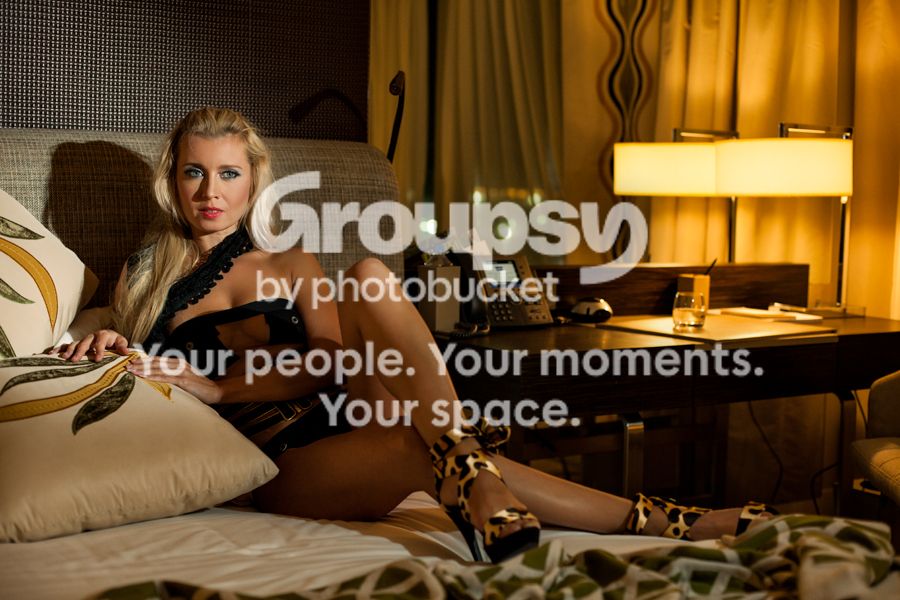
One of the weekend's photoshoot..

IMG_4855-Edit.jpg


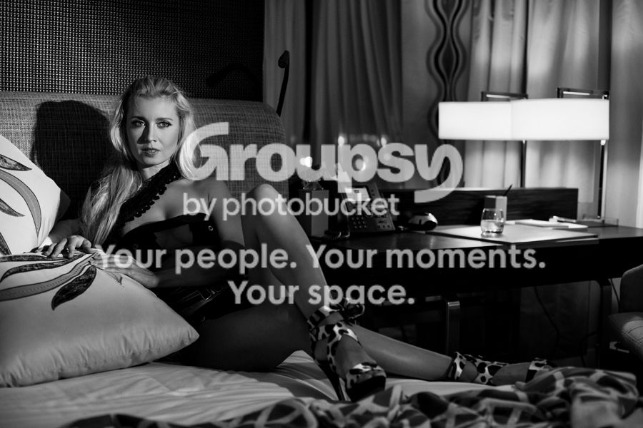
BW
IMG_4855-Editbw.jpg
 
If you would have used a fill light,left of camera it would have avoided shadows on the face.
Other than that I like the photograph.
 
This is a very busy photograph.

Her feet and shoes are lost in the visual confusion of bed covers. The light is confusing, it looks as if you are going for a dimly lit "come to bed, baby" look here, but the harsh strobe is clearly not placed where the lights on the desk are, so things are visually puzzling.

Too much crap on the desk, and too much space on the right of the frame that is filled with clutter. There are some good elements there, the glass is excellent for instance, it fits the scene well. A little clutter is fine, to add a little realism to the scene, but this is too much, it overwhelms the girl, visually.

The color balance is quite nice as well, it feels like incandescent lighting, a little underlit. It's the harshness and direction of the light that are problematic for the scene.

Lovely girl, well posed, nice ambiguous expression on her face. We can write any number of stories to fit this frame, and that's a good thing.
 
I think Amolitor nailed it. This is a bit of a departure from your normal work... I like the direction you're going with this, but I think cleaning up the set a lot, (mainly getting rid of the crap on the desk) and adding a second light would have really helped here.
 
Waaay too much going on here. The curtains are really distracting. The shadow around her nose is making it look really big. The way she is positioned with the pillow and her arm around her stomach makes her look like she is hiding something. Not flattering at all. Lose the pillows, the phone, and all of the stuff on the desk and reposition a little and I think we might be getting somewhere. I do like the image in color better because it does add to it.
 
If you would have used a fill light,left of camera it would have avoided shadows on the face.
Other than that I like the photograph.

This is a very busy photograph.

Her feet and shoes are lost in the visual confusion of bed covers. The light is confusing, it looks as if you are going for a dimly lit "come to bed, baby" look here, but the harsh strobe is clearly not placed where the lights on the desk are, so things are visually puzzling.

Too much crap on the desk, and too much space on the right of the frame that is filled with clutter. There are some good elements there, the glass is excellent for instance, it fits the scene well. A little clutter is fine, to add a little realism to the scene, but this is too much, it overwhelms the girl, visually.

The color balance is quite nice as well, it feels like incandescent lighting, a little underlit. It's the harshness and direction of the light that are problematic for the scene.

Lovely girl, well posed, nice ambiguous expression on her face. We can write any number of stories to fit this frame, and that's a good thing.

I think Amolitor nailed it. This is a bit of a departure from your normal work... I like the direction you're going with this, but I think cleaning up the set a lot, (mainly getting rid of the crap on the desk) and adding a second light would have really helped here.

Waaay too much going on here. The curtains are really distracting. The shadow around her nose is making it look really big. The way she is positioned with the pillow and her arm around her stomach makes her look like she is hiding something. Not flattering at all. Lose the pillows, the phone, and all of the stuff on the desk and reposition a little and I think we might be getting somewhere. I do like the image in color better because it does add to it.

Thank you all for your time looking and comments.

It is one of the few times that I really kind of disagree with critique as I have a different point of view.. Those pillows, curtains and things of the table, they are in any hotel room, so why should we remove everything that is there! Also those might be adding to the story. For example the man was sitting and working on that desk, drinking from that cup and ignoring her. she is looking at him when he walked away..

Also regarding the lighting, I used the harsh light to make it more contrasty. As the light hitting her is more contrasty than the over all image.. this will lead your eyes to her face again and again..

I don't mean to be deffensive, but it didn't really make sence to me as I consider that not all the images should be neat especially that these photos are not going for a contest nor publishing, it is just an expression trail.

I will post more soon and I hope they will be less busy :) but I was wondering if it is allowed to post lingerie (string) photos in people photography ?
 
I see what you are saying, Samerr9, and let me respond by first saying that it is your photograph and your vision, you should follow it as you see fit.

I like that you have a clear vision here. That's fantastic. What you might take away from this discussion is that your vision isn't communicated clearly to others. Of course YOU can see it as clear as anything in the photograph, but we viewers, looking at it without your idea in your mind, see only little hints of your idea and some visual confusion. To communicate with us successfully, you must be more blunt, more obvious and simple. We are simple people!

Perhaps a pile of papers on the desk, a pen across them? A more direct and obvious cue that someone was just here, was working, and now is not.

If she is looking at someone, she should look more like it. The model should be directed to focus sharply on a point, and to imagine.. something. In this photograph she appears unfocused and a little dreamy.

The light, regardless of your idea, is still confusing. There is an obvious light source in the frame, but the shadows cast are clearly not from that light, and look like no light I have ever seen in a hotel room.

 
I see what you are saying, Samerr9, and let me respond by first saying that it is your photograph and your vision, you should follow it as you see fit.

I like that you have a clear vision here. That's fantastic. What you might take away from this discussion is that your vision isn't communicated clearly to others. Of course YOU can see it as clear as anything in the photograph, but we viewers, looking at it without your idea in your mind, see only little hints of your idea and some visual confusion. To communicate with us successfully, you must be more blunt, more obvious and simple. We are simple people!

Perhaps a pile of papers on the desk, a pen across them? A more direct and obvious cue that someone was just here, was working, and now is not.

If she is looking at someone, she should look more like it. The model should be directed to focus sharply on a point, and to imagine.. something. In this photograph she appears unfocused and a little dreamy.

The light, regardless of your idea, is still confusing. There is an obvious light source in the frame, but the shadows cast are clearly not from that light, and look like no light I have ever seen in a hotel room.

Thank you again Amolitor and I am more simple than all of you :)

I agree with everything you said. It is my first try in such theme and working with ambeint light and speedlights at the same time and I am sure there will be flows and the outcome will improve with next session and so on.. I should have emphasized the point more as you have mentioned.

Shortly I will post a new thread with more photos from this session and I hope to hear your input. I will not post the ones with thongs unless some one tells me it is OK to do so..
 
i enjoy this picture just the way it is.
 
i'm going to have to disagree with the majority here. i like it. the clutter works for me. even without reading your post, i was thinking all of this really just makes the scene... a hotel room! the lighting is pretty contrasty, but i honestly could care less where it comes from. there are plenty of pictures where the lightsource is off camera and i'm not confused by them. maybe it's an open door to another room, maybe it's a huge flash, it really makes no difference (to me). i think you needed something pretty significant to pop her from the background (which you included a lot of). perhaps you could argue that it a little too bluntly gives away that this was a setup shot, and hence ruins the "story" of the image. but i think the model sitting on a bed in lingerie and leopard print high heels already gives up the setup. the shadow on the nose and the phone screen are the two things that bug me though. the bed covering could also have been pulled away from her shoes a little too.
 
i'm going to have to disagree with the majority here. i like it. the clutter works for me. even without reading your post, i was thinking all of this really just makes the scene... a hotel room! the lighting is pretty contrasty, but i honestly could care less where it comes from. there are plenty of pictures where the lightsource is off camera and i'm not confused by them. maybe it's an open door to another room, maybe it's a huge flash, it really makes no difference (to me). i think you needed something pretty significant to pop her from the background (which you included a lot of). perhaps you could argue that it a little too bluntly gives away that this was a setup shot, and hence ruins the "story" of the image. but i think the model sitting on a bed in lingerie and leopard print high heels already gives up the setup. the shadow on the nose and the phone screen are the two things that bug me though. the bed covering could also have been pulled away from her shoes a little too.

Thank you for your comment and agreeing on my point. I was using a snoot this time, I think I should use a gridded softbox next time which will resolve the shadow and high contrast and still give her that pop up.
 
I would have used a solid color bedspread or some kind of throw next to her cool shoes, because the print is too similiar. I like the idea that someone added to place papers or files with a pen on the desk to show that someone was working. Also, either take away the water glass or add an alcohol type glass. I really like the photo and especially like her clothing and expression.
 
I would have used a solid color bedspread or some kind of throw next to her cool shoes, because the print is too similiar. I like the idea that someone added to place papers or files with a pen on the desk to show that someone was working. Also, either take away the water glass or add an alcohol type glass. I really like the photo and especially like her clothing and expression.

Thank you Bunny.. You are right, I will work it out better next time :)
 

Create an account or login to comment

You must be a member in order to leave a comment

Create account

Create an account on our community. It's easy!

Log in

Already have an account? Log in here.

New Topics

Back
Top Bottom