What's new

On The Fence By Deon Hamilton™

Joined
Aug 9, 2013
Messages
463
Reaction score
358
Location
New Zealand
Can others edit my Photos
Photos NOT OK to edit
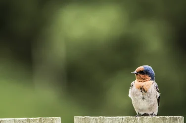
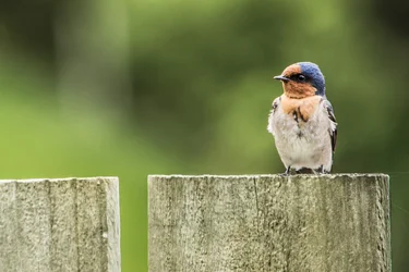
Bird photo i took on my fence

$DSC_2953.webp
 
If it were me I'd crop a bit tighter on the bird, and put a filter on the fence in pp to bring the exposure down a tad. These kind of photos work well when your subject is the brightest thing in the photo, at the moment that fence is competing a bit. Again harsh direct sun washes colour and texture out, but birds are difficult to shoot so you get a little leeway.

Other than that it looks good to me, exposure, sharpness, dof etc looks bang on, good shot.

 
"My name has the ™ only to separate me from all the other Deon Hamilton's out there
i post my name to help google search find my photos for my family and friends
i hate spamming them links but they like to look up my photos."

A flickr account would be much easier for that, and less pretentious as well.

I couldn't agree more. I tend to ignore the OP's posts. I figure if someone is good enough to have their name TM'ed that they shouldn't need my help... just saying...
 
If it were me I'd crop a bit tighter on the bird, and put a filter on the fence in pp to bring the exposure down a tad. These kind of photos work well when your subject is the brightest thing in the photo, at the moment that fence is competing a bit. Again harsh direct sun washes colour and texture out, but birds are difficult to shoot so you get a little leeway.

Other than that it looks good to me, exposure, sharpness, dof etc looks bang on, good shot.

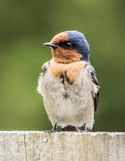
Is this what your your thinking ?

$DSC_2953.webp
 
If it were me I'd crop a bit tighter on the bird, and put a filter on the fence in pp to bring the exposure down a tad. These kind of photos work well when your subject is the brightest thing in the photo, at the moment that fence is competing a bit. Again harsh direct sun washes colour and texture out, but birds are difficult to shoot so you get a little leeway.

Other than that it looks good to me, exposure, sharpness, dof etc looks bang on, good shot.
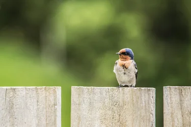
Is this what your your thinking ?

View attachment 63062


That is exactly how to ruin a perfectly good shot.
I do not care about the bird in this photo. What makes this shot is the juxtaposition of the bird against the fence. The square neat solid blocks of the fence contrast beautifully with the fluffy little creature. Remember that contrast is one of the few essential parts of a good photo. The fence also breaks the background nicely in terms of composition. Remove the fence and what is left? Just the bird in the corner. Who cares about the bird in the corner? Is it a photo for a Pocket Birds Lover Book? US Wildlife Catalogue? Kids Birds Encyclopaedia? If you want to make a good photo think in terms of ADDED AESTETIC VALUE. you have added a nice contrast to the subject, and that is why the photo is appealing. Remove the contrast, and it is just another bird. (TM)
 
Last edited:
Why do you like it more than the original? To me it is not good. The bird is placed awkwardly, too close to the edge, the simple rule of thirds was ignored here, the fence is blending with the background, the upper fence line is positioned with no regard to composition, the bird is disproportionally large in the frame to my taste. The composition no longer justifies the horizontal composition here as far as I can see. Why not vertical then?
Can you defend your edit?
"I like" and "I do not like" are not enough, you need to be able to explain your edit choice in photographic terms. Otherwise you will be wandering in the dark.
can you tell me why is it still horizontal? The row of three fence blocks justified the horizontal composition of the original. You have cut and blended the fence - so why still horizontal?
 
Last edited:
I personally prefer it as it makes the bird the focus on the photo rather than being swamped by large chunks of fence and background. The first thing you see is the bird, not the whole shot as in the first edit.

That said, as I mentioned above, I have no bird on fence photos so and not really qualified to comment [SUP]TM[/SUP]
 
Daniel - this is the difference in how we see the image. You want to see the main subject. I want to see the whole shot. In essence it is factual versus artistic. But iF it is all about factual, about the main subject, then why not cutting everything around the bird, do a vertical and let the bird take 2/3 of the frame? Then it would be a perfect Birds Encyclopaedia shot. Nothing added by the photographer, just details of the bird. If someone (apart from ornithologists) draws fun from these types of shots, I am really envious. To me it is boring dull. Here were are. Perfect ® ©.


$DSC_2953.webp


PS have you noticed, btw, that the bird looks small, weightless and vulnerable in the original shot, exactly as it is in real life. All the subsequent edits break that balance.
 
Last edited:
Yeah I get your point, I did feel after my post that the first shot shows the scale of the bird a lot better. However, the tight crop edit is still just more visually pleasing on my eye. Each to their own I guess.

That said, I don't actually like it and find it all a bit boring. Anyone with a camera could go out and snap the same shot and I find the bokeh irritating.
 

Create an account or login to comment

You must be a member in order to leave a comment

Create account

Create an account on our community. It's easy!

Log in

Already have an account? Log in here.

Back
Top Bottom