One picture

vansnxtweek

TPF Noob!
Joined
Apr 27, 2010
Messages
171
Reaction score
0
Location
Virginia
Can others edit my Photos
Photos OK to edit
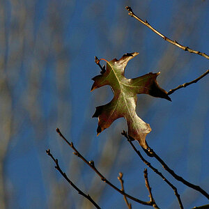
Got this one last night. I think its kind of cool. Got some others as well but haven't decided if they are worth showing yet.

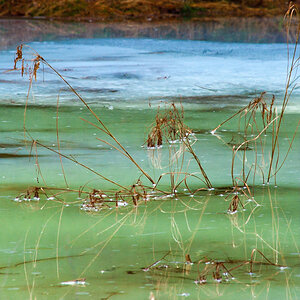
It was hard for me to get the white balance. I think its close.
IMG_1222.jpg
 
Benjamin Franklin - The First American

Where was this shot at? I like it, but the shadow across the lower right of the statue is a bit distracting. Also I think a shallower depth of field would make this stand out more.
 
Benjamin Franklin - The First American

Where was this shot at? I like it, but the shadow across the lower right of the statue is a bit distracting. Also I think a shallower depth of field would make this stand out more.
I agree about the shadow...nice capture overall though. The WB is still off though. Still has a goldish yellow tinge to it.
 
Nice capture. Like said in previous comments, WB is a bit off.
 
I am Canadian... BUT I agree that the white balance is off a bit and that shadow is distracting...But the shadow I see is on the left... Maybe I'm backwards though.......

Here's my quick stab at adjusting the levels a bit...

IMG_1222.jpg
 
I would of preferred if you were a bit more to your left and angled yourself so that it looked like he was looking at the camera.
 
Benjamin Franklin - The First American

Where was this shot at? I like it, but the shadow across the lower right of the statue is a bit distracting. Also I think a shallower depth of field would make this stand out more.

Dern I didn't even notice the shadow! Thats a good catch. Def. would be better if it was gone.


I agree about the shadow...nice capture overall though. The WB is still off though. Still has a goldish yellow tinge to it.

Nice capture. Like said in previous comments, WB is a bit off.

I am Canadian... BUT I agree that the white balance is off a bit and that shadow is distracting...But the shadow I see is on the left... Maybe I'm backwards though.......

Here's my quick stab at adjusting the levels a bit...

IMG_1222.jpg


Ya'll ain't lying about the WB. I knew it was off but I didn't realize it was that bad. What can I do to make it better? I did it in DPP and I just took the Color Temperture down to 2500k. I'm very new to RAW so what I know is limited.

All I do know is that this edit makes mine look like trash. The pure white look of the posts and the flag is exactly what I was going for. What I did try was to use the custom white balance on the camera but then it was overkill. I tried all the settings on the camera and all were still tinge yellow.

Please tell me how!
I would of preferred if you were a bit more to your left and angled yourself so that it looked like he was looking at the camera.

Well at least my mind was in the right place! Him looking straight on is exactly what I was going for. It took the computer screen to show me that I was a tad bit too far to the right. I'll be back to try it again! I think I'll go for a dusk time frame next time.
 
Vansnxtweek Quote: All I do know is that this edit makes mine look like trash.
Not trash, just not at its potential yet. As you stated you're new to RAW, most RAW programs have a wb adjuster either in a drop down window or an eye dropper. Look for it. Theres a learning curve to RAW. Keep at it and we'll keep helping.
 
Thanks man!! I tried all the different WB options that I could find in the RAW editor and it seemed to either be tinge yellow or wayy too blue looking. I tried to use the eye dropper on the white sections but it seemed to be too much.

Should I get an 18% grey card and use that?
 
Ahhh KmH I didn't see that either!! Now I can't miss it..

Thanks for that! I need to start seeing these things.
 

Most reactions

New Topics

Back
Top