Opinions on Composition

aprhockey

TPF Noob!
Joined
Jul 19, 2010
Messages
83
Reaction score
0
Location
Montreal
Can others edit my Photos
Photos OK to edit
I was wondering if I could get some feedback on the composition of these pictures. If the composition could be improved in any way or if the pictures could benefit from any cropping. None have any editing, not even cropping. Any other C&C would be appreciated also.

1.
4987666538_167e5332d8_z.jpg


2.
4968425208_dc7360531c_z.jpg


3.
4968424550_790740071a_z.jpg


4. This one was especially difficult to compose, but I think it turned out well.
4967883623_fa091eb671_z.jpg
 
#1 and 4 are quite good for composition...

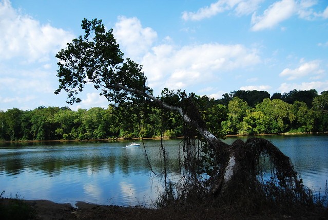
#2 would be good if the horizon was level...and the tree was the only object in focus...

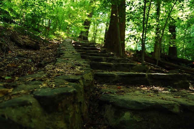
#3 leads my eye to....nowhere...

Find something in the scene to draw attention to...in number 3, the stairs are the only things I see that are interesting...maybe try focusing on the front part of the stairs and have a shallower DOF around the first two or three steps...

Just my humble opinion...keep up the practice...I don't know what camera you're using but a HDR technique would be perfect for Number 2...take three photos....one stopped down...one at exposure and the final one stopped up...use an editing program to merge them as one photo...there are plenty of resources documenting the steps..even here...so look around and find what you can...not all photos need HDR...but that second one in my opinion is a major candidate for its use...
 
Last edited:
BTW: on photo number 1, aren't overcast days absolutely breathtaking for some photos like this one? gorgeous...it makes me want to go walking there...great job on the photo...
 
Yeah, mid-day with an overcast sky is great... as long as the sky isn't in the picture (usually). On #2 I think I should've simply waited for a better time of day when the tree wasn't completely hidden in a shadow. I don't have any experience with HDR but I'll learn...one day. And I agree with you on #3.

Thanks for all the feedback, going out to shoot some more
 
very nice very nice.. composition is well.. i agree with drex :)

i would pop the colors out a bit.. or a lot... on all the images.. bluer blues.. greener greens.. etc just my personal style..
 
I love the curves and shadows in #4, but would crop the left so that edge is dark, focusing the eye on the interesting stuff happening inside the structure.
 
1 and 4 are good pictures but I'm not so fond of the other two. 4 stands on it's own but imho the 1st could use a crop both to the foreground and to the left side so the tree trunk is at the outer frame.
 
#2 and 4 are top heavy. They could have benefited from more material on the bottom for visual balance. But #4 is perhaps the best you could get given the circumstances. Otherwise they are very, very good.
 
Well, it seems that everybody covered things well here... the only thing I will add is that your horizon always seems to appear in the center of the pic. You can add visual interest by including more of the ground or more of the sky....or whatever you are photographing. Pick which is more interesting- top or bottom, and consider adding a bit more of one or the other. Like...on a day with beautiful big white puffy clouds or deep dark stormy clouds, a larger amount of sky might add some visual appeal....
 
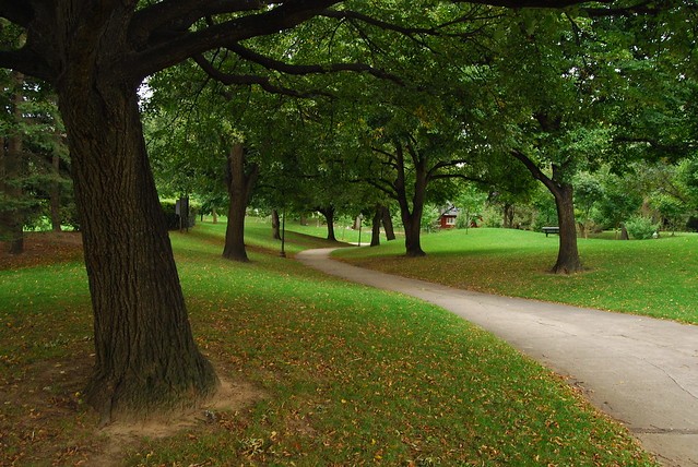
1 is good. It's a tricky horizon with the trees going every which way but it looks like you got it to me. The haphazard tree growth adds interest to it and I like the way the path seems to be slinking around my as I look down it.

2 could be good. Needs the horizon fixed but for me the bigger issue isn't the composition, it's the lighting. The tree is very dull against a beauty of a back ground and seems to be more of a distraction than a strong subject. I also think if you were lower and shooting more upward it would be a little more interesting. A little less water and more sky.

3 I think could be improved if you were closer to the wall you were shooting up. A shot like that, one that follows a line up needs to be more in your face and not so small. Especially with a it blending in so much with it's surroundings it's gonna need all the help it can get. Move closer, get lower and turn slightly left.

4 I don't like. The closest post on the left is killing me, or at least the space to it's left to the edge of the frame. I think if you had stepped a few feet to your right, making that post the left edge of your frame and showing a bigger gap between it and the next post may have worked out better, assuming that angle didn't kill your leading lines.

Just my opinion, we all see things differently.
0347AA46-A968-8EEB-D640-C17C55046F94
1.02.28
 
Thanks for all the comments. I understand #2 could be much better. I understand, it would have been nicer to be lower, looking up more, unfortunately there was a hill where I was standing and if I moved closer, I couldn't open up the lens wide enough to get the whole tree. I should've tried for more creative angles i suppose. I understand everything else that was said and hope that it will sink in for next time.
 

Most reactions

Back
Top