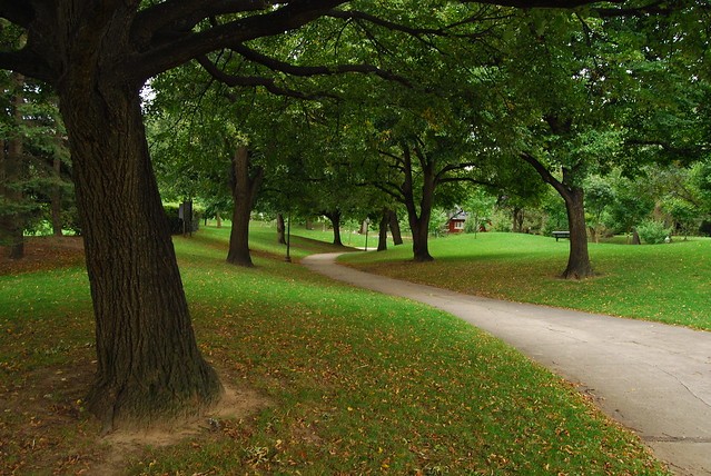
1 is good. It's a tricky horizon with the trees going every which way but it looks like you got it to me. The haphazard tree growth adds interest to it and I like the way the path seems to be slinking around my as I look down it.
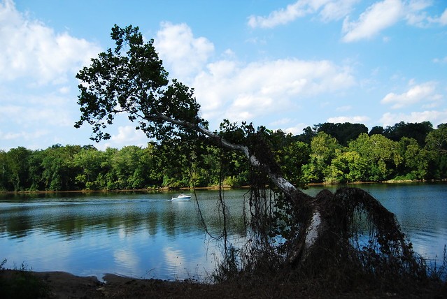
2 could be good. Needs the horizon fixed but for me the bigger issue isn't the composition, it's the lighting. The tree is very dull against a beauty of a back ground and seems to be more of a distraction than a strong subject. I also think if you were lower and shooting more upward it would be a little more interesting. A little less water and more sky.
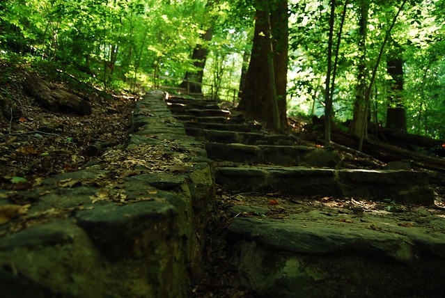
3 I think could be improved if you were closer to the wall you were shooting up. A shot like that, one that follows a line up needs to be more in your face and not so small. Especially with a it blending in so much with it's surroundings it's gonna need all the help it can get. Move closer, get lower and turn slightly left.
4 I don't like. The closest post on the left is killing me, or at least the space to it's left to the edge of the frame. I think if you had stepped a few feet to your right, making that post the left edge of your frame and showing a bigger gap between it and the next post may have worked out better, assuming that angle didn't kill your leading lines.
Just my opinion, we all see things differently.
0347AA46-A968-8EEB-D640-C17C55046F94
1.02.28

")


![[No title]](/data/xfmg/thumbnail/33/33351-cd8e1d901d113ee8f9312e19478885a7.jpg?1734163268)


