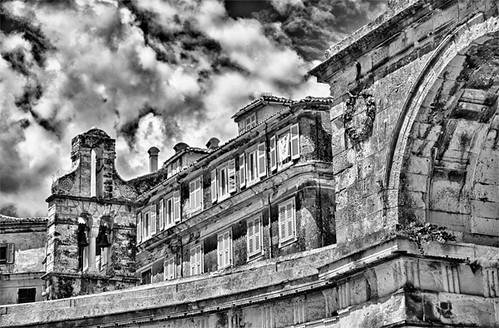
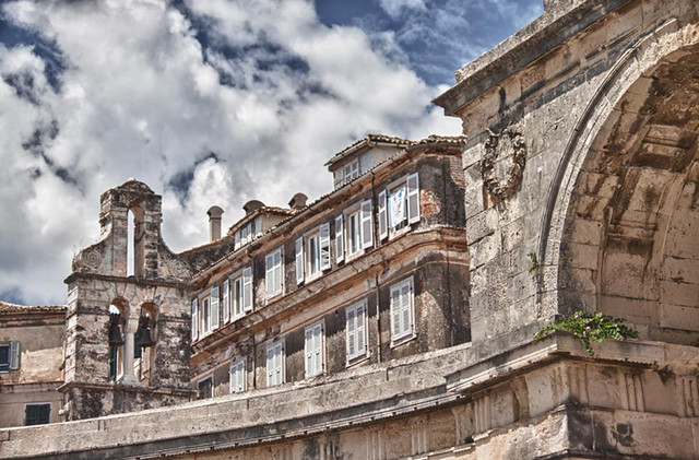
IMHO, This pic has a lot of potential. (B&W). It is a howling success in HDR, I just think you went a little too far with it. And now for some recommendations from a guy who has no professional recognition at all.
I think the sky and the building texture is very similar, it seems flat. There are too few mid tones. I think if you darken the sky a little, brighten up and reduce the contrast on the building itself and deepen the shadows on the building it will give you the depth I think you are looking for. It seems it is all absolute white and absolute black. The underside of the arch is just as bright as the face of the building with direct sunlight. The overall brightness is too uniform.
Again, it is an opinion, treat it as such.






![[No title]](/data/xfmg/thumbnail/1/1592-cfae4a7ea791f96c6e2d03484be2e454.jpg?1734142210)


![[No title]](/data/xfmg/thumbnail/39/39180-3dcdd0aa38e4d015a48a17b0e45542fb.jpg?1734173054)
![[No title]](/data/xfmg/thumbnail/39/39182-efc21fe87c9b5f9b2fa9ab0f8f01c205.jpg?1734173056)

![[No title]](/data/xfmg/thumbnail/34/34689-7546fa5b2c817c48b60563925693cd53.jpg?1734165695)