KAMurphy
TPF Noob!
- Joined
- Apr 24, 2018
- Messages
- 11
- Reaction score
- 2
- Location
- USA
- Can others edit my Photos
- Photos OK to edit
Hey!
I was wondering if I could get some constructive criticism on my edit to this photo. I'm new to photography/editing, so any advice is welcome!
Thanks in advance,
Kate
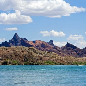
Original:
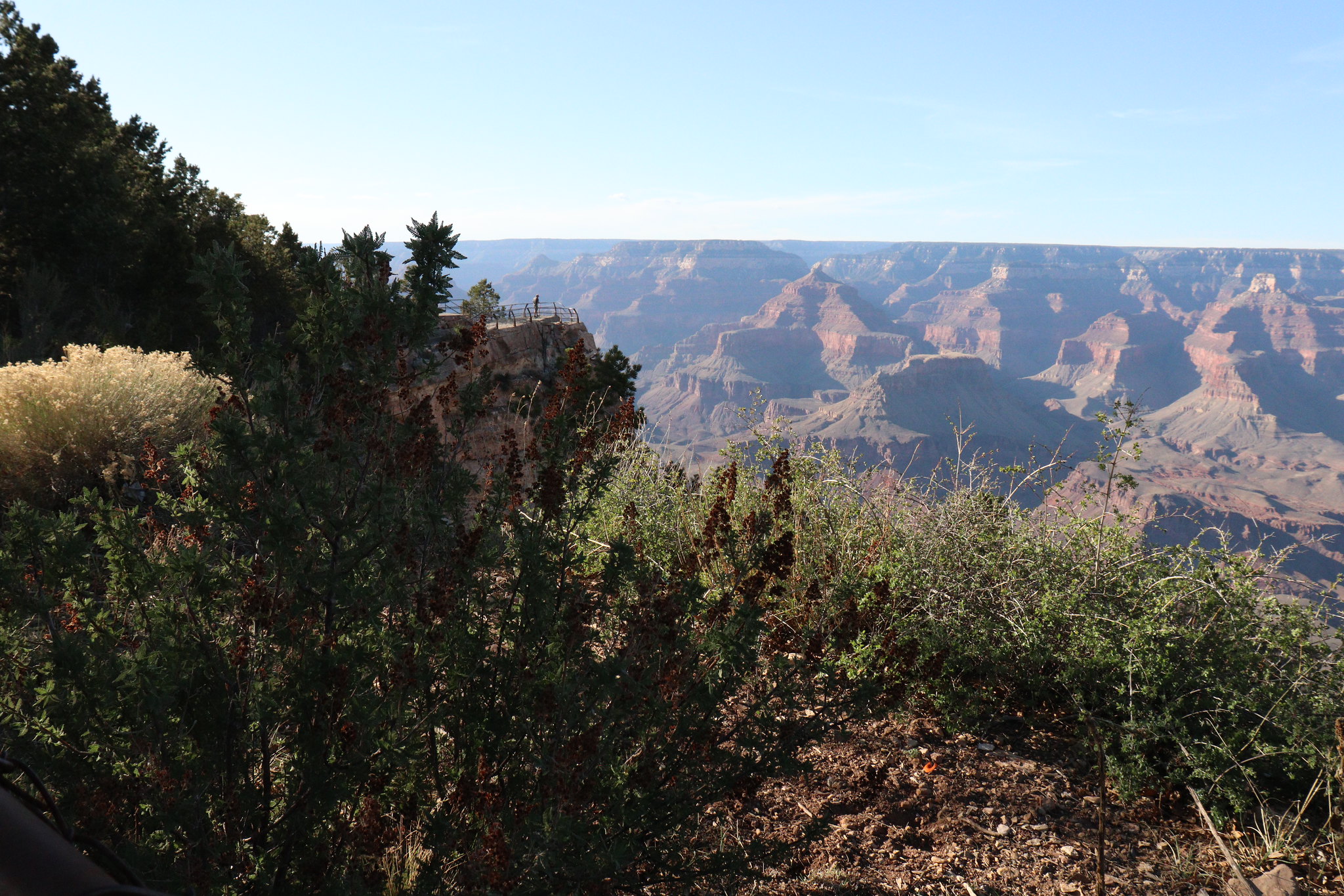 IMG_1546 by Kate Murphy, on Flickr
Edit:
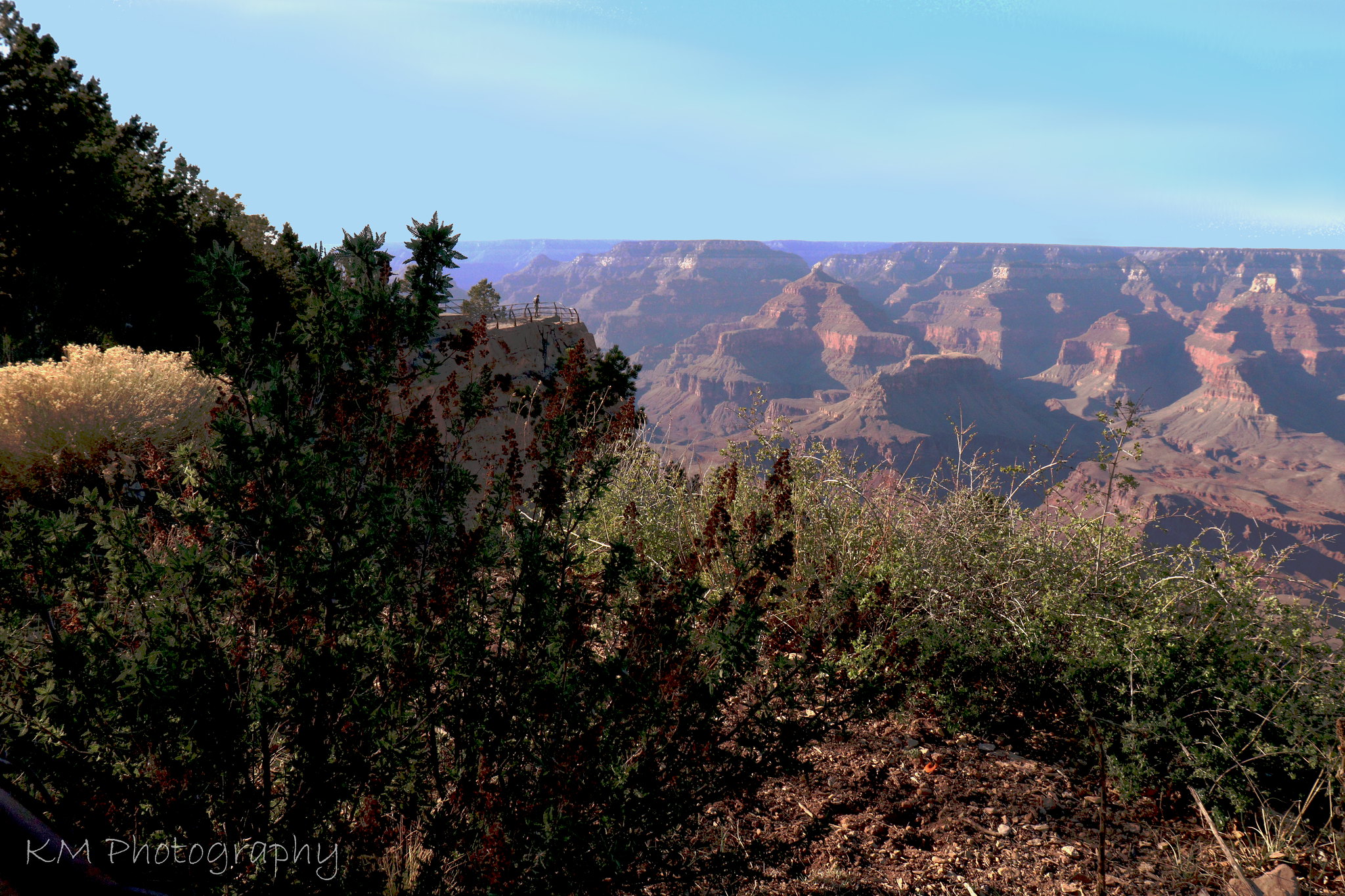 Canyon with red plant by Kate Murphy, on Flickr
I was wondering if I could get some constructive criticism on my edit to this photo. I'm new to photography/editing, so any advice is welcome!
Thanks in advance,
Kate
Original:
IMG_1546 by Kate Murphy, on FlickrEdit:
Canyon with red plant by Kate Murphy, on Flickr")
![[No title]](/data/xfmg/thumbnail/39/39480-e4e26ffe5c6148262ac81eff975a5c0e.jpg?1619739047)