What's new

Out for opinions!

Status
Not open for further replies.

PhotoBrody

TPF Noob!
Joined
Jun 28, 2012
Messages
117
Reaction score
8
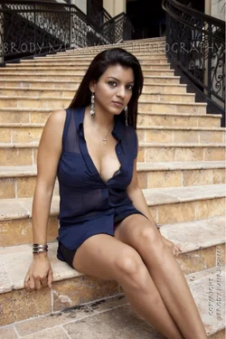
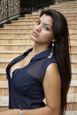
Few shots from yesterday's shoot, c&c with respect please!

Uploaded from my iPhone, hopefully it keeps the quality.

$image-2132492239.webp
 

Attachments

  • $image-3234946396.webp
    $image-3234946396.webp
    60.5 KB · Views: 161
I'm sure you'll get lots of detailed technical advice from a lot of people here, so I'll just say that I love the photos, I like the processing, I would make a few minor composition changes, and I hate the placement and size of the watermark.

Great work overall!
 
michael9000000 said:
I'm sure you'll get lots of detailed technical advice from a lot of people here, so I'll just say that I love the photos, I like the processing, I would make a few minor composition changes, and I hate the placement and size of the watermark.

Great work overall!

Thank you! Haha and not many people like my watermark, I think that's what is making me keep it - muahaha. It's more of a "point" I keep it I guess.. Once I find something I like, I may change it :-)
 
PhotoBrody said:
Thank you! Haha and not many people like my watermark, I think that's what is making me keep it - muahaha. It's more of a "point" I keep it I guess.. Once I find something I like, I may change it :-)

I'm not bothered by the fact that you use a watermark... I just think it's an awful idea to ram your watermark through the skull of your lovely model. ;)
 
michael9000000 said:
I'm not bothered by the fact that you use a watermark... I just think it's an awful idea to ram your watermark through the skull of your lovely model. ;)

On second look, the watermark is actually more like a news ticker above your model's head... :)
 
I suspect folks are going to say you chopped her legs off at an odd point. Right above the foot. Not sure, though... I'll be interested to see. Can't comment too much overall as I'm more an observer of this kind of thing than a doer.
 
I like the second one best. I personally am not a big fan of chopped limbs. IMO if you would have included or cropped higher it would have worked better for me.
 
manaheim said:
I suspect folks are going to say you chopped her legs off at an odd point. Right above the foot. Not sure, though... I'll be interested to see. Can't comment too much overall as I'm more an observer of this kind of thing than a doer.

Some people it may bother, some it might not. I have other raw shots of her full body, this was just an edit I sent myself. I'll add more on here soon. This particular shot I was zooming in -> out at high speed shutter since she kept moving and doing poses.
 
meh. beyond the obvious chopped limbs, these aren't doing much for me. There's no risk here, nothing novel or interesting. Sure the exposure is good, but the pose is flat and uninspired, and I am more interested in her and what she is wearing than the photograph itself. Perhaps this is exactly what you had in mind, but it is done in a way that doesn't leave an impact or impression.

Also, the top section of the first is really distracting, too much headroom, not enough leg room.

Some people it may bother, some it might not.

When doing commercial work, it's best to appeal to the widest audience. If some people don't mind chopped limbs, but others mind considerably, then don't do it. You're not going to offend anyone by not chopping limbs, however, you will offend some people if you do.
 
unpopular said:
I am more interested in her and what she is wearing than the photograph itself. Perhaps this is exactly what you had in mind, but it is done in a way that doesn't leave an impact or impression.

Then my work is done. That was the purpose, these are glam/portraits. Models ask me to do exactly this. The exposure, lighting, tones, quality are what is important. If I wanted different/risk/unordinary I would have done that. I have several other girls who pose in these exact same spots.

I will post some "different/creative" stuff just for you next time :-p
 
The model seems to be anxiously gripping the steps in #1. The watermark distracts. I'd like to see her feet (unless she's wearing "I think I'm sexy" high heels). The chopped limbs in #2, and that "look at my chest" pose kind of ruin it for me. FWIW, she's very pretty.
 
unpopular said:
I am more interested in her and what she is wearing than the photograph itself. Perhaps this is exactly what you had in mind, but it is done in a way that doesn't leave an impact or impression.

Then my work is done. That was the purpose, these are glam/portraits. Models ask me to do exactly this. The exposure, lighting, tones, quality are what is important. If I wanted different/risk/unordinary I would have done that.

I only reply to what is visually, not the assumed mindset of the client.

I have several other girls who pose in these exact same spots.

Wow. Really? Do you charge them?
 
Models ask me to do exactly this.

I think it's a professional photographer's obligation to help the client understand the artistic vision and to explain what works best, rather than simply comply with the desires of the client. It should be a collaborative process, to a certain extent.
 
Last edited:
^ in practice I think it may be a bit more restrictive.

I'd imagine though that model agencies are inundated with these kinds of images. A good model is an actress/actor, who can has the ability to carry out the art director's or photographer's ambition and not just a pretty face.

Of course, most model wannabes (and there are millions of them out there) likely don't realize this.
 
Last edited:
The lighting is really flat and boring in both. If they're glam shots, you should have certainly photoshopped the couple of skin blemishes off her legs in photo #1. Also in 1, her pose is stiff and uncomfortable looking and the black spots on the staircase below her leg are really ugly and distracting. Also, I don't know if it was intentional, but you can see her underwear, in an unflattering way. Her pose also kind of makes her stomach look like she has fat rolls.

Also, given her skin tone, the background really blends in with her, taking a away a lot of visual 'pop'.

2 is a lot better, but again, better lighting, a better background, and more contrast are needed to make it stand out at all.

 
Status
Not open for further replies.

New Topics

Back
Top Bottom