What's new

Out for opinions!

Status
Not open for further replies.
do you care if I do an edit to show you what I'm talking about with the flatness of the lighting and background causing the image to fall flat?

Figure if it was that big of a deal, you'd have marked 'not ok to edit'

I'll gladly remove if you want.

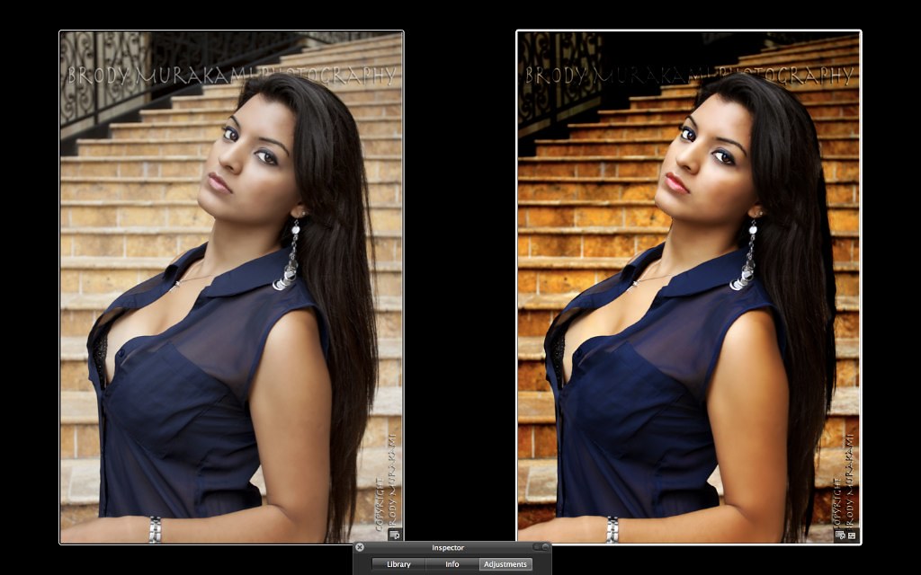
Here is what I thought would make the shot better:
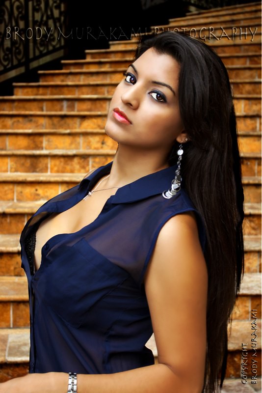

image-3234946396 by franklinrabon, on Flickr


Basically I used 2 curves adjustments. First a really extreme one to kick the background out of the model's tonal range. Also, to just generally add some contrast to the otherwise flat background. Second, I gave the model a mild curves adjustment that basically just added a bit of depth and contrast to her skin tones.

I added a tiny bit of vibrancy to her skin tones as well, and her lips a little bit more.

Just a simple 5 minute edit with a jpeg as a source, but I think you get the idea of what I'm talking about a little better now.
 
Last edited:
No. That's not an improvement at all. Way over saturated, almost to the point of jaundice. Her top is way too dark, makeup went from totally appropriate to completely "hooker wrong". You've also managed to make the separation of an already distracting background even less.

One thing I really liked about these images was the clearness and subtly in saturation.
 
No. That's not an improvement at all. Way over saturated, almost to the point of jaundice. Her top is way too dark, makeup went from totally appropriate to completely "hooker wrong". You've also managed to make the separation of an already distracting background even less.

One thing I really liked about these images was the clearness and subtly in saturation.

well, I thought he was going for 'hooker' since her bra is showing. And I didn't increase the saturation at all on her. There was some increase in the background's saturation. Perhaps you're seeing the increase in contrast as an increase in saturation on her?

If you measure the original, the background is almost the exact same tone as she is, which is a big no-no for glam. You either have to darken it considerably or blow it out. The considerably darker background is usually the more conventional choice for glam shots. Though usually it's achieved with better lighting (ie strobes and a huge softbox on the model, which relatively darkens the ambient light, and thus darkens the background), that wasn't an option here.

Look at glamour photos, they're not exactly about 'subtlety'. Check out Guiness man's glam thread. THere isn't a whole lot of flat, desaturated subtle lighting going on there.
 
If you see them side by side, you can see that there were no color manipulations made to her skin, other than on her lips. Her skin just has a bit more contrast (more to emulate a strobe light with a soft box than anything, since the point wasn't to show what I'd do in post, but more how I'd light the thing in the first place)


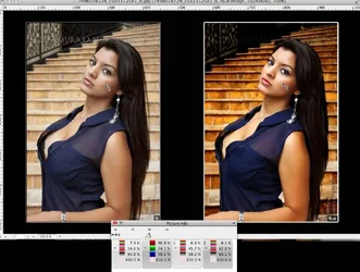
Screen Shot 2012-07-03 at 2.43.36 PM by franklinrabon, on Flickr
 
Her cheek bone increases in saturation from 44% to 75%. If you adjusted tone in RGB without making the adjustment in luminance mode, then you've adjusted saturation.

I wouldn't consider Guinessman's stuff "glam" more pinups.

Fashion Photography - Google Search

There are lots of examples of subtlety in fashion photography.
 
If you see them side by side, you can see that there were no color manipulations made to her skin, other than on her lips. Her skin just has a bit more contrast (more to emulate a strobe light with a soft box than anything, since the point wasn't to show what I'd do in post, but more how I'd light the thing in the first place)

Are we even looking at the same image?

$Screen Shot 2012-07-03 at 12.51.43 PM.webp

ETA: review samples "1" and "2", not the first two unlabeled samples at left of dialog.
 
Her cheek bone increases in saturation from 44% to 75%. If you adjusted tone in RGB without making the adjustment in luminance mode, then you've adjusted saturation.

I wouldn't consider Guinessman's stuff "glam" more pinups.

Fashion Photography - Google Search

There are lots of examples of subtlety in fashion photography.

The photos you linked are high fashion, which is totally, wildly different than glam. High fashion does all kinds of crazy things, since the whole point is to be edgy. The OP specifically stated he wasn't going for anything edgy.

and yes, there in some ways ends up being a bit more saturation in certain points because I changed the contrast, which will obviously bring out more color in the middle/low tones that were originally a bit washed out, because that's how contrast works.
 
and yes, there in some ways ends up being a bit more saturation in certain points because I changed the contrast, which will obviously bring out more color in the middle/low tones that were originally a bit washed out, because that's how contrast works.

Over saturation is over saturation, regardless how you got there. And no, it doesn't have to work that way.

Here is the exact same edit, in fact using your version, but without the wonky colors:

$image-3234946396-2.webp

Lower shadows are still too dark, IMO.
 
and yes, there in some ways ends up being a bit more saturation in certain points because I changed the contrast, which will obviously bring out more color in the middle/low tones that were originally a bit washed out, because that's how contrast works.

Over saturation is over saturation, regardless how you got there. And no, it doesn't have to work that way.

If I had a RAW file to work with, instead of a highly compressed JPEG, yes, I could have done those things. My only point is to sort of demonstrate how it should be lit, using strobes and a sotbox, to alleviate the flat lighting of the original.

And it seems sort of pointless to argue this when you're talking about fashion photography, and high fashion at that, and not glam.

Do your same google search for glam photography, and you'll see a bunch of high contrast images, highly saturated. You may or may not like that style, but thats what the style is, it's what OP said he was going for. It's not subtle deaturation. It's not flat lighting. It's dramatic lighting from softboxes, a lot of contrast, and probably even more saturation than is in my edit.

It's almost like you're criticizing grass for being green, saying you prefer a much more orange-ish hue.
 
Clearly though these fauxtographic qualities of so-called "glam photography" is not what the OP had in mind, else he would have done so. While I am not a fan of these images, it's clear to me that he knows what he's doing beyond some contrived convention of garish color and unnatural skin tone!
 
Clearly though these fauxtographic qualities of so-called "glam photography" is not what the OP had in mind, else he would have done so. While I am not a fan of these images, it's clear to me that he knows what he's doing beyond some contrived convention of garish color and unnatural skin tone!

glam isn't fauxtographic, it's selling sex and bold, it is what it is. And the 'wild differences in skin tone' are less of a difference than you'd get from a yellow gel or a gold reflector.

edit: and it's kind of weird of you to say that, since your first post was you telling the OP he should have done these wildly differently? And to not do glam style?
 
Glam perhaps not, but your description and edit is. That's not sexy, it's almost sickly and is clearly artificial.
 
^perhaps, but most "glam" photographers = fauxtographer/GWAC, thus the pictures are fauxteuxs.
 
Status
Not open for further replies.

New Topics

Back
Top Bottom