What's new

Outdoor Shoot C&C Please and thank you!

Aw shucks, Grandad! Thanks! <blush>!


(tactless, huh? hmmm....) ;)
 
Don't tell me, Charlie, you moonlight as a diplomat for the United Nations. :boogie::biglaugh: ;)
 
hi.

i think there are three things that would help you straight off the bat and make these into really successful shots.

1. move back... back back back. each of your images contains uncomfortable chops or is too close to the subject. had you stood several feet back, you'd gain back elbows, feet, etc. etc. always leave enough room unless you're trying for a close-up shot of a face... and in that case it's typically better to go close such that their face fills the frame, going off it even, rather than just occupying a lot of it.

2. don't shoot everything in the center. try putting your subject to the side of the center and you might find you like them a lot more from a creative standpoint.

3. mind your white balance. these all look very cool to me and typically that can make the subject look unhealthy. a warm up will help a lot.

nice work... great focus from what i can see in the small images. :)
 
ha, like grandad said, dont take things to personal here :) i quickly learned not to when i posted my first photo, i thought everyone was attacking not knowing they are really helping. its true what charlie said you should understand his critique(or soon enough at least) in no way was it harsh when i read it. As for my CC, i think they are too noisy. Shoot at a lower ISO and it will have better quality. You dont need such a high shutterspeed also to freeze time. 1/250 should be plenty. Stay positive and keep shooting :)
 
You've ruffled feathers because you broke some of the technical rules. The great ones do it all the time, so you're in good company. There are many people here and all judge photos a bit differently, so take with a grain of salt. Some view photography as a craft, some as art. You've heard from the craftsmen.

As an artist, I kind'a like 'em. They tell a story and reflect personality. Putting on my craftsman hat, I'd like to see the last one processed to match the first three and I would give him more air to look into.
 
well most of what i said has already been said for feedback, i think the third image is really good shot.
 
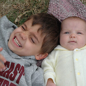
#1-the child appears to be laying down, on his back, looking upward toward the sky, and covering his eyes with his arm. Cute picture. I have absolutely no idea why anybody would suggest that this shot would be better if the child's arm were above the eyes, and on the forehead...that is simply not what was happening...it would also be a better picture if he were blowing a bubble gum bubble and whistling Dixie at the same time, but neither were actually happening then either...I think if the green grass on the sides were brighter, and more-visible, the laying down in the grass and shielding the eyes with ye olde arm thing would be more clear to the viewer.

#2-the leaf. I do not like the shallow depth of field, nor the framing. Not sure why this is framed as a horizontal.

#3-kind of a cute picture. Composition is a bit off...arms cropped off...cute expression, cute child, decent exposure.

#4-sittin' on the fire hydrant...should probably have been a tall...the sidewalk on the diagonal behind the head, and the chopped-off body and the wasted space on either side of the child...none of those things are helping this shot.

To my mind, #1 is the clear best shot out of these four frames. #3 is a cute snap, but has some issues. #2 is just not good. #4 is a nice moment but is hurt by the way it was framed.
 
You've ruffled feathers because you broke some of the technical rules. The great ones do it all the time, so you're in good company. There are many people here and all judge photos a bit differently, so take with a grain of salt. Some view photography as a craft, some as art. You've heard from the craftsmen.

As an artist, I kind'a like 'em. They tell a story and reflect personality. Putting on my craftsman hat, I'd like to see the last one processed to match the first three and I would give him more air to look into.

I thought photography was all ART :)
 
CorrieMichael, as we say here in England, "don't get your knickers in a twist!" :D
Some of the photographers on here are a little short in the tact department but mostly the advice is good - and Charlie's advice fits into that category. My first postings didn't get much better C&C than yours but I stuck with it, listened and worked at it. Now (after 18 months), when one of my photos gets a compliment from someone like Charlie, I GLOW for a week.

I'd say your work shows potential and you've got the concept of what makes a good photo... You've got some of the essential down but there are other things you need to learn that could turn these photos from "good for Facebook" snapshots into photos you'd be proud to have in your portfolio and which pro photographers will compliment you on.

I agree on the logo, it's nice but it's too big. You don't need one on here, I stopped using mine here till my work was (occasionally) worth stealing. :hippie:

Well to be quite honest....I have a rule of thumb that I live by which is: If you know the rules than you can play at any game........I thought I was contributing to a witty and sarcastic conversation......adding a bit of spice. lol.......apparantly the rule which I live by isn't always true. I completely understand where his critique is coming from and however it is presented will hopefully learn from it.......eventually :)
 
You've ruffled feathers because you broke some of the technical rules. The great ones do it all the time, so you're in good company. There are many people here and all judge photos a bit differently, so take with a grain of salt. Some view photography as a craft, some as art. You've heard from the craftsmen.

As an artist, I kind'a like 'em. They tell a story and reflect personality. Putting on my craftsman hat, I'd like to see the last one processed to match the first three and I would give him more air to look into.

I thought photography was all ART :)

So is a three year old's finger painting, to some people! (but usually only the parents love it!) :greenpbl: :mrgreen:
 
Cut off limbs is definitely a thing some TPFers have a problem with. Me, I don't see it as a problem at all. I am, however, a sample size of one, so you should take that into consideration.

These all feel a little too much, in some vague an indefinable way, too me.

The skin is too clean and poreless (and yes, I know that's how little kids look, but if you DID do something to the skin, do it less). The two tighter shots feel a little too close in, too wide angle. There IS a sense of intimacy created, but I think it's a bit much.

The one with the leaf is just trite, more of an exercise in depth of field control than anything else. I think you're trying to get that sensation of "MOOOM! WOOKIT MY WEEF!" which is definitely a kid thing, but the shot feels too formal and technical to really get convey that feeling. More depth of field, and I think the kid's face IN focus with the leaf very close but OUT of focus might get closer.

I like the fire hydrant one pretty well, but the background there is a bit distracting. The kid feels very clean (visually) and kind of "popped" but the background looks vaguely dingy and disorganized.
 
Really? Then why don't you say in plain language what you learned? And what those photos need, to be improved?

To be fair... perhaps you should say in plain language what you would like to teach??

I don't disagree with the comments, per se, but I also think #3 is a good shot, and cropping the arms is not a mortal sin when balanced against other compositional elements.

With the fire hydrant, a crop from the top left 2/3 of the frame might create thirds composition, remove the cropped shins, and increase the size of the kid as the subject.
 
Perhaps I can amplify some of the points that Charlie made:

2. Again, better suited to a vertical/portrait orienation IMO. I understand (I think) what you were going for, but this sort of selective focus only really works well when the part in focus is of primary interest, such as, say, wedding rings in a bridal shot.

I think you could crop it vertical, except compositionally, it seems to me the leaf should have been offset from the face a little so the face was visible, and then maybe a little less blurring... not in focus, but still identifiable. Maybe stopped down 2-3 stops.
 

Create an account or login to comment

You must be a member in order to leave a comment

Create account

Create an account on our community. It's easy!

Log in

Already have an account? Log in here.

New Topics

Back
Top Bottom