You are using an out of date browser. It may not display this or other websites correctly.
You should upgrade or use an alternative browser.
You should upgrade or use an alternative browser.
Perpetual Beginner seeking C&C
- Thread Starter Argentis
- Start date
dcclark
TPF Noob!
- Joined
- Feb 19, 2009
- Messages
- 480
- Reaction score
- 0
- Location
- Houghton, MI
- Can others edit my Photos
- Photos OK to edit
Quick reply:
#1: I like the composition, although I'd try to get in closer (to see more of the grasses -- they're cool). Also, branches in the top left are distracting, but easily removed.
#2: Nice subject, good composition. The rocks are interesting, and the angle lets the ice recede into the distance. The hilights look a bit blown out.
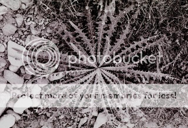
#3: My favorite. Very geometric, almost abstract. You could use some curves or levels to make the thistle really pop out.
#4: Interesting, but crooked -- should be straightened. The lines of the railroad are nice, but could do more to lead your eye in to the grainery if you changed the angle a bit -- try having them come in from one corner, for example. You might also get lower, to emphasize the rails more.
Flower Child
TPF Noob!
- Joined
- Oct 19, 2008
- Messages
- 778
- Reaction score
- 4
- Location
- Southeastern Kansas
- Can others edit my Photos
- Photos OK to edit
Hello Argentis!
1. love the pastel colors. the whole picture seems very peacful and soft. dont like the very dark branch that jumped in the picture at the top, though. i would crop or clone that out its pretty distracting.
2. I like the subject and composition, but the rocks arent in focus. maybe camera shake? its hard to do these darker icey shots without a tripod.
3. really love this one. its got great patterns and textures. good job!
4. very grainy but i think it works. love the comp with the train tracks and everything. you need to straighten the horizon though. i think it has great black and white quality, you might want to try it balckand white and see how that looks.
5. wow! thats awesome. beautiful sceanery. ive been wanting to get a train shot like that for a while.
Samanax
TPF Noob!
- Joined
- Jan 1, 2009
- Messages
- 2,562
- Reaction score
- 0
- Location
- Kaneohe, Oahu
- Can others edit my Photos
- Photos OK to edit
#1 - What is the main subject of this shot? The tuft of grass? The blue sky? The grey clouds? The white snow/sand (can't tell what it is)? The grass/landscape in the foreground? The most interesting thing is the different layers you've created with the different elements of the shot. The twigs in the upper corners are very distracting. And it looks like your sensor needs cleaning...there's appears to be a dust spot near the top of the shot.
#2 - Nice capture...clean shot with nice compositional elements. Simple and elegant...almost like a Japanese screen painting.
#3 - Too busy for me...and the mono-chrome treatment makes it even more confusing.
#4 - Film? Would work better if the buildings and horizon were straighter.
#5 - You have some interesting compositional elements working in this shot (curves, lines, textures, colors) but as a whole the shot really doesn't do anything for me...and it seems very soft. Take a look at the picture of the train in this thread. (not my image).
Dagwood56
No longer a newbie, moving up!
- Joined
- Jul 19, 2007
- Messages
- 3,025
- Reaction score
- 491
- Can others edit my Photos
- Photos NOT OK to edit
1 - I like the shot but the sky is off, the color just doesn't look natural to me.
2 & 3 I don't really care for, they just lack something in my opinion
4 I like this shot, but the horizon line is crooked
5 - if it were only in focus it would be a beautiful shot with nice lines and color.
2 & 3 I don't really care for, they just lack something in my opinion
4 I like this shot, but the horizon line is crooked
5 - if it were only in focus it would be a beautiful shot with nice lines and color.
Similar threads
- Replies
- 4
- Views
- 387
New Topics
-
-
I'm trying not to over-share/post here, but here we go anyways
- Latest: DanOstergren
-
-
-
-


![[No title]](/data/xfmg/thumbnail/41/41900-d02b27da6248f10da25edf2413570222.jpg?1734176254)
![[No title]](/data/xfmg/thumbnail/40/40284-f59f6230f0d5b9eacf977f8b0392f087.jpg?1734174694)
![[No title]](/data/xfmg/thumbnail/33/33496-cbbeddf3051451b7c3d3db2cd5ed1dc0.jpg?1734163608)


