BlackDog
TPF Noob!
- Joined
- Mar 14, 2011
- Messages
- 23
- Reaction score
- 0
- Location
- San Diego
- Can others edit my Photos
- Photos OK to edit
I was hoping to get some feedback on some pics I took recently. Let me know what you think good, bad or ugly! I feel like I am over critical sometimes and it is nice to get some outside opinions since I feel like I have been struggling a little bit. I have done some PP to add contrast/brightness and to clone out leashes. THANKS for looking!!!
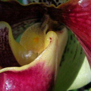
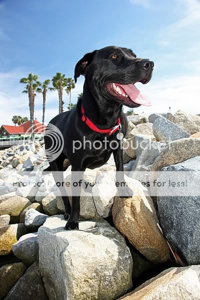
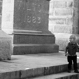
#1 Aperture Priority ISO 100 f/6.3 1/200 sec
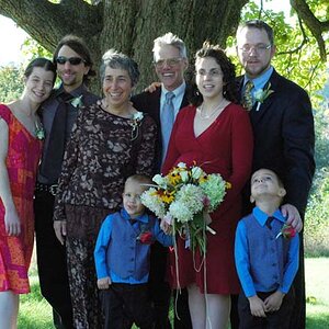
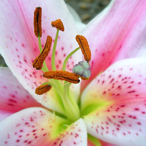
#2 Ap Priority f/10 1/40sec ISO 100 on camera fill flash
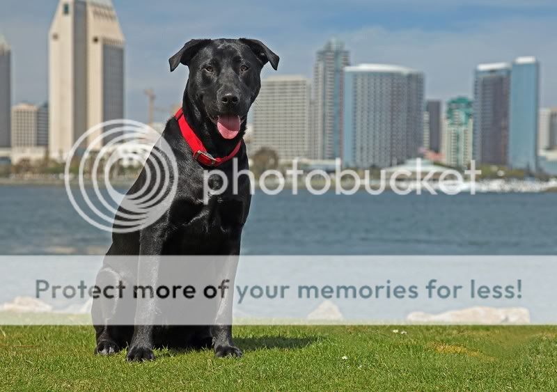
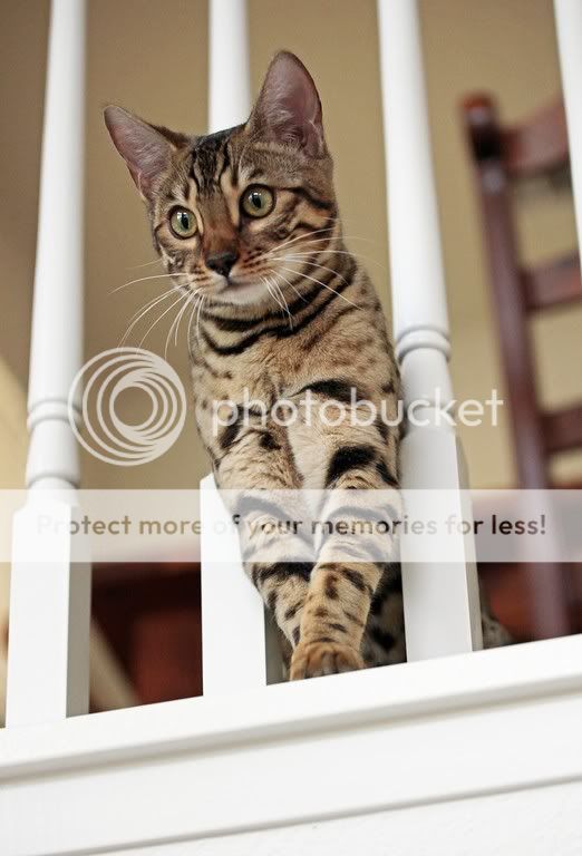
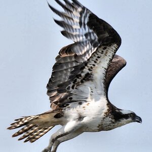
#3 Ap Priority ISO 800 (it was quite shady) f/6.3 1/180 sec
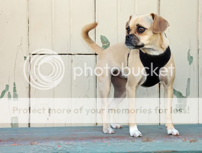
#4 Ap Priority ISO 800 f/8 sec 1/200
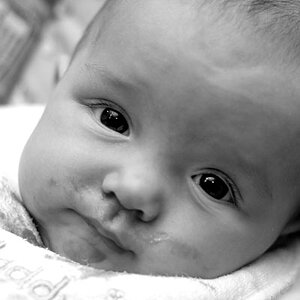
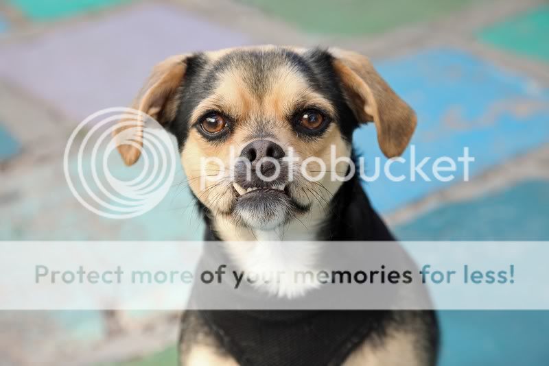
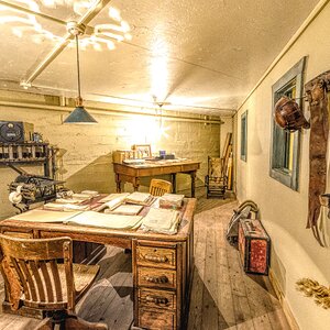
#5 ISO 2000 f/4 1/500 sec This one I struggled a lot since it was fairly dark inside the house and I had to bump the ISO to 2000!
#1 Aperture Priority ISO 100 f/6.3 1/200 sec
#2 Ap Priority f/10 1/40sec ISO 100 on camera fill flash
#3 Ap Priority ISO 800 (it was quite shady) f/6.3 1/180 sec
#4 Ap Priority ISO 800 f/8 sec 1/200
#5 ISO 2000 f/4 1/500 sec This one I struggled a lot since it was fairly dark inside the house and I had to bump the ISO to 2000!
")

![[No title]](/data/xfmg/thumbnail/42/42468-f720ff996eb9cc6554c0019901223156.jpg?1619740193)
![[No title]](/data/xfmg/thumbnail/40/40285-2ce5915035c220ccb3485030863b62d0.jpg?1619739408)
![[No title]](/data/xfmg/thumbnail/40/40288-4d5d7a8aa74ddfceb5fb82062d9b21be.jpg?1619739409)
![[No title]](/data/xfmg/thumbnail/40/40284-f59f6230f0d5b9eacf977f8b0392f087.jpg?1619739407)