What's new

Phlox, maybe?

amolitor

TPF Noob!
Joined
May 18, 2012
Messages
6,320
Reaction score
2,131
Location
Virginia
Can others edit my Photos
Photos OK to edit
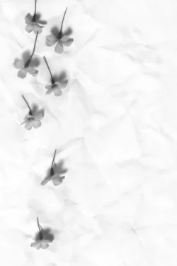
Some sort of little Phlox-like flower, anyways.

$Phlox-Small.webp
 
I think you're right - certainly the right season for it. Hmm. This is an odd presentation - almost has a flat-scanned look of a negative that didn't get flipped. I don't think I care for the crinkled paper, but I do like the way the flowers are coming across here. Can you tell us what you did here? :)
 
  • Thread Starter 🔹
  • Banned
  • #4
Sure.

Crumpled resume paper, flattened out overnight and painted with some coffee dregs for a little texture and grit. This is set horizontally and backlight with a bit of strobe to produce a moderate glow through the paper. Flowers arranged carefully on the paper. Camera almost straight down, angled a bit to look more "into" the flowers, which were declining to lie down in the fashion I had envisioned.

Softbox in the obvious place to light the flowers.

Convert to B&W with red filter to lighten the purple flowers as much as possible. Mild digital "enlarger diffusion" effect (google it and watch out, it's used for nudes a lot). Burn and dodge until head falls off to get the tones where I want them.

 
Sure.

Crumpled resume paper, flattened out overnight and painted with some coffee dregs for a little texture and grit. This is set horizontally and backlight with a bit of strobe to produce a moderate glow through the paper. Flowers arranged carefully on the paper. Camera almost straight down, angled a bit to look more "into" the flowers, which were declining to lie down in the fashion I had envisioned.

Softbox in the obvious place to light the flowers.

Convert to B&W with red filter to lighten the purple flowers as much as possible. Mild digital "enlarger diffusion" effect (google it and watch out, it's used for nudes a lot). Burn and dodge until head falls off to get the tones where I want them.

Wow - good work! Thanks. :thumbup: It definitely has character.

I have also mentally flipped it and I think I like that better. :)
 
  • Thread Starter 🔹
  • Banned
  • #6
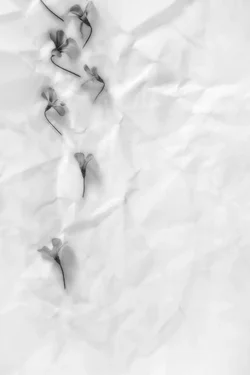
Yeah, I think the flowers are the wrong way around. They should be stems down. Then they look correct, and I can put the light up instead of down, which is where I think it oughta be.
 
I like it the folds in the paper almost mimic the shape of the flowers
 
Yeah, I think the flowers are the wrong way around. They should be stems down. Then they look correct, and I can put the light up instead of down, which is where I think it oughta be.

Interesting though, the way it was done, with the flowers upside down, and the light coming from below in the classic "horror lighting" or "light from below" style. Hmmm...

I dunno...there's an interesting quality to the way it was shown, all "wrong and stuff"...

Really simple, reduced-element still-life pictures like this can be changed, sometimes tremendously, by small adjustments, changes, or retouching work like cloning or healing. IF there's something that bugs me, it is the relatively large open space that runs down the whole right hand side...that seems a bit....I dunno...stilted? Not sure if I can find the best word for how that comes off...

Terri is right--this is an odd presentation. Odd in a good way though. How successful was this in terms of YOUR ideas, amolitor? Is this a success?
 
  • Thread Starter 🔹
  • Banned
  • #9
It's a qualified success. Many of the elements are where I wanted them, but several are not.

I wanted a stronger sense of "falling flowers" than I got, mainly because I got the flowers upside down in my imagination. Why on earth I thought they would fall that way I do not know. I also wanted smaller flowers, or larger paper, but this is what I had handy, so this is what I used. The paper is a bit larger than the frame, so when I re-shoot, I will try for a larger frame. Obviously the flowers are NOT falling, they're resting on something, and that's ok. The concept was a photographic realization, a still life, that goes for the idea of a painting of falling flowers.

I had actually visualized this with something like 1/4 to 1/3 of the height empty of flowers at the bottom. I think my concept was "flowers falling into the frame" not "flowers falling through the frame" now that I really think it through.

I would actually like to get the relative tonalities reversed, as well. My mental image went back and forth on this, but I liked the "white flowers on light grey paper" idea about as much as this one. That does make retaining detail in the flowers more difficult.

ETA: It's possible that if I am able to "get it right" it will become completely banal ;)
 
Well...if you want the flowers to appear to be falling, then the obvious solution is to light it so that the shadows are UNDERNEATH the objects that are to be portrayed as "falling"...I mean, that right there is critical...

and yeah...if it is "right", it might come off as banal.
 
Yes indeed ;) I wanted the lighting to be into the bell of the flower, so that the interior details would be visible. But that meant that the light had to come from below.. because I had the stupid flowers reversed!

Having them "fall" stem down solves at least two problems in one go. Tomorrow morning, we shall see!
 
This is quite a bit closer to what I had in mind:

$Phlox-Small.webp
 

Create an account or login to comment

You must be a member in order to leave a comment

Create account

Create an account on our community. It's easy!

Log in

Already have an account? Log in here.

New Topics

Back
Top Bottom