nuetan
TPF Noob!
- Joined
- Apr 22, 2014
- Messages
- 13
- Reaction score
- 6
- Can others edit my Photos
- Photos OK to edit
Hi All,
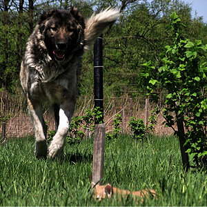
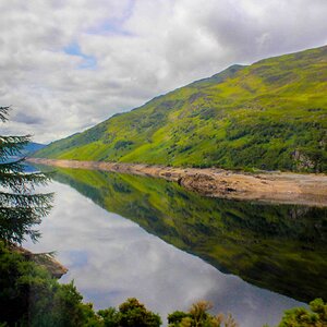
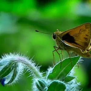
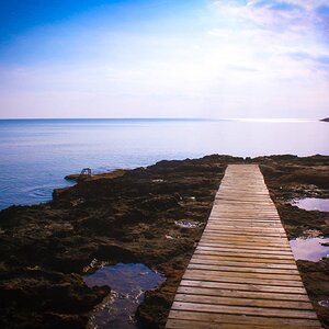
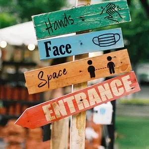
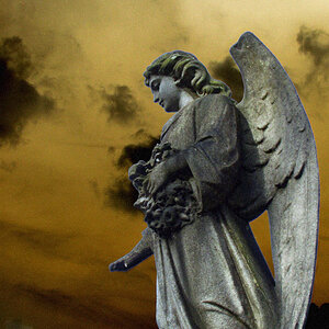
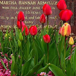
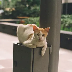
I am from India and took photography as my hobby since last one month. So you can call me as an infant noob. I am posting few of my images for your full critique.
Thanks in advance for visiting and replying.


I am from India and took photography as my hobby since last one month. So you can call me as an infant noob. I am posting few of my images for your full critique.
Thanks in advance for visiting and replying.



![[No title]](/data/xfmg/thumbnail/31/31096-b9b8d52b45753cd4f9251832149ef9da.jpg?1734159254)
![[No title]](/data/xfmg/thumbnail/31/31019-2d026027bccbe16cea34daffbab9e4f0.jpg?1734159107)