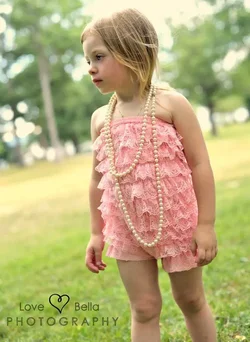
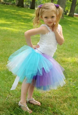
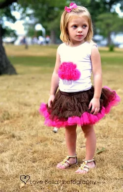
A very valid point Derrel makes about the presentation order. By submitting them here in a tightly packed row of four rather than in a column with spaces between them, we tend to compare each shot to its neighbor and look at the set more than at each one individually. We ask ourselves "what story are these four shots telling" just as much as asking what story an individual shot in conveying. There's a reason that shots look better when the subject's head is turned to look into the frame. Similarly, in a print portfolio or other photo book, you generally want the subjects looking in toward the binding rather than to the outsides. To that extent I agree with D that the second and third should be swapped. I disagree about the other two though. In each of those her body is turned toward the center of the "frame" (both of the individual shot and the group of four), it's only her head or eyes which look back toward the outside. And for a child of this age, I think it's appropriate that part of the story of these images is that her attention has been caught by something off camera, away from where she is supposed to be looking. Also, IMO, the first shot is the strongest of the bunch, and all else aside you want to lead with your best shots.
Now for the shots themselves:
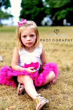
1) My favorite of the set largely because it is the most interesting pose. Nice composition, minus the already mentioned cropping of her foot (I don't as much mind the skirt being cropped). If you're going to crop, crop so much it's clearly intentional (as in shot 2). I like the headroom and the relative spaces you left to her sides. It does look to me like you missed focus, grass in front of her bent leg seems sharper than her hair. The depth of focus has blurred the background enough that I don't mind the horizon cutting through her head.
2) A decent shot. As mentioned, the desaturation works for the subject. I'm generally not a fan of tilted shots, and it doesn't add anything for me here. The one nitpick I have is that her outfit seems to have ridden up on her right leg; I prefer such things balanced, and it's also leading me to interpret her serene expression as uncomfortable.
3) Honestly, this one comes off as more of a snapshot. The lighting is flat and with your larger depth of focus she is not popping from the background like in the others. It's a potentially fun outfit, but the pose seems more forced than spontaneous and I would like to see a beaming smile here than this coy look.
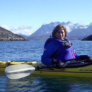
4) I like the horizontal composition here, with her body turned into the frame even though her head and eyes are looking out of the frame. What I don't like is the vertical composition, it looks unnatural with so little headroom and so much foreground under her feet. You've done a good job in getting down to her level (in all of these, actually, though less so in #3). I think had you tilted your camera back up a tad (to address the headroom issue) and maybe even gotten a bit lower (her head is tilted slightly down, so you still wouldn't have been shooting up her nose) the feel of the shot would be greatly improved.



 The angles are a personal preference, but not mine.


![[No title]](/data/xfmg/thumbnail/35/35214-39f59bb7f7da2878bab0187a7d4d80bb.jpg?1734166874)

![[No title]](/data/xfmg/thumbnail/42/42272-c0d91b9d0872bcdfbcdfb5bb0529e302.jpg?1734176673)
![[No title]](/data/xfmg/thumbnail/36/36679-b3112c1f4841912cbaa9edc11e6852fe.jpg?1734169174)