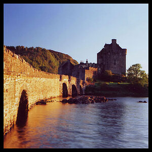
Nothing says "musician" about these? In my opinion.
I want to like these. there's a few things that aren't quite sitting with me.
First id like if you could bring the blacks back down a bit, they are too reduced for me.
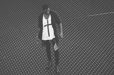
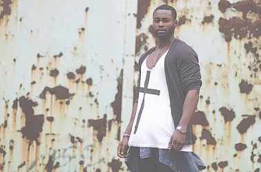
and i really wish #2 and #3 was shot in portrait orientation.
I dont mind the colors as is, peronally, just the black level.
good work.
What filter did you put on these, if any? I think that if you did, it really takes away from the images.
I agree that the blacks need to be reduced. My favorite is #2, though.
here is a shoot for a toronto musician i did recently
C&C is appreciated
these need to be warmer?
p.s. i just realized that i didn't remove magenta colour to fix chromatic aberrations in these
View attachment 79736View attachment 79737View attachment 79738View attachment 79739
Nothing says "musician" about these? In my opinion.

I love everything happening in that image, and I love your processing on it.^^^^^^
First things first...
I've learned that you can't post here and specify someone is a musician if you're doing a promo shoot for them, because unless there is a piano, guitar, bass, drumsticks, SOMETHING... in the photo... people here get upset.
P-LEN-TY of musician/band promo shoots are sans instruments/stage/whateverthehellpeopleexpect
So don't even worry about that.
What's most important is to convey the mood the musician wants to evoke for whatever he's using these images for (Usually you want to evoke the mood of the style of music he creates, which you've stated was your intention).
As far as the *images* are concerned...
I'm one of the rare ones that actually likes... debris and stuff in images, but in the case of the first one, I'd almost be inclined to clone out whatever is floating in the air, off his body. It's too much of a contrast to the darkness of his figure in that one. Unless that's a texture you added in, in which case, mask it out over him
I love the feel of that first one though.
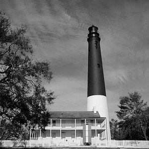
The second one... I like it except for the crop. I wish you would have framed a hair wider to catch his hands. Or you could crop it tighter, but then I think you lose the feel of the location.
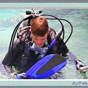
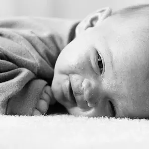
YeyNumber 3: Love it, Print it, Sell it.I love everything happening in that image, and I love your processing on it.
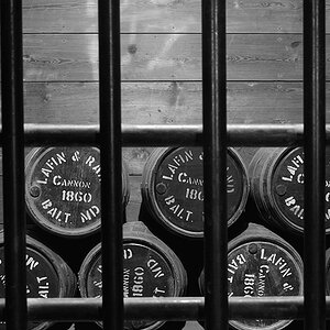
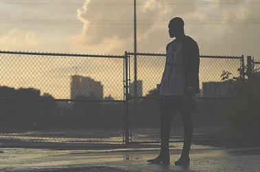
Number 4 is cool, but I think you need to bring a little back in the blacks. I get that you're going for a faded look, which is fine, but it's pushed a little too far. Bring back a little in the blacks and maybe mute the highlights a little.
Overall, great job though!

^^^^^^
First things first...
I've learned that you can't post here and specify someone is a musician if you're doing a promo shoot for them, because unless there is a piano, guitar, bass, drumsticks, SOMETHING... in the photo... people here get upset.
P-LEN-TY of musician/band promo shoots are sans instruments/stage/whateverthehellpeopleexpect
So don't even worry about that.
What's most important is to convey the mood the musician wants to evoke for whatever he's using these images for (Usually you want to evoke the mood of the style of music he creates, which you've stated was your intention).
Oh I am glad I am not alone in this world
As far as the *images* are concerned...
I'm one of the rare ones that actually likes... debris and stuff in images, but in the case of the first one, I'd almost be inclined to clone out whatever is floating in the air, off his body. It's too much of a contrast to the darkness of his figure in that one. Unless that's a texture you added in, in which case, mask it out over him
I love the feel of that first one though.
Oh yeah grungy is fun.
Those are rain droplets.. he just soldered into the rain. i like the rain drops here but i can see how they might be distracting.
Thanks yeah i still remember trying to get his fingers into the frame but i was literally fenced in an lying on the ground so it was physically impossible but i liked the lines converging to his face lol. i tried though
YeyNumber 3: Love it, Print it, Sell it.I love everything happening in that image, and I love your processing on it.
thank you for the compliment
Number 4 is cool, but I think you need to bring a little back in the blacks. I get that you're going for a faded look, which is fine, but it's pushed a little too far. Bring back a little in the blacks and maybe mute the highlights a little.
Overall, great job though!
thanks for the c&c&c, e!
I do like these. They're different than a lot of the photos posted on here. Just an observation, though. They all seem kind of low-res. And I don't mean pixel-wise. It just seems like there's a lack of detail and there's a lot of digital artifacts or noise caused by heavy cropping. Did you add noise in post?