Pics for the week for C & C

linpelk

TPF Noob!
Joined
Jan 1, 2009
Messages
406
Reaction score
0
Location
California
Can others edit my Photos
Photos OK to edit
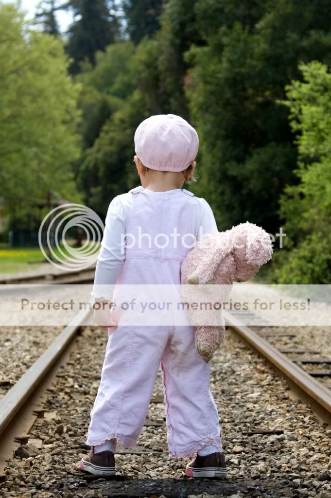
Ok, pic #1 was taken in my yard in the early morning. It feels a little underexposed, but I was afraid of blowing out the detail in the elephants in her dress and the white fence in the background. This has been my greatest challenge lately!! I actually took a few with fill flash, but I blew it and they were overexposed and then my model decided to be uncooperative. So that's that!

Exif:
f/5, 1/400, ISO 250 at 84mm (shot with a Canon 30D and a 24-105 f/4L lens)

IMG_6007.jpg


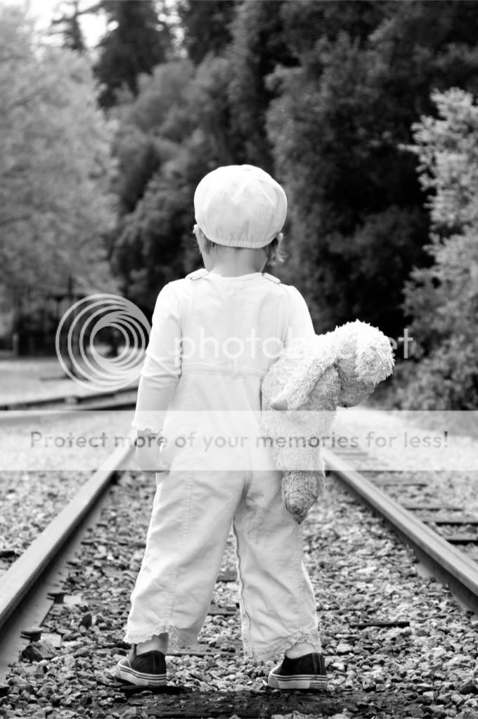
Photo #2..I just love this one. What do you think?

Exif:
f/4, 1/1000, ISO 250 at 47mm (shot with a Canon 30D and a 24-105 f/4L lens)

IMG_47612.jpg


I tried to remove the dirt from the seat of her pants in Photoshop, but it looked even worse. I'm really terrible at PP!
 
Nice shots! For the first, I really like framing and the expression on her face is cute too. The incorporation of pattern on her dress and hat is great, and you have many subtle lines that lead the eye around the frame (glasses arms, ribbon on hat, dress creases, etc). I don't really see a problem with the exposure, but if you want to lighten it a bit, add an adjustment layer for brightness/contrast and move your brightness slider accordingly. Or use the levels adjustment and push your white arrow (right side of histogram) in a bit towards the middle. If you're not familiar with the levels adjustments, you should mess around with it to see how it can affect your photos.

#2. This is another great shot. The central placement of your subject works here with the symmetry. You have a nice balancing act going on here. Without the bear (sheep?) in her hand, the shot would feel heavy on the left side and would make a symmetrical shot like this look bad. Luckily you have that there for composition, but it also adds to the emotion of the photo as it looks like two friends taking a journey. I like the shot a lot and unfortunately I don't have any advice for removing the dirt other than trying to use your clone tool. You may be able to do a small selection of the area and do a color selection to remove the saturation, but I don't use it much to be able to explain it properly.

Great work though and I look forward to next week's.
 
I like both however both seems to be little soft in focus. On the first photo, I would like to see her eyes sparkle a little more and maybe brighten her face some. Also, for me, I would crop more off the bottom of the photo. On the second photo, her hat seems to be over exposed as does her left shoulder. Also, I think the second one would look good in black and white or selective coloring as well as color.

Overall, I like both of them. :)
 
#1 Shows me how important getting the eye(s) in focus is. What a cute pic! I also agree with cropping the bottom half. All I want to look at is the top. So cute. Was this image cropped to begin with? Is there more decent image to the left of her gaze to avoid a square?

#2 Could use a little more saturation to bring the pink up a bit. I also want to see this in B&W :thumbup: Great composition. Great storytelling here. At least the story I see. I think the DOF is perfect, too. Great job in my opinion.
 
lovely. i wish i could take pictures of children like that :) i particularly like the second one. nice use of lines and contrasts. good job
 
Thank you all for your input. I went and played around a bit with the pictures. Here is what I came up with:

Sherman Banks: I took your advice and went into photoshop and adjusted the brightness. Do you think it looks better?

MackGlasses2.jpg


Bitter Jeweler: This is how the picture was shot in camera, so unfortunately I don't have any space to the left to crop the pic horizontally. If I crop any off the bottom, it would be square. Thanks for your critique!

Picture #2: I went back and tried it with B&W and I also tried a vintage/sepia look as suggested. I also tried cranking up the saturation. This is what I came up with. What do you think of these compared to the original posted above?

MackPigBW2.jpg


MackPigVintage.jpg


MackPigSaturation.jpg
 
I love #1. It is a great capture of a little girl's "pouty" face. My only complaint, although minor, I think, is that her left arm is cut off. Looks like the perfect DOF. It looks like she's taking off her glasses in order to make a profound statement, a la David Caruso in "CSI: Miami" (those of you who have seen the show will know what I'm talking about).

I'm not sure I am crazy about # 2. I like the idea--looks like she's "running away," with her prized stuffed animal to keep her company, but maybe if she was taking a step, it would convey that a little better. And it would be a tragedy if her hair was long and her golden trusses were stuffed into that little cap. And if it were me, I would have had her farther down the tracks, with the tracks hitting the corners of the photo dead on. But that's just me. She's an absolutely adorable little girl!
 
It looks like she's taking off her glasses in order to make a profound statement, a la David Caruso in "CSI: Miami" (those of you who have seen the show will know what I'm talking about).

Oh no, you did not just reference David Caruso in your critique! :lol: 
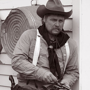
My wife and I always make bets when we switch to that channel on whether or not he has his stupid sunglasses on, and I usally bet "on" and win.

Ok, back to the photos, your edit on the first looks great in terms of exposure but the saturation on the red is a hair too much for me.

I really like the B&W treatment on your second though. I has a little more continuity with the subject's relationship to the stuffed animal since now they look to match in color. I should've noted this in my first critique, but the only thing that kind of distracts my eye in the photo is the positioning of the feet. Being that they both are pointed left, it kind of implies her attention was to the left of the frame but there is nothing there of any interest. It's a small thing, but these invisible lines do have an impact on photos. Great edit though with the B&W, I'd probably ditch the sepia or at least tone down the amount of film grain you applied to it. Maybe adding a vignetting to this version would help make it look like an old time photo.

Great work, look forward to your next pair!:thumbup:
 
The pants dirt should not be difficult to get out. I'd use a soft-edged clone at about 75% strength until you get it out.

I did this in 10 seconds and it's missing some texture, but I bet with a little more effort you could do a much better job:

pinkgirl.jpg
 
I love these! I'm wanting to get in to photographing children though, and I taught preschool for a while, so maybe I'm a little partial. I agree with you on the first. When I look at pictures of children, I like to see brightness and highlights on the things that you notice most about them - their skin, eyes, and lips. At least that's what I notice. The only think I want to really look at is her face and I feel like it could be a little brighter. Also, I wonder if there's a way to make her eyes really pop. She's beautiful!

As for number 2, I LOVE the b&w. It really makes it.

Great job and I hope to see more!
 
Also, I wonder if there's a way to make her eyes really pop. She's beautiful!

Here's my effort on the eyes and lightening her face.

redgirl.jpg
 
Wow, thank you all for your great input on these pictures. It looks like the B & W version wins. I hadn't thought about changing it before, but now I also agree that it adds some character.

Stella, thanks so much for taking the time to fix my pictures. You did a great job removing the dirt from her pants and lighting the face a bit more on pic #1. That was really nice of you.

Sherman Banks, I HAD noticed that her feet are slightly skewed to the left in pic #2, but hadn't thought about it in terms of creating an invisible line of interest. I DID think that it kind of threw off the symmetry, but these details are impossible to control, unfortunately. I was so glad she actually stopped running for a brief instant. :)

Sjluto, thanks for the compliment. I love taking pictures of kids. I am lucky enough to have a couple at hand right now to practice on, but am really looking to pursue a little business someday when I am good enough to charge for it! I think it's a LONG way down the road for me though :)

Thanks again everyone!
 
Cute little girl. :)

I was thinking the same thing about what the second pic says... kinda downbeat. Her head looks like its pointed down, slightly... she's looking away... train tracks imply inevitability, leaving, and possibly even walking till you get run down by the train. Her posture says a lot too... legs wide arms straight down, body somewhat rigid... implies defiance. All over, I read, "Ok, train... come get me. I'm right here. Make my day."

It is *not* a happy picture, imo.

That being said, if that's artistically what you were going for... nicely done! :lol:

Thanks. I brought the little stuffed animal because I was hoping for some shots on the railroad tracks that looked like she was running away from home. I wasn't sure if I could successfully convey this. I can never predict what will actually happen since she is 2 and does whatever she wants to do..even with LOTS of encouragement and bribery. I am happy with this shot because I feel it DOES reflect some of the defiance of one "running away" and therefore captured what I had hoped.
 

Most reactions

New Topics

Back
Top