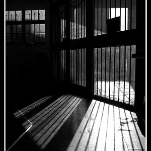
I like the idea of this, the confusion of different elements jumbled together, and it has some interesting lines and contrasts. However, I would present just what is in the window, using perspective or probably skew to straighten it. I don't think the window frame and bricks/concrete add anything to it. I know they establish the context, but what works for me is just the pure graphic elements in this.
I struggled with the crop for the reasons you mentioned.
The graphical elements and the imagery both determined the decision to leave the frame. My initial reaction was one of confusion and withdrawal, reinforced by the "Do Not Enter Sign", "Bars", and "Wall" all within the window. Each seemed to reinforce a look inside a troubled mind. Not sure if a more appropriate title would have helped convey the message, "A Troubled Mind" maybe ...
Imagery aside, I like the pure graphic elements too and will do some experimenting with the crop............ Thanks KenC


![[No title]](/data/xfmg/thumbnail/32/32717-74f4cee577117aa4476c9eb68fec51c7.jpg?1619735622)
![[No title]](/data/xfmg/thumbnail/33/33489-cc76e5d22658c0f79ccb4ae9d307610d.jpg?1619736003)
![[No title]](/data/xfmg/thumbnail/42/42279-f60778d39180ee6cd87fc84a15559b96.jpg?1619740087)