What's new

Pinup-ish

lbowser

TPF Noob!
Joined
Sep 4, 2013
Messages
111
Reaction score
8
Feedback? :)
 

Attachments

  • $image-559633453.webp
    $image-559633453.webp
    146 KB · Views: 130
Feedback per req:

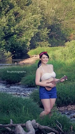
It's a nice enough image, but there are a numbe or areas for improvement IMO. The subject is rather under-exposed, due, I suspect, to the use of an automatic exposure mode or a mis-interpretation of the meter reading caused by the brighter background area. A fill light high and left would have helped a lot here. The subject is rather too small in the frame, and the DoF is somewhat excessive; a longer focal length and larger aperture would have allowed you to make the subject much more prominent, as well as to reduce the detail in the background by rendering it less sharply focused.

Just my $00.02 worth - your mileage may vary.

~John
 
again with the odd crop...do you just like to be different for different's sake or is there a reason you choose this ratio? Too much room top and bottom, the subject is totally lost.
 
... and this tiny guitar makes her look at least two sizes larger than she is.
 
It's a ukelele, they're small.

I'd have turned her the other way. I like the arabesque of the stream, but I wish that it was in front of her, in the "live" space, rather than behind her. I also would like it a little wider, since this is about a girl and a stream, let's see the stream. Of there's a paper mill just out of frame left, well, so be it. If there's the remainder of an appealing curve in the stream, though, I want to see it.

Light rather dull on her. But she looks quite nice!

 
Didn't realize my crops and pics were losing the subject, wasn't really intentional , thank you! :)
 
As a rule, when cropping try to hit the traditional ratios that are commonly used. 1:1 (square), 1.5:1 (4x6), 4:5 (8x10), 16:9 landscape (1920x1080) etc. I'll usually crop twice... once to confirm the look, then undo it, and do it again to one of those exact ratios. If I have to, sometimes I'll use a calculator and stretch or shrink one dimension to fit the ratio. I also won't use 16:9 for portrait mode, as I think of it as a landscape only format.

If you are going outside one of these formats, you should have a specific reason for doing so. And then it should be WELL outside of 16:9. Such as 2:1, 3:1, etc.

You are around 2:1... but there's no good reason for it. Thus it looks amateurish, ignorant, or accidental.
 
It's a ukelele, they're small.

I'd have turned her the other way. I like the arabesque of the stream, but I wish that it was in front of her, in the "live" space, rather than behind her. I also would like it a little wider, since this is about a girl and a stream, let's see the stream. Of there's a paper mill just out of frame left, well, so be it. If there's the remainder of an appealing curve in the stream, though, I want to see it.

Light rather dull on her. But she looks quite nice!

I think I'm going to same something very similar here. My first thought was that I wished you were on the other side of the stream (to camera right). It looks like you then could have gotten a better exposure because everything would be in the shade with not much bright sunlight showing. You would have also gotten more of the stream as Andrew points out.

I also agree that she needs to be more prominent in the framing.
 

Create an account or login to comment

You must be a member in order to leave a comment

Create account

Create an account on our community. It's easy!

Log in

Already have an account? Log in here.

Back
Top Bottom