Playing around...

mishele

Moderator
Staff member
Supporting Member
Joined
Jun 19, 2009
Messages
13,661
Reaction score
4,894
Location
In your dreams!
Can others edit my Photos
Photos OK to edit
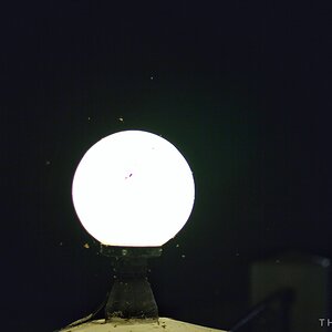
I had fun but didn't get what I wanted. I'll play again next weekend. If you love it or hate tell me why!! C&C always welcome.:greenpbl:
8522898434_2521781e4c_z.jpg
 
Last edited:
Very nice lighting! Can't wait to see what you "wanted" to get because this is yummy lol
 
Ahh...I'm pretty nitpicky...lol I'll wait till more people take a look before I say what I don't like about it. lol
 
Beautiful result, regardless.

Rolls of paper?
 
The lighting is nice, the lines could be cleaner. What are we looking at?
 
I'm thinking Mishele is seeing nits (along the paper edges). The glow at the edges (middle, lower right) seems somewhat artificial - more postprocessing than lighting. I do like the arrangements of the shapes and the curves (yes! I love curves!) which are suggestive, but not symmetrical - a little different. I think GSGARY put up a few some time back, and this is a continuing favorite subject of the minimalist camp. I too am curious, Mishele, what your "success" image will look like...
 
Very nice lighting
 
Great idea and I've dinked a few times myself with such a project. My nitpicks are the paper fuzzys, middle top left, agree with Mully on the glow at the bottom but my biggest nit is that all the curves (lines) exit the page and then come back in except the ones at the very top left. Once my eye focused on that, all was lost...but still, a good exercise.
 
Looks like Art Nouveau
 
The lines and the light are both great. Good one.
 
Very nice lighting! Can't wait to see what you "wanted" to get because this is yummy lol
Thank you, Rabbit! I'll post it up when I get it...lol
The lighting is nice, the lines could be cleaner. What are we looking at?
You are looking at paper. :sexywink:
I'm thinking Mishele is seeing nits (along the paper edges). The glow at the edges (middle, lower right) seems somewhat artificial - more postprocessing than lighting. I do like the arrangements of the shapes and the curves (yes! I love curves!) which are suggestive, but not symmetrical - a little different. I think GSGARY put up a few some time back, and this is a continuing favorite subject of the minimalist camp. I too am curious, Mishele, what your "success" image will look like...
Ahhh...yes..those silly fuzzies!! I also don't like that I didn't get all the paper on the same plain. I wanted more of the edges to be in focus but every time you move something...something else is out of whack. =)
 
I like all but the glow at bottom of the frame.
Hmmm...funny that wasn't something that bothered me, but now that you pointed it out...I can't stop looking at it.

Very nice lighting
Thank you. All I used was light coming in through a window. ;)

Great idea and I've dinked a few times myself with such a project. My nitpicks are the paper fuzzys, middle top left, agree with Mully on the glow at the bottom but my biggest nit is that all the curves (lines) exit the page and then come back in except the ones at the very top left. Once my eye focused on that, all was lost...but still, a good exercise.

What I see when I look at the shot....is kinda a abstract of a flower. I see stems leading up to a bud. I do have some issues w/ the composition being top heavy. These are fun to play, so I play again. Thanks for the comment!!
 
I like it, but there's something off about it for me. I'm not sure I can explain it well though, but I'll try.

I know that its paper because of the edge being rough with the fibers obvious. Then my mind looks for the texture in the paper's surface and it's not there.
It's bothersome in a way that feels off to me. I tried to play with the shot and my initial instinct was to try to smooth the edges of the paper, but it's really the lack of surface texture that nags at me.
I don't know if that makes any sense. Need to go to bed I think ;)

Oh, I'm also bugged a bit by the crop on the right. It feels cut off to me.

All this is nit picking and only because you asked for it. ;) It's a cool shot and very creative.
I love the good w/ the bad!! I'm glad you took the time to tell me what you didn't like about it. I used a macro lens at f2.8 so the DoF is very shallow. That is probably why there it no texture on the paper.
I'm going to go back and see if there was a different crop that I like.
 

Most reactions

Back
Top