
TimmyJP
TPF Noob!
- Joined
- Dec 25, 2005
- Messages
- 89
- Reaction score
- 0
- Can others edit my Photos
- Photos NOT OK to edit
Hey all,
Last weekend I met up with a friend to experiment with a few ideas she'd had for her college art project.
The models are the two of us, we did our best with the self-timer; focussing was slightly interesting!
Any and all criticism is very much appreciated. There are a few ideas I'd like to try again; actually behind the camera rather than running backwards and forwards between it, so any tips would be very useful.
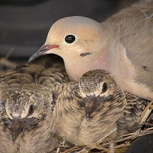
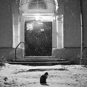
#1

#2

#3

And finally, just a bit of fun, rather than a silhouette
#4

Thanks in advance for any criticism and comments!
Timmy
Last weekend I met up with a friend to experiment with a few ideas she'd had for her college art project.
The models are the two of us, we did our best with the self-timer; focussing was slightly interesting!
Any and all criticism is very much appreciated. There are a few ideas I'd like to try again; actually behind the camera rather than running backwards and forwards between it, so any tips would be very useful.
#1
#2
#3
And finally, just a bit of fun, rather than a silhouette
#4
Thanks in advance for any criticism and comments!
Timmy
![[No title]](/data/xfmg/thumbnail/37/37096-449bdc6a1e392458a52fd1cca97c6b2e.jpg?1619737881)
![[No title]](/data/xfmg/thumbnail/32/32929-22e23acc63d6ecb25e5ee941be87121f.jpg?1619735758)


![[No title]](/data/xfmg/thumbnail/37/37093-76cde0d618a8f2748a7d7543d7b4f9ea.jpg?1619737881)
![[No title]](/data/xfmg/thumbnail/32/32926-ec27ecead8c80d803404500d8f888dbf.jpg?1619735754)

![[No title]](/data/xfmg/thumbnail/41/41423-156eb6e5a056cd1cbcf60e12a03f9d56.jpg?1619739809)