What's new

Please critique latest river landscapes

zulu422

TPF Supporters
Joined
Jul 18, 2015
Messages
4,157
Reaction score
6,043
Location
NV
Can others edit my Photos
Photos OK to edit
I'm learning my gear. I can usually make the camera do what I want, and get the image to have the look I envisioned.

I put myself in beautiful locations, and shoot pretty things, so I've taken a lot of pretty pictures.
The landscape photography I love to view, however, is on another level.

With top tier landscape photographers, such as @Vieri, it is the photograph that is beautiful, not just the landscape. It is the vision of the artist that makes one take interest. The landscape only has to be a somewhat willing subject.

I will never be that good. I'm perfectly happy to aspire. And I want to improve.

Seeking critique, technical and artistic. Critical comments have been so helpful. The ones that have stung the most have spurred the most improvement :)

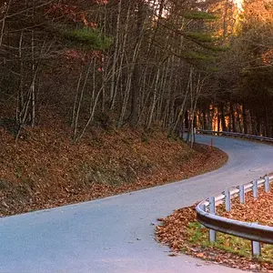
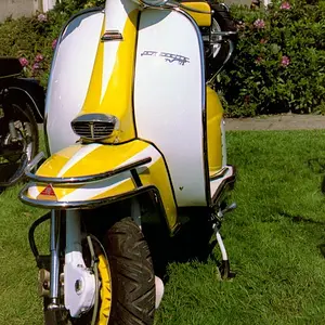
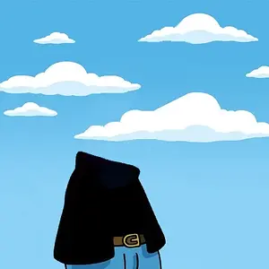
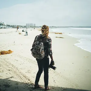
A few from dawn on the Cosumnes River. Northern California foothills of the Sierra Nevadas.
Starting to find myself taking almost the same picture of different rivers.

Thank you for looking
1
cosumnes (1 of 1)-2.webp


2
cosumnes (1 of 1)-3.webp


3
cosumnes (1 of 1)-6.webp


4
cosumnes (1 of 1)-4.webp
 
Good shots and colourful too, 1 & 3 are my favorites.
 
I wish I was good enough to critique or offer help, especially because landscape photography is what I like to look at and attempt to photograph as well. I really like your first three photos, the fourth just doesn't catch my attention the way the first three do.
 
I seem to have a personal thing about cutting off of the midground tree ... I would have liked the whole it to be part of the scene.
 
Good shots and colourful too, 1 & 3 are my favorites.
Thank you Dave. Appreciate the comment.

I wish I was good enough to critique or offer help, especially because landscape photography is what I like to look at and attempt to photograph as well. I really like your first three photos, the fourth just doesn't catch my attention the way the first three do.

Thank you fishing. I love your landscape shots.

I'm digging #3. It's crazy vivid, but it totally works for me.
Thanks my Peeb

I seem to have a personal thing about cutting off of the midground tree ... I would have liked the whole it to be part of the scene.
Thank you for the comment. I often struggle with trees when framing the shot. I always dislike cutting them off, but then including the whole tree makes for a very different shot. I agree, though, for sure. Cut trees introduce tension to a tranquil scene. Thank you again.
 
Nice landscapes!

I am also barely qualified to offer suggestions for improvement as I am not much of a landscape photographer, but I can always comment as a viewer and nature lover.

I love monumental landscapes, wide and taking in lots of space. Looking at your images I find myself wanting to see more and with a wider angle. The partial trees is telling me there is more I would lile to see.

Another thing I love about some landscapes is how they draw you using devices like perspective, lines and shapes. So that one is gently invited to step into the scene. Images 1 and 2 do it well and I could see am opportunity to add those ideas to 3 and 4, perhaps by changing camera height or position, or perhaps introducing a strong subject in the foreground, like flowers or rocks.

My last comment is about light amd color. Love your light and color, especially on images 1 and 3. Lovely done.
 
Nice landscapes!

I am also barely qualified to offer suggestions for improvement as I am not much of a landscape photographer, but I can always comment as a viewer and nature lover.

I love monumental landscapes, wide and taking in lots of space. Looking at your images I find myself wanting to see more and with a wider angle. The partial trees is telling me there is more I would lile to see.

Another thing I love about some landscapes is how they draw you using devices like perspective, lines and shapes. So that one is gently invited to step into the scene. Images 1 and 2 do it well and I could see am opportunity to add those ideas to 3 and 4, perhaps by changing camera height or position, or perhaps introducing a strong subject in the foreground, like flowers or rocks.

My last comment is about light amd color. Love your light and color, especially on images 1 and 3. Lovely done.

Thanks so much for the kind and thoughtful comments. I find them valuable. I think the elements of the busy composition are leading eyes out of the frame. Maybe the lack of a solid point of interest to keep you in the composition. Nice of you to take the time :)
 
Hello zulu42, very good job here and what a great attitude towards photography! Can I ask you if you own or if you have used any Grad ND filters here? On my monitor, the first three photos all look like the sky is burned, and that to my eye is a bit distracting; using a Grad ND would have helped you with that. About your compositions, I see texxter's point about a wider angle. To me, the point is not that you necessarily have to get more of a scene in (or less); the idea is to be deliberate in your choice, meaning that the viewer should have a clear understanding of what your intentions were. If I may, let me give you a couple of suggestions about image nr. 1, to show you what I mean. I would not have included the reeds in the river (bottom right), they are too few to add anything to the scene, but their presence is evident and slightly distracting. Same goes for that one branch on the top right, the one that is disconnected from everything. As well, I would not have cut off the top of the main tree in the middle of the image, or - if impossible to include - I would have gone even more into the image: a good principle to follow when composing and when you are not sure about an object is "either in or out", meaning: does it add to the image? If yes, have it in. If not, take it out. The center tree in image nr. 1 in my opinion is too much in to be considered out, but not in enough to be considered in - hope that makes sense.

Sorry about the long message, and I hope you'll take in the spirit I wrote it: just a few general suggestions that you can apply to your work going forward. Best regards,

Vieri
 
Hello zulu42, very good job here and what a great attitude towards photography! Can I ask you if you own or if you have used any Grad ND filters here? On my monitor, the first three photos all look like the sky is burned, and that to my eye is a bit distracting; using a Grad ND would have helped you with that. About your compositions, I see texxter's point about a wider angle. To me, the point is not that you necessarily have to get more of a scene in (or less); the idea is to be deliberate in your choice, meaning that the viewer should have a clear understanding of what your intentions were. If I may, let me give you a couple of suggestions about image nr. 1, to show you what I mean. I would not have included the reeds in the river (bottom right), they are too few to add anything to the scene, but their presence is evident and slightly distracting. Same goes for that one branch on the top right, the one that is disconnected from everything. As well, I would not have cut off the top of the main tree in the middle of the image, or - if impossible to include - I would have gone even more into the image: a good principle to follow when composing and when you are not sure about an object is "either in or out", meaning: does it add to the image? If yes, have it in. If not, take it out. The center tree in image nr. 1 in my opinion is too much in to be considered out, but not in enough to be considered in - hope that makes sense.

Sorry about the long message, and I hope you'll take in the spirit I wrote it: just a few general suggestions that you can apply to your work going forward. Best regards,

Vieri

Firtstly, I'm very grateful for your time and consideration in taking a look at my photographs. A most sincere thank you.

You are correct about the burned skies, I do not own any Grad ND and often burn the sky in post using adjustment brush or software grad filter. In the case of pic 1 the sky was exposed separately and composited in.

Without addressing each of your suggestions individually, I appreciate each bit of valuable insight, and yes, they do make perfect sense.
It is pretty special to have photographers - for whom I have great admiration - comment and help with my work.
 
I like 1 and 2, but 2 wins.
#1 is kinda confusing to my eye. Do I look at the ground on the left bottom or the river? IOW my eye is trying to figure out what the subject is.
#3 is like #1, my eye is trying to find the subject or composition.

Having said that, I admit that landscape composition is HARD, for me.
I was never trained in the arts.
 
If you wish to improve, I think two technical and artistic suggestions would help you the most. The first suggestion is to avoid so frequently defaulting to the 18mm focal length of your 18-35mm zoom lens (I suspected this, and later when I looked at your EXIF, my suspicion was confirmed on the majority of your images in this post). The 18mm focal length setting makes the foregrounds physically large on-sensor, but it also makes the background objects very small, and less-impactful, as well as increases the physical width of the background angle of view in relation to the foreground width. I find wide-angle landscapes often quite boring, with very little detail visible beyond 20 to 50 feet...this is the single,biggest problem I see in landscape photos from many,many people, especially in this type of forest/woodland type of landscape genre.

The second issue is to avoid using long shutter speeds and creating blurry clouds; frequent use of Neutral Density filtration as a way to create drawn-out shutter times is has now fallen into the category of over-used technique in the modern era, and this type of blurred cloudscape rendering immediately injects the photographer's technical decisions right into the heart of the photo, and steals from the realism of the scene, which I think is counterproductive most times. Too much blurring of water and clouds strikes me as contrived and formulaic. There's a fine line between too much, and just right as far as water goes. When clouds start being rendered as blurry...the shutter time's typically too long. IMO.

When people are, as ac12 writes, "trying to figure out the subject or composition", I think this is often because short focal length lenses used in many landscape scenarios create a wide,vast image, with everything that's beyond 20 to 25 feet being rendered as tiny, and with very little visual impact.

If you want to make better landscapes, start thinking about more frequently using a 35 to 180mm focal length range lens selection on the D800.
 

Create an account or login to comment

You must be a member in order to leave a comment

Create account

Create an account on our community. It's easy!

Log in

Already have an account? Log in here.

New Topics

Back
Top Bottom