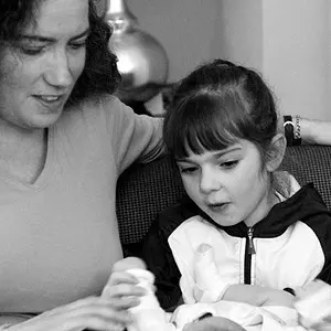
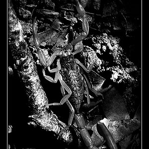
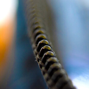
You are welcome to comment on my composition, exposure, etc. too, but I am concentrating on improving my bw conversion with this one. This conversion was done in PS CS with a channel mixer layer. Thanks for any help!
I like the feel of it; it has very nice mid-tones and it doesn't scream CONTRAST! I usually like a smidge more contrast in my B&W, but I think it works well with the shot. It all depends on your personal taste and what you're going for, though. Could you post the original?
B&W, to me, is accentuated by simplicity, shadows and patterns. Your picture is far too busy and should be in color. Mind you, this is my personal opinion



![[No title]](/data/xfmg/thumbnail/34/34120-9085bc65df236ba03977d33a60b852d3.jpg?1734164595)

![[No title]](/data/xfmg/thumbnail/37/37099-7f42b61932abea7ffe1be7746e7bd261.jpg?1734169828)