What's new

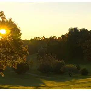
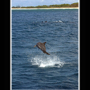
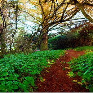
Please critique some of my new england landscape photos. What you like/dislike

jsecordphoto

Been spending a lot of time on here!
Joined
Oct 26, 2013
Messages
1,493
Reaction score
1,055
Location
new hampshire
Can others edit my Photos
Photos OK to edit
a15b5d9f-f288-48f3-a8c5-9a55d719ae76.jpg

Newcastle, NH

ca607153-7bd6-45bf-8f2b-5f47c36db504.jpg

Laconia, NH

87bddad3-1300-44bb-8aa7-0682b02ceb5d.jpg

Tilton, NH

13c1c5cc-16fc-4dcb-bb8a-281e78eadd95.jpg

Kittery Point, Maine

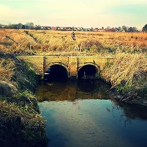
42fa5ffb-64b4-4160-a28e-61eee1663d0a.jpg

Sanbornton, NH
 
I find #'s 1, 2 and 3 to be way over-saturated, but I like the composition and think they could be really nice toned down.
No. 4 is too OOF in the foreground.
No. 5 is nice but I think it is under exposed.
 
#2 is so good I couldn't look at the rest.
 
Thank you for the responses! Ive just recently gotten back into photography about 3 months ago, after years away when my life was a complete mess. Its been amazing getting back into it.

Ill try scaling back the saturation a bit in lightroom. Working with RAW files sometimes I "remember" scenes being a little more dramatic than they actually were. I think its easy to accept criticism on this forum because I respect the photogs on here and know you guys have a lot more experience than I do. Thanks again!
 
Thank you for the responses! Ive just recently gotten back into photography about 3 months ago, after years away when my life was a complete mess. Its been amazing getting back into it.

Ill try scaling back the saturation a bit in lightroom. Working with RAW files sometimes I "remember" scenes being a little more dramatic than they actually were. I think its easy to accept criticism on this forum because I respect the photogs on here and know you guys have a lot more experience than I do. Thanks again!

Keep up the good work
 
The moon pasted in to #2 is much too big. Are we visiting a lake on Barsoom here?

#1 and #4 are essentially the same picture.

#3 and #6 feel out of balance and a bit chaotic.

The others are perfectly reasonable examples of a particular form. Lots and lots of people take these pictures. What you think of that depends on you.
 
You are over-processing....give natural colors a break.

I like the last one, it has nice reflections.
 
Good work. #3 is my favourite. i also like number two but it does look a bit too saturated on my screen.
 
Ill try reprocessing tonight after work and going a little easier on the saturation and put the new versions up to see what everyone thinks. it can be difficult to hear criticism but I truly appreciate it. most people I show my photos to love them, but their frame of reference is basically comparing my stuff to what they see on instagram or iphone photos, I'd much rather hear from my photographer peers what they think and try to improve. Either way it has been great getting back into photography and thanks everyone
 

Create an account or login to comment

You must be a member in order to leave a comment

Create account

Create an account on our community. It's easy!

Log in

Already have an account? Log in here.

Back
Top Bottom