What's new

Please critique some of my photos!

Peacemaker636

TPF Noob!
Joined
Jan 7, 2007
Messages
156
Reaction score
0
Location
Iowa, U.S.
Can others edit my Photos
Photos OK to edit
Okay, so here are some of my photos. I'd like to take any critique, no matter how harsh, so long as you have a point and are trying to tell me what to do better. Btw, these are in no particular order, they're just some random pictures that I want critiqued :mrgreen:.

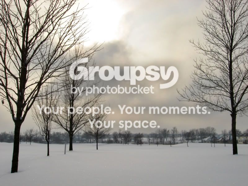
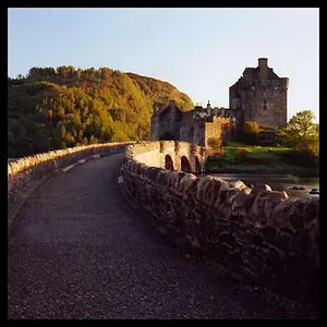
1.
IMG_0612.jpg


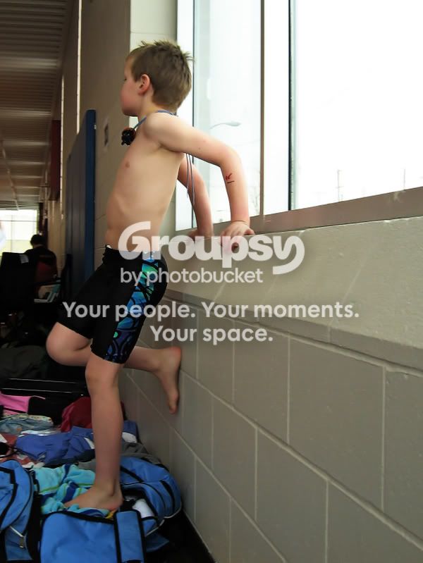
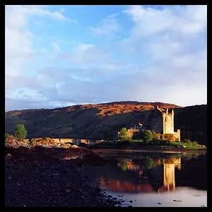
2.
IMG_1505.jpg


3.
IMG_0713_shallow_depth_of_field_fin.jpg


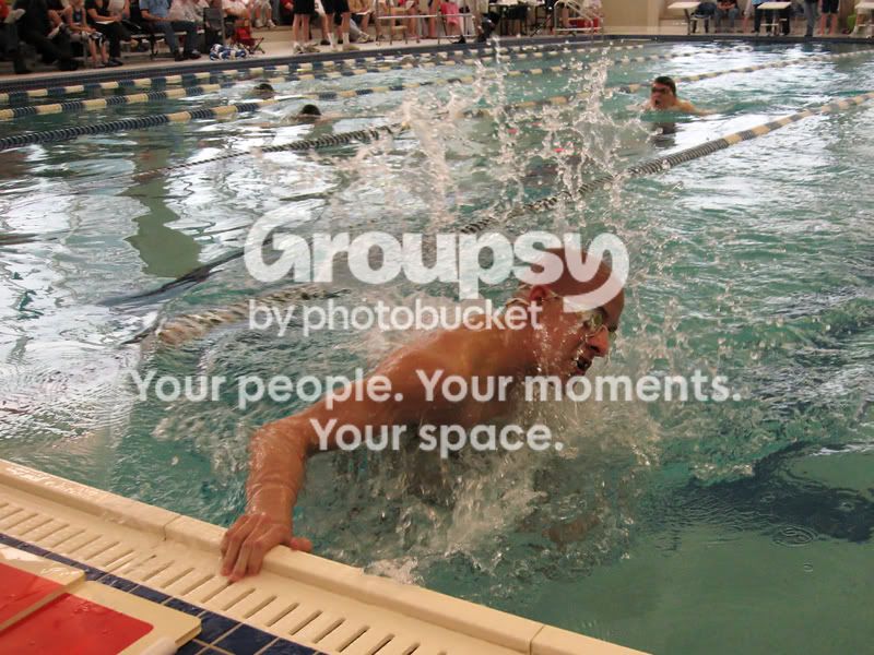
4.
IMG_1576.jpg


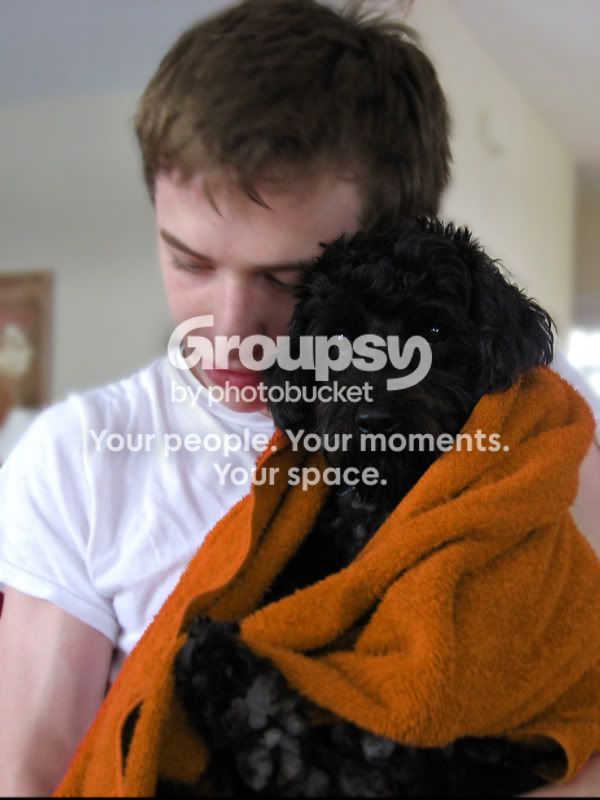
5.
IMG_0630orange.jpg


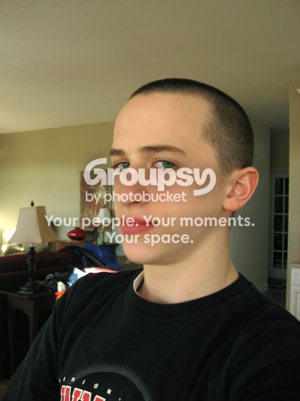
6. (A self portrait, and I know the background's busy, so please don't comment on that)
Mecopy.jpg
 
I have moved this post to the General Gallery. The Photo Critique section is reserved for more serious critique and therefore we like to keep it to one image at a time...(see FAQS), otherwise it just gets too confusing.

Feel free to post multiple images in other parts of the forum...or to re-post your images individually into the critique section, with a bit of an explanation of the shot and what you were trying to show.

Thank you.
 
Sorry, I wanted to get serious feedback on what (if anything) is wrong with any of the pictures. So I put it in the critique section. I didn't know we weren't supposed to post multiple pics.

Sorry!
 
These look more like "snapshots" rather then photos that require serious critique.
 
Wow, thanks for making an effort to give me useful advice. I'm asking for helpful criticism that will be of use to me in the future. So unless you're going to give it, I'd rather you don't say anything.

If you would tell me what exactly makes them look like snapshots, then I wouldn't care.
 
i'd say pimp the colors a bit in the first one and crop the legs of the watching people out in the fourth one. just my idea
 
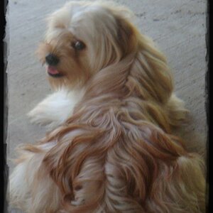
oh and there's something with that dog too, it's just a big black spot. maybe mess around with the contrast/brightness?
 
Thanks, I actually thought about cropping the legs but that cut off some of the spraying water, and I wanted to keep that. I'll look into adjusting the brightness on the dog.
 
Wow, thanks for making an effort to give me useful advice. I'm asking for helpful criticism that will be of use to me in the future. So unless you're going to give it, I'd rather you don't say anything.

If you would tell me what exactly makes them look like snapshots, then I wouldn't care.

One of the many definitions of 'critique' is "to review or analyze critically."

HoboSyke gave you their PERSONAL review of your photos.

I don't think there's any need to critque someones critque.

While I agree with HoboSyke on the style of your pictures I will offer some opinions of my own on how you could improve this batch.

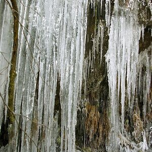
#1. While it's a nice landscape there is really focus point that grabs the viewers attention.

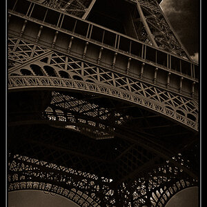
#2. I would crop tighter and lose some of the wall on the right side. Maybe try black & white.

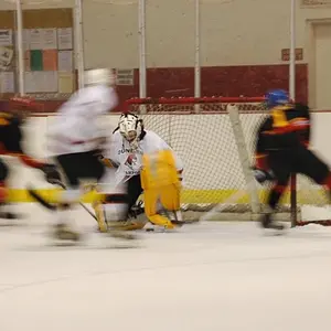
#3. While it's a very neat picture, I like how it shows motion, it seems there is really no focus again. I would've prefered for face to be in focus.

#4. I really like this picture also. But again, too much 'empty' space around the main subject. Tighter crop. I like color but I can also this in b&w too.

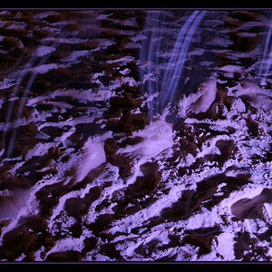
#5. I can see what you're trying to say here. Personally I'd fiddle with some effects in Photoshop or whatever editing program you have.

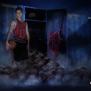
#6. I would erase the entire background and maybe make it black or something to look like a studio portrait. This is very simple to do, especially on this picture.

If you don't know how to do any of these things you can always ask. There's a section here about digital photography.

Remember, there are no stupid questions. The only thing stupid is to not ask. And you did ask for critque, no matter how harsh, so next time be prepared for WHATEVER anyone might say.
therwise, tell us to take it easy on you;)

There are other sections around here where you can post a picture and ask people to edit it themselves and repost. This will give you a better idea, visually, of what we all mean when you give advice.

Keep taking pictures!!!!

 
Also, remember to always really pay attention to what you see in your viewfinder. Check around the frame for anything that might sneak it's way into the frame that you'd otherwise want to crop out.
I know that the joy of digital has let people just take pictures non-stop.
I shoot film, and it gets expensive.
I always ask myself if the picture is really something I'm willing to pay to get. Is it something that I would like to see on my walls? Is there another angle or view that would make this better (with digital you can take all those angles and disregard the lesser of the bunch).
 
Like the swimmer one the best, good action style...
 
1. Greyh snow (means under exposure) yet over exposure of the bright centre of the sky (the sun). THere's no real subject. Doesn't do it for me.

2. I don't really get this one either. A snapshot really.

3. Really like the style of this although it looks like a blurred photoshop background which wastes it. Love the page in motion but the face isn't sharp.

4. Nice but lose the distracting background.

5. Having the face more in focus might have helped. The background is busy to. Doesn't really do it for me.

6. Just a snapshot and not a great one. Your eyes are too far to the left (right as you look) and there's no real expression on your face. Try and be more relaxed in front of the camera and be more natural.
Sorry if that sounds harsh.

JD
 
Thanks for the critique! I'll certainly keep in mind what you all have said! I agree that some of them are a bit 'snapshot'-ish, but I'd prefer that people don't just leave it at that, that they go a bit more in depth.

Thanks again!
 
.. .. "are mere snap shots frozen in time! I don't have to name the photographs, there are too many of them. "flag being raised at Iwo Jima"!
but the composition was "perfect" you have too much distracting "noise" going on all around your "creations" or snap shots. try using "seamless" paper. hung in a huge curve from the wall to the floor and put your subjects into space, without distractions and "FILL THE FRAME WITH DETAIL"

You exhibt a "trained eye" likeness in some aspects. that needs further deveopment to wipe out all the distractions. The girl moving the page, I like it a lot. I would have been "higher" to get the other stuff that wasn't necessary to include.. I love the first one. and I will be the first to argue that grey snow is underexposure. The image that did the worst for me was the black against the red. a black "fluff" with eyes. no detail..

The last picture, intriguing but you stretched it just a little bit.? But remember this.. "these are people's Opinions only. including mine.

The water, nice nice.. thumbs up!

the swimmer.. after looking at him the first place my eyes WANT to go, is out that window.. !

Take the time to think.. what are you trying to show.. ? in your images.? how can you draw or lead a person's eyes into that one point your trying to draw attention to ? that's a lot of questions, to ask yourself before you go -=click=-!

I see a lot of potential in your way of thinking, now slow down and look at how your composing your "busy" thoughts!
 

Create an account or login to comment

You must be a member in order to leave a comment

Create account

Create an account on our community. It's easy!

Log in

Already have an account? Log in here.

Back
Top Bottom