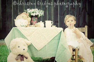
I see what you're going for here, and it's not a bad idea. The "vintage" color cast is probably going to attract some attention, in a good way. I would lean more yellow than green, though, as has been pointed out.
The main problem is that you've got too many elements going on here. The kid should probably be the main point of attention, but the large stuffed animal draws the eye more, and there's all that stuff on the table and so on. It's visually very busy, and the kid (who is very cute, and acting in a very cute way) doesn't visually stand out.
Fewer, smaller, cute element, more emphasis on the kid would improve this.
This is a very popular look for postcards and birthday cards here in the USA, and you've done quite a nice job on it. It could be improved, though!