FuryofNature
TPF Noob!
- Joined
- Sep 18, 2005
- Messages
- 361
- Reaction score
- 7
- Location
- California
- Website
- www.furyofnaturephotography.com
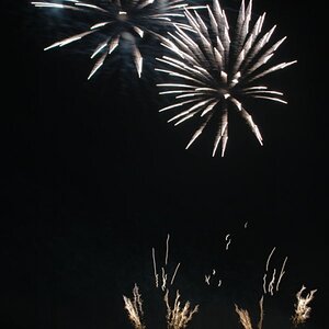
Or too much photoshop? I can't tell, I've looked at it too much I guess. What do you guys think?

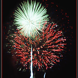
This one will eventually be in a book on The Making of the movie.
Thanks for looking!
_KA
This one will eventually be in a book on The Making of the movie.
Thanks for looking!
_KA
")


![[No title]](/data/xfmg/thumbnail/39/39529-3b8de3decb03849c8e9c6abdae9650cf.jpg?1619739070)
![[No title]](/data/xfmg/thumbnail/35/35264-5ade32b7036391926536661aeb7491c3.jpg?1619736969)

![[No title]](/data/xfmg/thumbnail/42/42055-105f2ee23a1fd79c786de42c5578274b.jpg?1619739992)