What's new

Portrait of a detective (2)

bingbang

No longer a newbie, moving up!
Joined
Jan 6, 2013
Messages
128
Reaction score
56
Location
Belgium
Can others edit my Photos
Photos OK to edit
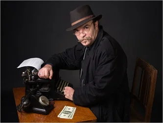
$20140201_140507.webp
On a black background : https://plus.google.com/photos/114391137842140117468/albums/5976235766196343169/5976235772057063218​


This is the second one, but it is part of a series that can be seen here : BingBang: Vie et mort d'un privé (Life and death of a private investigator)
For those who want to read the associated story, there is a Google translate widget on the right of the page (not perfect, but hopefully useful)
 
There's no "illusion" --It too perfectly fits the caricature. It needs something spontaneous, unplanned, unrehearsed, unexpected. It's kinda like when you watch a movie and you can tell the actors are acting. There's a little too much control here, and it breaks the spell. The best characters somehow break their stereotypes. Just my opinion.
 
There's no "illusion" --It too perfectly fits the caricature. It needs something spontaneous, unplanned, unrehearsed, unexpected. It's kinda like when you watch a movie and you can tell the actors are acting. There's a little too much control here, and it breaks the spell. The best characters somehow break their stereotypes. Just my opinion.

How right on the mark this comment is.
If I had to focus (no pun intended) on what seems 'staged', it is a set of little things including the typed page displayed so much, the phone turned away from the user and the uncluttered desk.
 
The modern bills ruin it for me... You went as far as getting an old typewriter and a disconnected phone, but those bills just stand out like a sore thumb.
 
Did you look at the series ? I don't think so.
 
Why you guys do you want to always argue about the fact that is shoud be this way or that way instead of what you are seeing ? It is exactly what I have said, and it is a kind of obsessive-compulsive disorder on photography forums in general. Just present ANY pictures, and there is always someone that would consider that it would have been done another way. Should I have put no bills, someone would have said that the table looks empty. Should I have cluttered the table with a bunch of paper, someone would have said that this distracts from the character, etc. etc. etc. So take it as it is : you like it or you don't like it.
 
Last edited:
Did you look at the series ? I don't think so.

Is this directed towards me?

Yes, I clicked your link, it mentions a detective from the 1950s. It also mentions that you want to recreate Jack as accurate as possible.

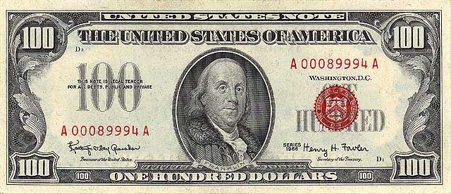
Therefore an $100 bill of 1950 would look like this:

US_%24100_United_States_Note_1966.jpg

public domain


I appreciate that you went and got the typewrite and phone, but it just looks staged. The phone is disconnected and why is there a few hundred dollars just sitting there? The photography is good, but the staging is subpar and distracting. The one shot where you're more level with the desk it's not as bad, in fact this one is really great (except for the phone cord), but when you shoot from above and show the contents of the table, I assume it to be of importance, but I don't understand how some crisp bright $100 bills are important to the series. I also want to see what he's writing on the typewriter since you as displaying that as well.


EDIT: I don't like it. it's trash.
 
lol.

So basically if I desaturate the bills to make them gray and put a loosy cord on the floor, you would be happy ? And the reason for the bills where mentioned in the story, by the way. I don't think you get the meaning of the story either, except that you read the three first lines that are not representative of the idea. And for God sake what's the point to see what he is typing on the machine ?

Bye guys, I filled my bag of stupid comments for a whole. I need some fresh air.
 
the story also mentioned an office...I see a gray backdrop. derp.
 
Yes, that could be because you might be a guy with no imagination. I am sorry for you.
 
Why you guys do you want to always argue about the fact that is shoud be this way or that way instead of what you are seeing ? It is exactly what I have said, and it is a kind of obsessive-compulsive disorder on photography forums in general. Just present ANY pictures, and there is always someone that would consider that it would have been done another way. Should I have put no bills, someone would have said that the table looks empty. Should I have cluttered the table with a bunch of paper, someone would have said that this distract from the character, etc. etc. etc. So take it as it is : you like it or you don't like it.

Well, this is a critique forum ... I think it's helpful to keep an open mind and try and learn from others, even if you don't always agree with them, you may agree in part or be able to use the suggestions in another image. People here are taking the time to look at your image, think about it, and try to offer what they feel would be helpful.

Do you want the image to look "staged"? Do you want self-consciousness in the art making process to be a theme in the series? My impression is you do not. My impression is you want to create a character, based on a real person, that feels authentic and believable to the viewer. What the above posters are pointing out to you are the things in the image that make it feel less authentic, and make the character less believable.

There are a few different ways to approach critique. You can cop an attitude, "Those idiots! My images are perfect exactly the way they are!" is one way, but I think a more productive path is one where you at least consider the alternatives, objectively, and incorporate them as you see fit in the image at hand, or utilize them in the future.
 
Yes, that could be because you might be a guy with no imagination. I am sorry for you.

yes, I have an inaccurate as possible imagination.
 
I have no problem with that, jenko. The idea was not to reproduce a real office. Do you consider me as idiot to the point that I forgot that there is a backdrop instead of a real office wall behind ? If I would have been willing to reproduce a real office, I would not have doing this in a studio, right ? The fact that people point this out is just showing that they don't get it. If you go to a show in a theater and the guy is on stage with a table, a chair and a fake window behind him, pretending that the scene is taking place inside a house, would you claim "Look, this is fake, the guy is not in a real house !" ? This would sound pretty stupid, right ? However, this is exactly what is done here.
 
I want to like this, I really do. I'm a huge fan of mid-century detective stories (Sam Spade, Philip Marlow, etc), but there a bunch of things here that just don't work for me. The things that do are the lighting and his expression. The things that don't: His hat and jacket. Both seem wrong for the era. Why is the telephone not angled toward him, and why is his right hand wrapped around the carriage return lever like that? The biggest nit however is that everything is so clean. I'd like to see an empty coffee cup or highball glass on the desk, along with lots of rings where wet glasses/mugs had been placed, his jacket and hat need some wear an dirt, there needs to be a pencil or two somewhere in the scene, and the desk needs to be bigger.
 
I have no problem with that, jenko. The idea was not to reproduce a real office. Do you consider me as idiot to the point that I forgot that there is a backdrop instead of a real office wall behind ? If I would have been willing to reproduce a real office, I would not have doing this in a studio, right ? The fact that people point this out is just showing that they don't get it. If you go to a show in a theater and the guy is on stage with a table, a chair and a fake window behind him, pretending that the scene is taking place inside a house, would you claim "Look, this is fake, the guy is not in a real house !" ? This would sound pretty stupid, right ? However, this is exactly what is done here.
Lighten up Francis, yeesh!!! I think what has caused most of the comment is that you've such a good job on part of the image, but the other part seems somewhat haphazard. The concept, lighting, and expression of the subject are excellent, and the image is okay as-is, but as the viewer, I'm left wishing that more of the details were handled better. I take your point about stage window, BUT... that is background dressing. No one is complaining about the background, rather here, it's the foreground.
 

Create an account or login to comment

You must be a member in order to leave a comment

Create account

Create an account on our community. It's easy!

Log in

Already have an account? Log in here.

Back
Top Bottom