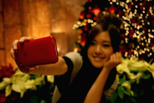
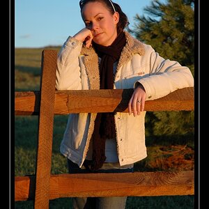
I think #3 is my favorite as well, although I do agree it is a little underexposed.
For my tastes...
#1 she is a bit far to the right, and the expression on her face doesn't do it for me
#2 is a good idea, but there is too much weird stuff behind her, like a floating suitcase
#4 I'm not quite sure why she's leaning against a wall on the street, facing the wall
#5 seems to be more of a product shot than a portrait






![[No title]](/data/xfmg/thumbnail/30/30992-773558233723ab0d28c307a97a1a2427.jpg?1734159059)



![[No title]](/data/xfmg/thumbnail/30/30994-49c5521f7b5b417f49dcd43891cbec27.jpg?1734159066)