What's new

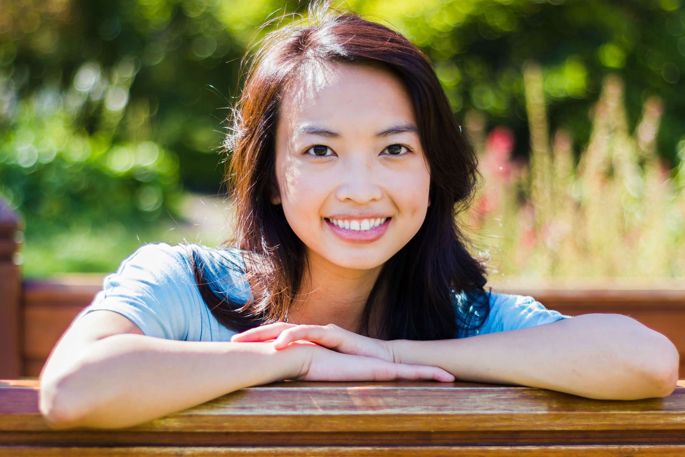
Portrait of my gal

651stp

No longer a newbie, moving up!
Joined
Sep 19, 2012
Messages
214
Reaction score
33
Location
Minnesota
Can others edit my Photos
Photos OK to edit
hi again! another portrait of my gal. i love the hair light of this picture, i wish it really didnt spill on the face but its the only shot i took that i really liked from this set. It does have a little bit of chromatic abber. but i tried to remove as much of it as i can without altering anything else. let me know what you guys think!


IMG_1451September 15, 2012 #jpixx by jpixelz, on Flickr
 
The composition isn't bad, but the bokeh seems a bit busy. Also it would help if you brought down the highlights in post.
 
The composition isn't bad, but the bokeh seems a bit busy. Also it would help if you brought down the highlights in post.

hows this? i turned the highlights down. Also after looking at it, it looked a bit blue to me so i raised the temp a tad bit.

WWgY6.jpg
 
She's lovely, and you've done a good job of showing that! The background is a bit busy, but not too terribly much so...it looks "summery", and so the light on her face seems okay to me.
 
Pretty girl and she's got a great connection with the viewer, it's hard to look away. But once I was able to take my eyes off her face, the close elbow that is out of focus is a bit of a distraction.

I might (well I certainly would) add a vignette to darken the edges & background.
 
a little over exposed, maybe its just me. the light looks a lil too hard.
 
She's lovely, and you've done a good job of showing that! The background is a bit busy, but not too terribly much so...it looks "summery", and so the light on her face seems okay to me.
Thanks for the kind words Derrel!

Pretty girl and she's got a great connection with the viewer, it's hard to look away. But once I was able to take my eyes off her face, the close elbow that is out of focus is a bit of a distraction.


I might (well I certainly would) add a vignette to darken the edges & background.
Thanks big guy! your right, i added a vignette and it does look much better, thanks for the tip!

a little over exposed, maybe its just me. the light looks a lil too hard.
It looks correctly exposed to me, maybe my monitors off though :P thanks for the cc
 

Create an account or login to comment

You must be a member in order to leave a comment

Create account

Create an account on our community. It's easy!

Log in

Already have an account? Log in here.

Back
Top Bottom