What's new

Portrait Photos of my son, C&C Welcomed

JacJac

TPF Noob!
Joined
Dec 10, 2010
Messages
54
Reaction score
1
Location
Perth WA
Can others edit my Photos
Photos NOT OK to edit
Hi What Do you Think?

1.
IMG_9200.jpg


2.
IMG_9169.jpg


3.
IMG_9100.jpg


4.
IMG_8684.jpg


Thanks :)
 
Really cute shots!


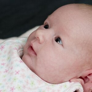
#1 .. normally I don't care for really tight framing, but it works in this one... with those big blue eyes.

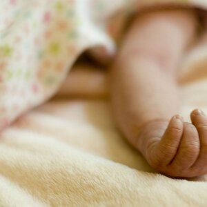
#2 cute... and niceley done. The shadows on his arm in the foreground detract a little bit, but overall a nice shot.

#3 BADLY underexposed....

#4 The processing is terrible.. I dislike tinting like that. It works for some shots.. but not this one. The shadows on the right side of his face are bad... light was too harsh and contrasty.. could have used some fill! I wold do a vertical (portrait) crop on it to get rid of dead space on camera right.
 
I only like #2. You should center the baby more though. He's a little off centered.
#1 looks like a snap shot
#2 as said above is way too dark. Even if bump the exposure, it's not a great picture.
#4 could be a really cute pic but the processing kills it.

#2 has great light (besides that small shadow on his left side), sharp and looks great. I would take this pic and build from there.
 
I love one. You really captured something sweet there. One suggestion would be bump up your aperture just a bit (higher number, smaller aperture), that way you can get both eyes in focus.

In general, pay attention to your backgrounds (this is a total weakness of mine). Just a slight angle change can really help!

 
Thank you for all your feedback, i shall take this on board :)
 
Hi JacJac,

It looks like you're using a wide angle. I think you would see an immediate improvement in your portraits if you use a longer lens (maybe 85mm).

All four shots could use improvement in lighting. The lighting in #1 looks a little harsh and one side of the baby's face is overexposed. In #2, you can tell you're shooting with a wide angle here, and there's a lot of shadowing on the babies arm. You already know about the lighting issue in #3. In #4 you might be able to improve the shadowing on the babies with a flash outdoors for fill light.
 
I love LOVE 1!!!!!!!!! What camera/settings/lens did you use? I really like 4 too. Number 3 does seem a little shadowy and grey..
 
#2 is pretty good. The bit of high thighs that is peeking over is a bit distracting though. You could clone that part out and see what you think but the rest of the framing is good. I like the effect of number 1 but your framing is a little too tight.
 

Create an account or login to comment

You must be a member in order to leave a comment

Create account

Create an account on our community. It's easy!

Log in

Already have an account? Log in here.

New Topics

Back
Top Bottom