C&C per req:
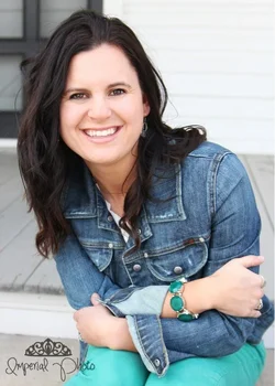
1. I find the door/window/black-patterny thing behind her head somewhat distracting and her pose looks rather forced; almost as if you'd asked her to pose when it was very cold and she was trying to keep warm and force a smile. The exposure is good (maybe just a touch bright, but easily corrected in post), 'though I find the lighting a trifle flat, and some catchlights in the eyes wouldn't go amiss.
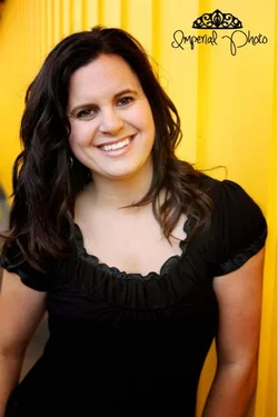
2. Pose and expression are much nicer here, but I'm not sure I agree with the choice of posing a model in dark clothing against a bright yellow background; it's really pulling my eye away. There's a loss of detail in the blacks, and a marked difference in exposure between her face which looks slightly flashed and her arms which appear about 2/3 stop under-exposed.
The cropping in both is a little tight for my taste, and in #2 you've actually cropped her arm along the linear axis (generally regarded as a portraiture no-no). Consider opening up just a tad to allow a little more room.
I'm curious; what precisely do you see about this as your 'style'? (No, that's not a shot or a snide comment, it's a sincere question)
Just my $00.02 worth - your mileage may vary.
~John